Dynamic Cafe Design: Iron meets Jute creating an organic balance
- July 10, 2024
- By: Ar. Priyanshi Shah
- INFLUENCERS
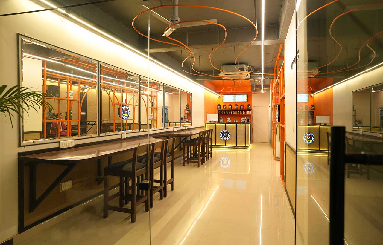 Gym Diet Cafe II is the latest addition to a thriving protein-based healthy food business, marking its first professionally designed space by Khudrrang Design Studio. This cafe is designed to embody the brand's journey from its mathematical foundations to dynamic, abstract growth. Featuring an iron structure with balanced semi-circular arches transforming into a free-flowing design. Contrasts in materials, such as glossy bright orange iron and humble jute, create a metaphorical balance.
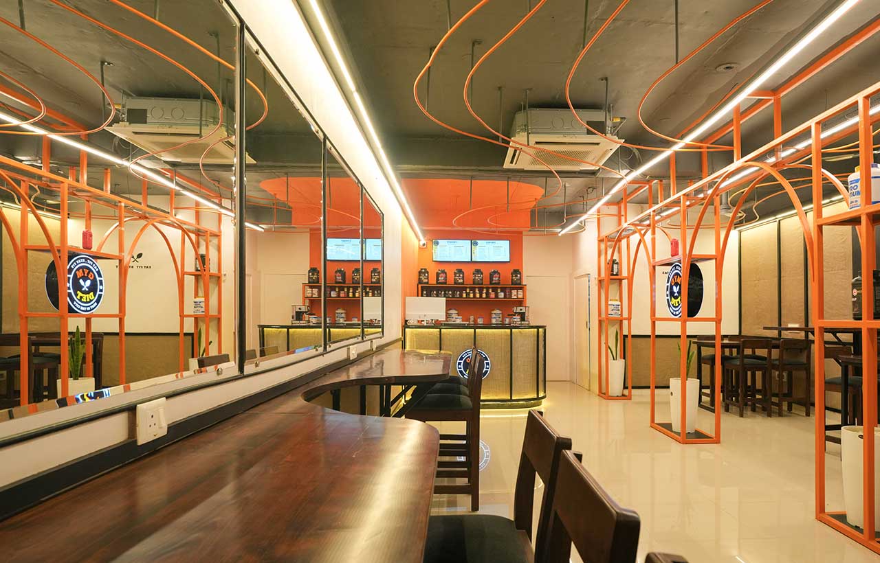
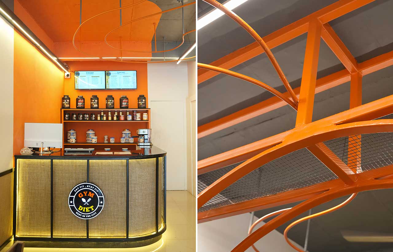 The idea was to create a brand image through design that can be replicated in their upcoming cafes. Trying to show how the company grew and depict the young and dynamic phase of the business, the initial idea was to start with something mathematical – which is the foundation of every business and change into something abstract.
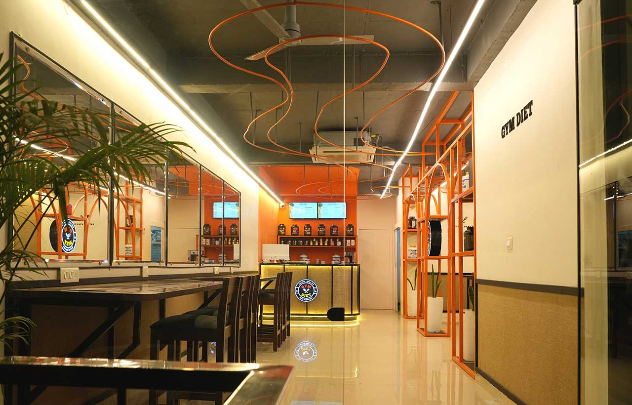
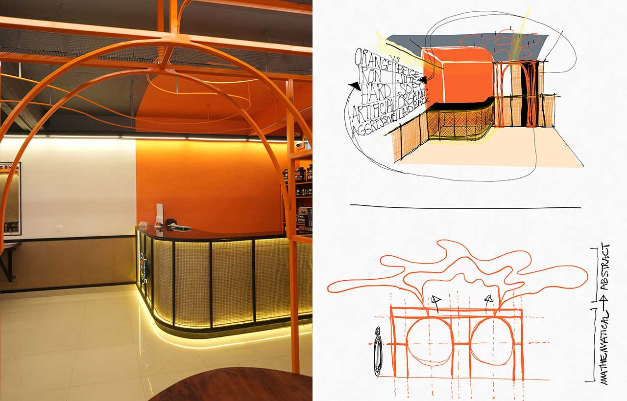 The design was of an iron structure with a rationally balanced frame consisting of two semi-circular arches that convert from the top into a free-flowing web of lines. This organic form starts from one of the arch center and ends in another, as if going back into its roots. The surrounding spaces were meant to complement this structure.
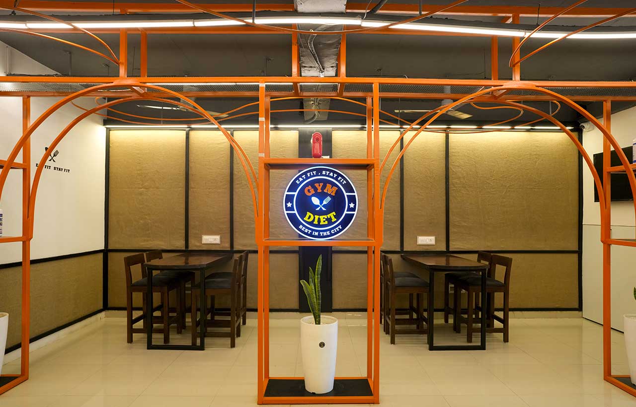 The idea behind designing the surroundings was also to create contrasts which, in the bigger picture, might make the user metaphorically realize the opposite realms of life. So the design details were guided in the attempt to balance these contrasts. Healthy and protein-based food was related to the contrast of ‘soft & hard’ leading to the choice of Jute and Iron as the main materials.
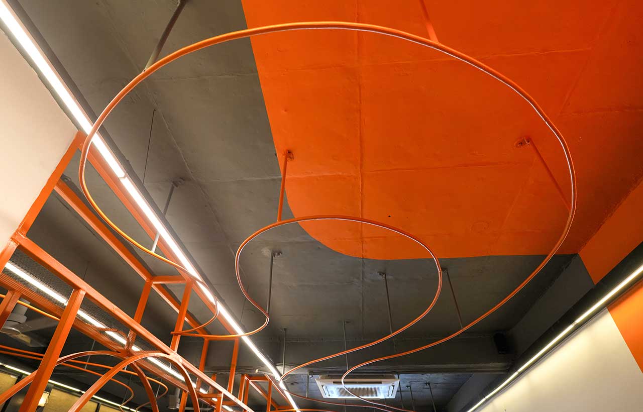
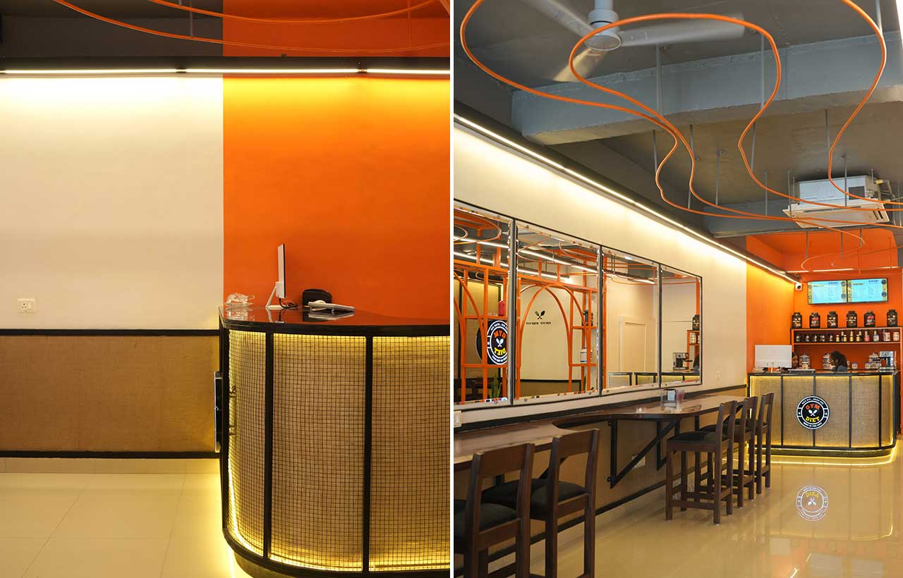 Using jute made the design cost-effective and could act as a protection to everyday ‘marks of usage’ which in commercial spaces generally happen below the height of 3 feet. Thus the challenge was to achieve a visual balance between the glossy bright orange iron and the organically textured humble-looking jute. This could be achieved by highlighting the jute fabric with slashes of light and framing it in black borders everywhere. The black borders made of plywood also helped hold the fabric tightly in place.
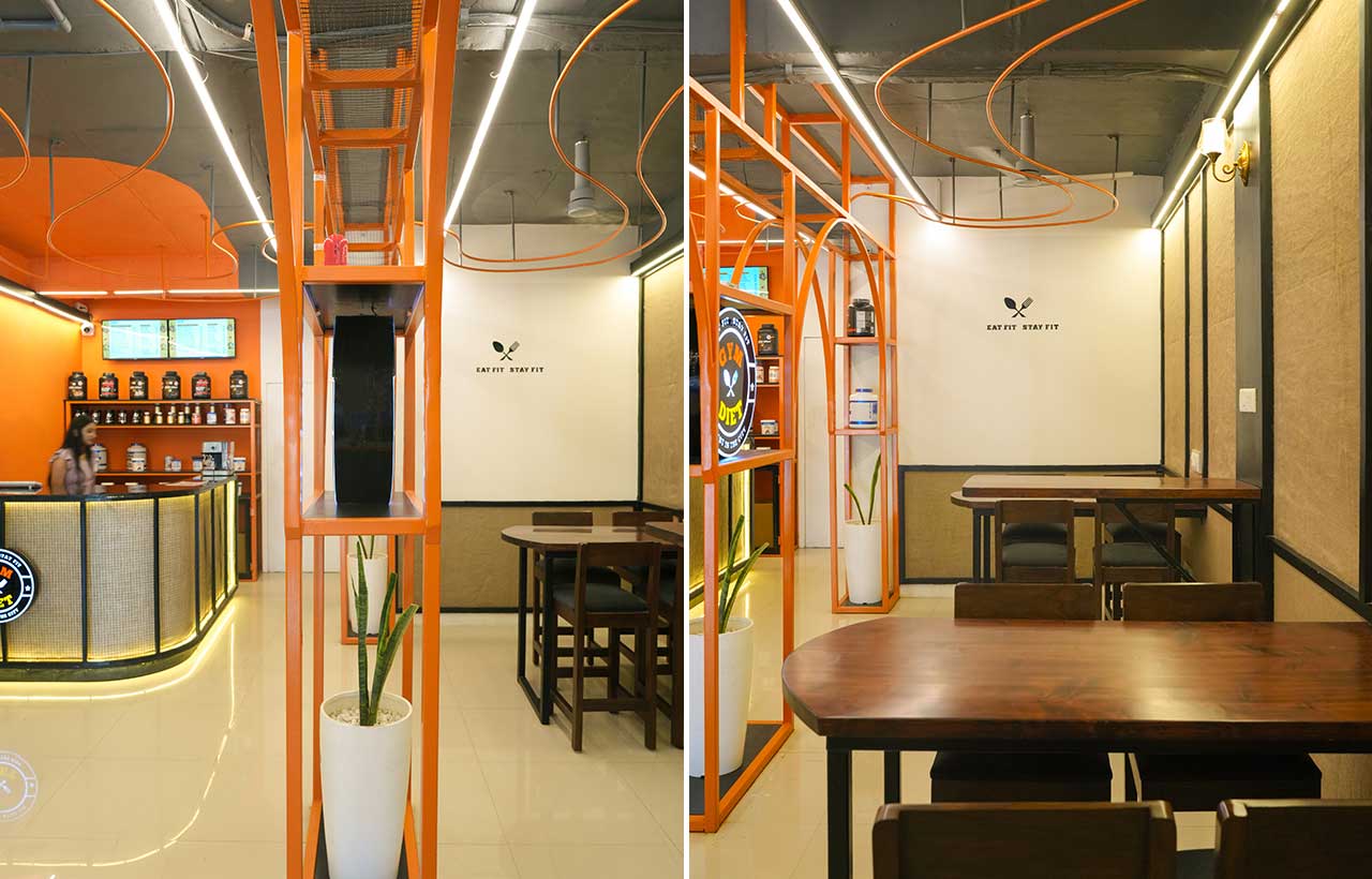 Overall design vocabulary continued being ‘organic & calculated’ in the iron structure, the ordering counter table and the fixed table along the mirrors. For example, the counter was wrapped in jute from the inside while taking an organic shape and caged from the outside in an iron structure of equally spaced bars and square grid mesh.
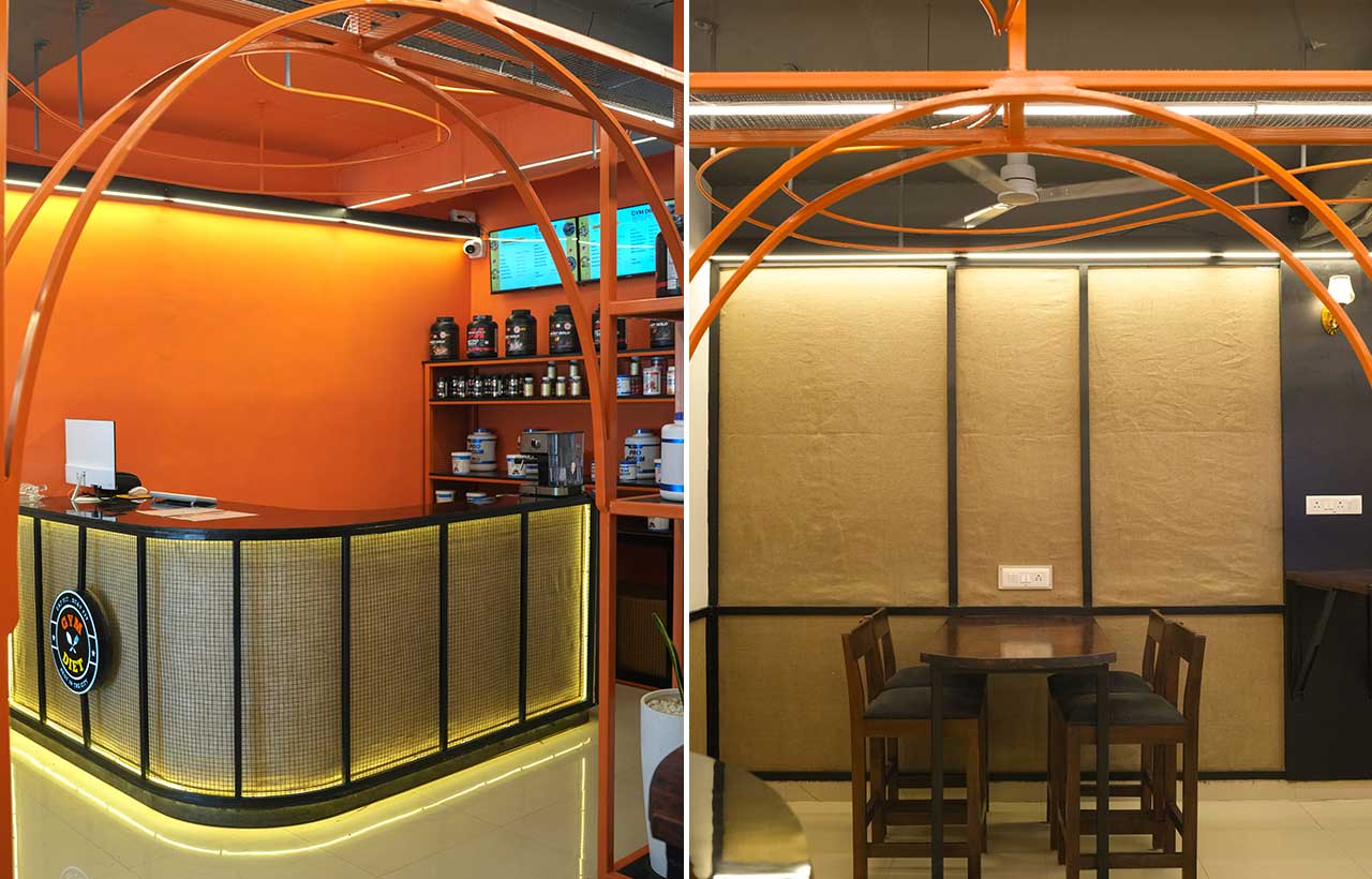 The design language, blending elements, extends with a primary colour palette of beige and bright orange to evoke a mix of laid-back and bold aesthetics.
 Stay updated on the latest news and insights in home decor, design, architecture, and construction materials with Building Material Reporter.
Fact File
Firm Name: Khudrrang Design Studio
Project Name: Gym Diet Cafe II
Project Location: Hisar, Haryana
Lead Designer: Hitesh Rathi
Photo Credits: Harish Chhabra
