Pinklay: Essence of Indian Handicrafts
- November 22, 2023
- By: Editorial Team
- INFLUENCERS
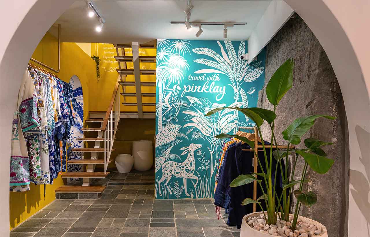
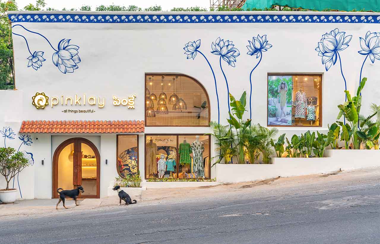 Pinklay is a homegrown lifestyle brand, dedicated to showcasing the richness of Indian handicrafts. Embracing vibrant colours, their designs span across a diverse range, including clothing, home décor, accents, furnishings, and accessories. The focal point of the brand is encapsulated in their motto, "Travel with Pinklay." In establishing their largest store in a new city designed by Crafted Spaces, the clients aimed to craft an environment that not only embodies youthfulness and vibrancy but also aligns seamlessly with the brand's ideology.
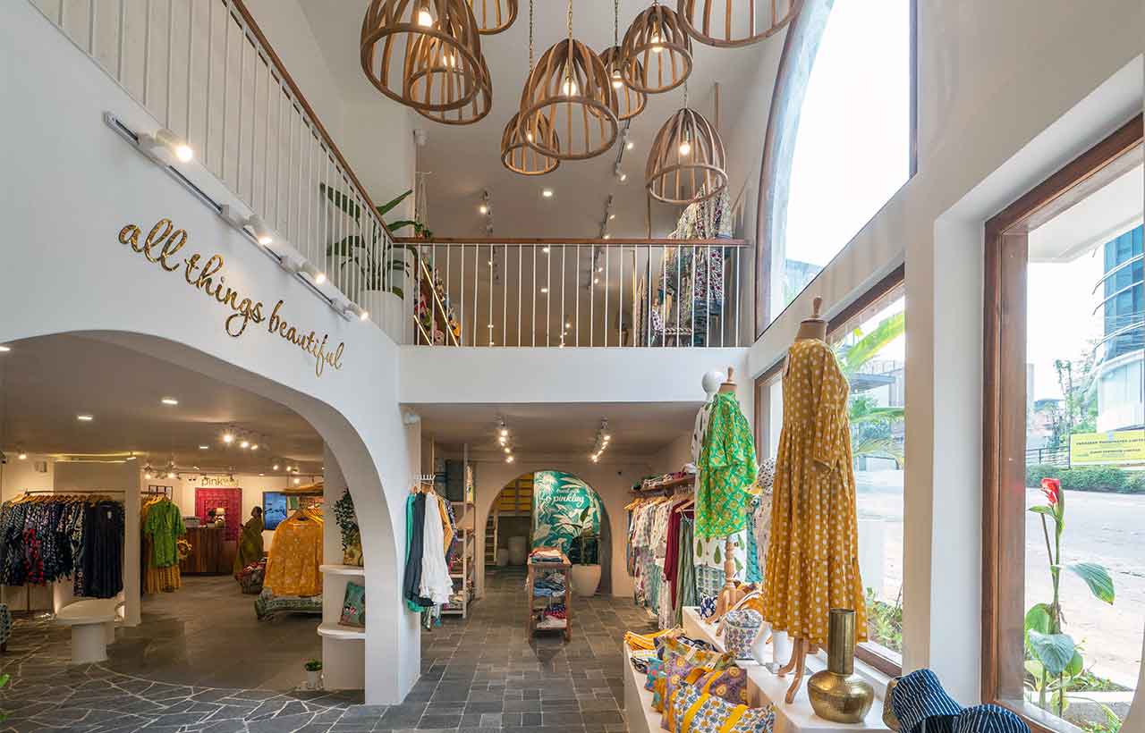
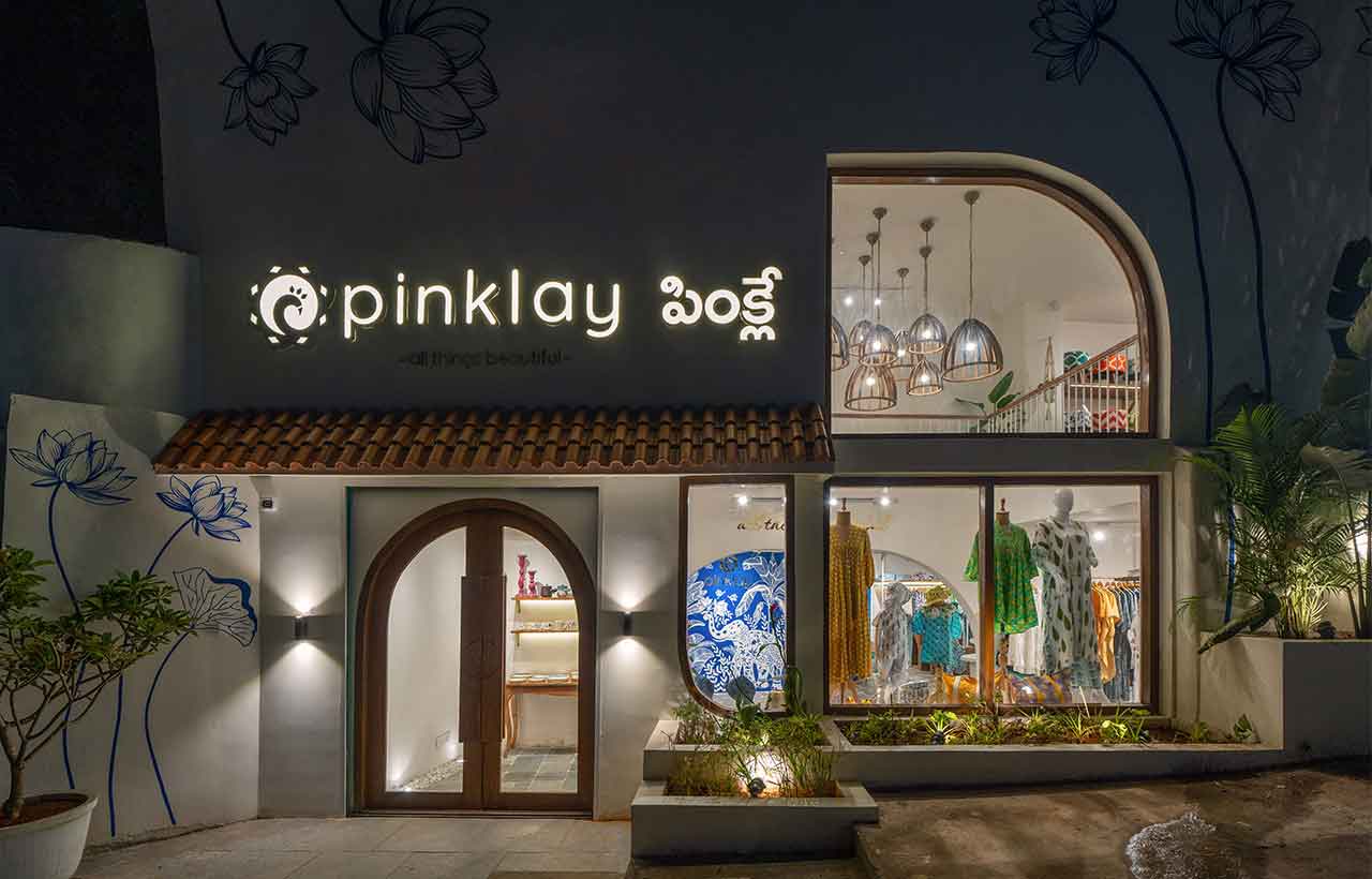
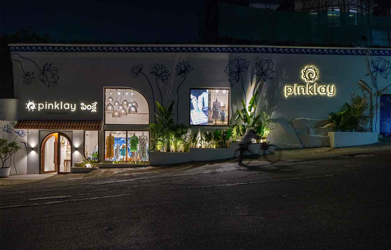
Our vision centered around infusing a Greek-inspired ambience with a distinctive Indian touch. We aimed to transcend the conventional retail setting by curating an immersive customer experience, achieved through the strategic use of curved fluid walls and flooring reminiscent of an art gallery. Confronted with a blank, 90-foot-long white wall ascending on a prominent road amid upscale boutique stores, the challenge was to create a façade that would stand out in this highly competitive space.
To captivate potential customers, we opted for a bold approach—a hand-painted floral mural adorning the facade, featuring lotus motifs inspired by the client's collection and accentuated with the brand's signature blue colour. This not only transformed the exterior into a visually striking masterpiece but also served as a compelling invitation to explore the unique fusion of Greek aesthetics and Indian flair within the store.
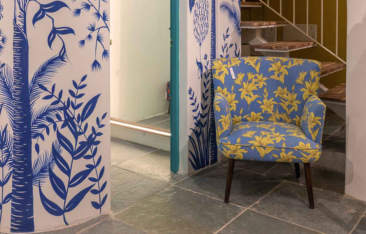
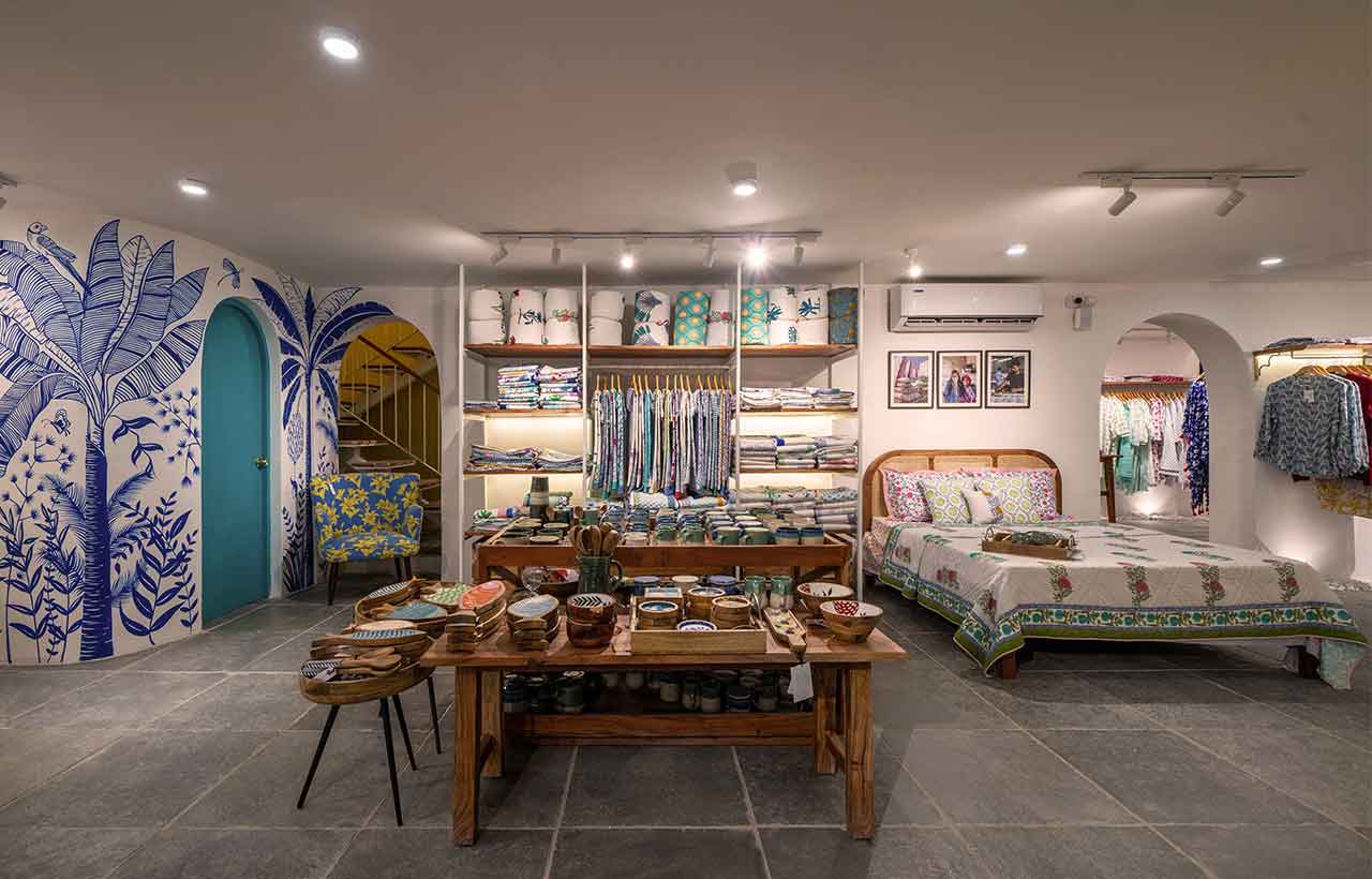
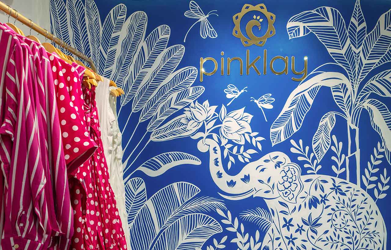
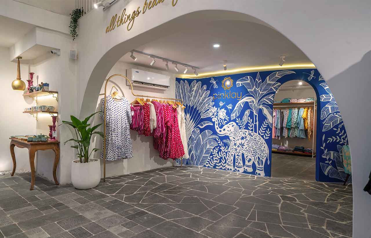
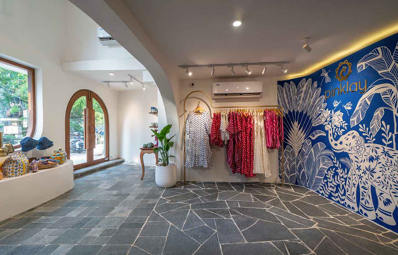
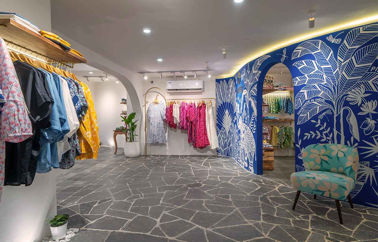 The objective was to curate an immersive experience, inviting customers not just to shop but to engage in meaningful conversations and spend quality time within the store. Carrying forward the design language inside, we identified three walls devoid of display to create hand-painted murals representing the brand's ethos incorporating their designs and prints. The remaining walls were kept neutral for their clothes and décor items to shine.
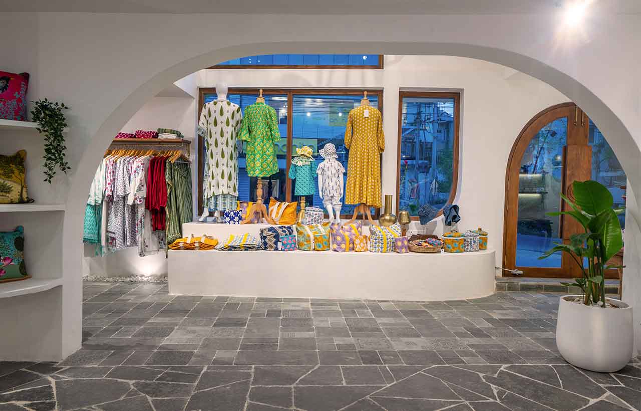
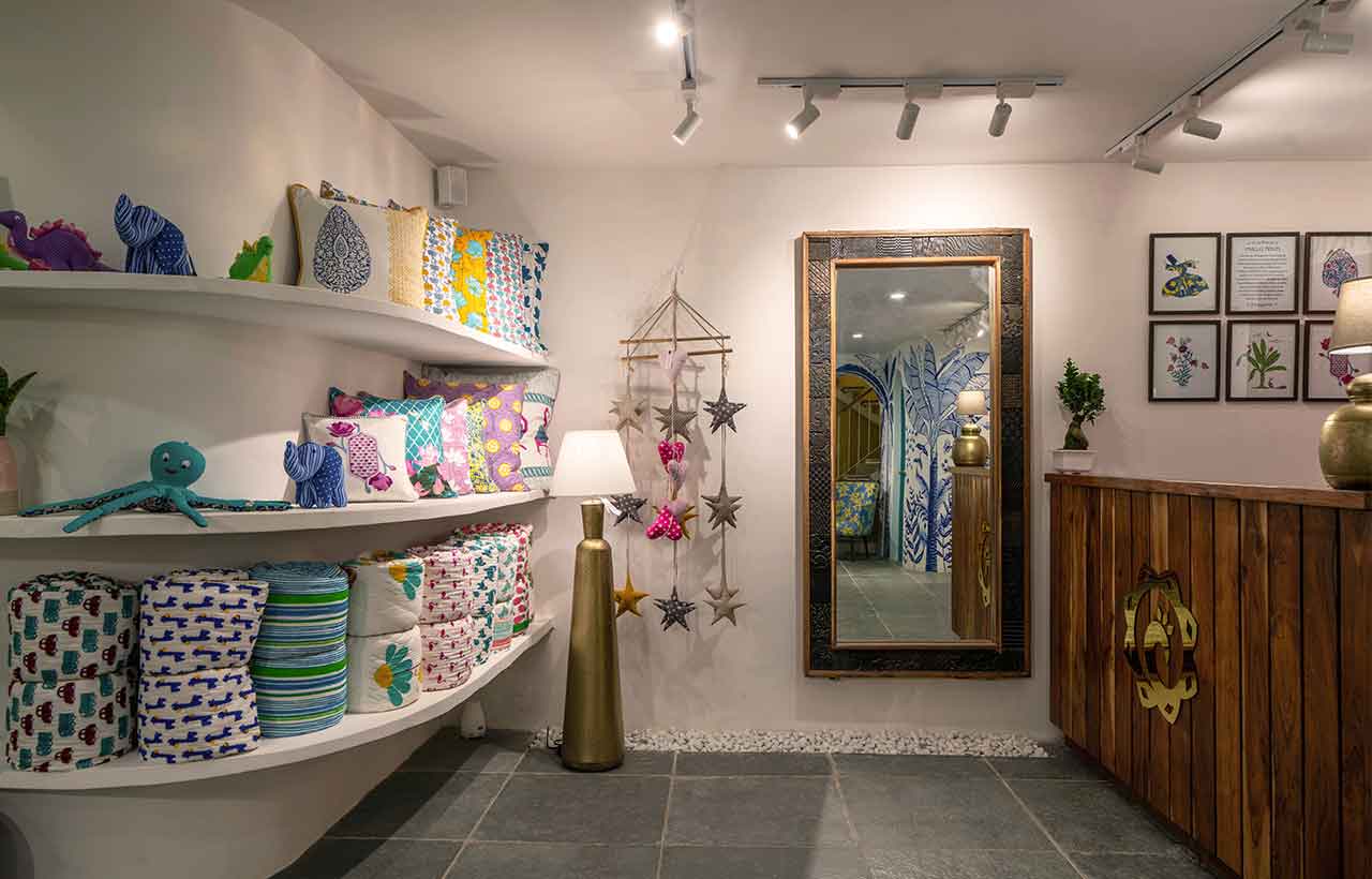
Nestled in a prime locality surrounded by upscale designer stores, the site draws inspiration from the timeless aesthetics of Santorini. Embracing the simplicity of whitewashed walls adorned with accents of white pebbles, organic flagstone flooring, and graceful arches, the design incorporates pops of colour in the form of serene blue, lively pink, and vibrant yellow hues. Situated in the basement of a spacious bungalow, the initial challenge lay in the absence of natural light, compounded by the presence of retaining walls.

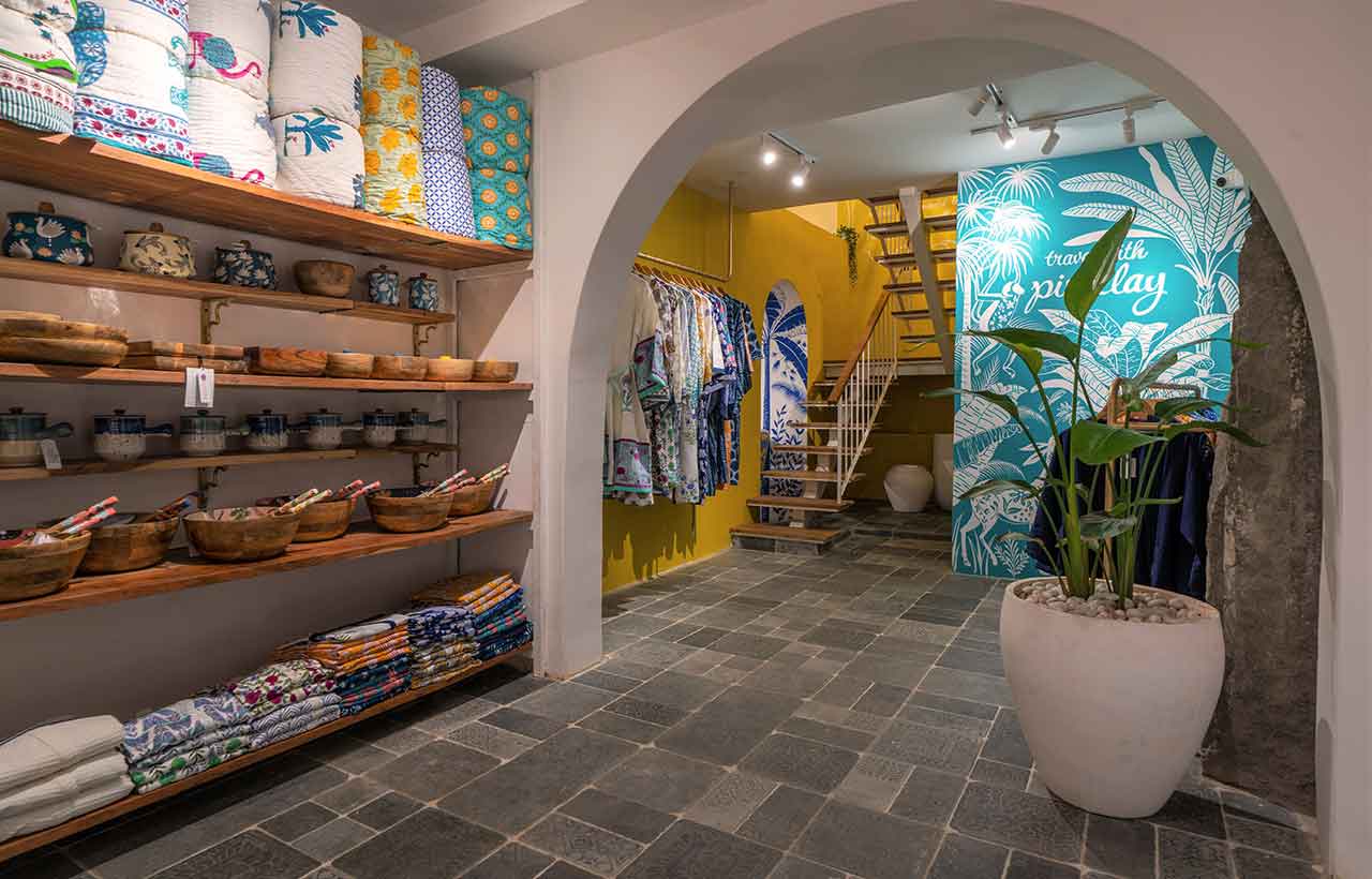
The first transformative step involved introducing natural light into the space by creating a double-height area, featuring a sizable glass window that not only served as a captivating display but also flooded the interior with ample natural light. This thoughtful addition not only addressed the light deficiency but also contributed to an inviting and airy atmosphere. To enhance the flow of spaces within the confined setting, subsequent measures included the strategic removal of walls and the introduction of archways.
 This architectural intervention seamlessly connected different rooms, fostering a harmonious transition throughout the space. By breaking down barriers and establishing visual connections, the design not only overcame the spatial constraints but also created a dynamic and inviting environment, enriching the customer experience within the transformed Santorini-inspired haven.
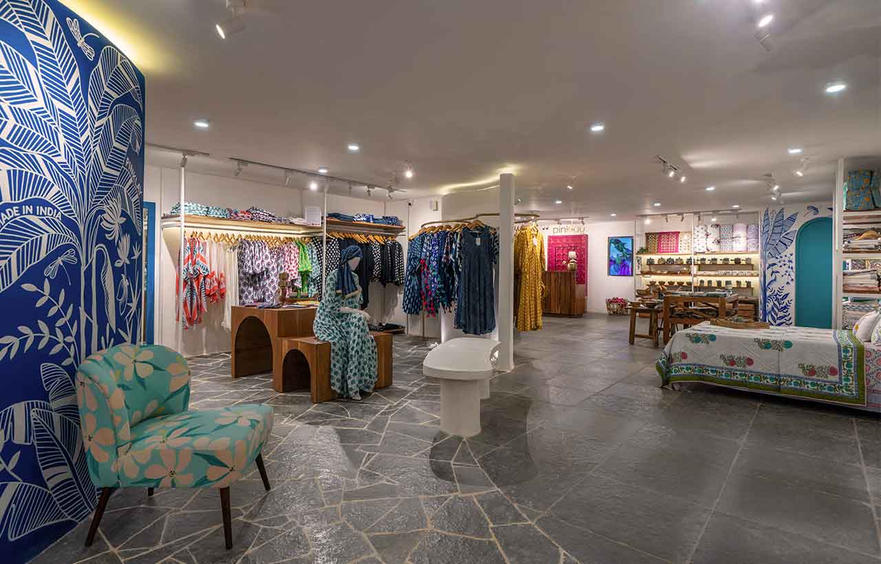
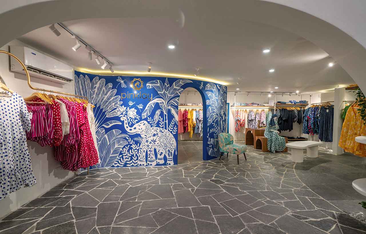
 Overcoming the constraint of a low ceiling height measuring only 8 feet presented a unique challenge in transforming a plain, white, rectangular room into a captivating space. The solution involved the introduction of fluid curved walls, a design choice that not only addressed the height limitation but also added an element of playfulness to the overall customer experience.
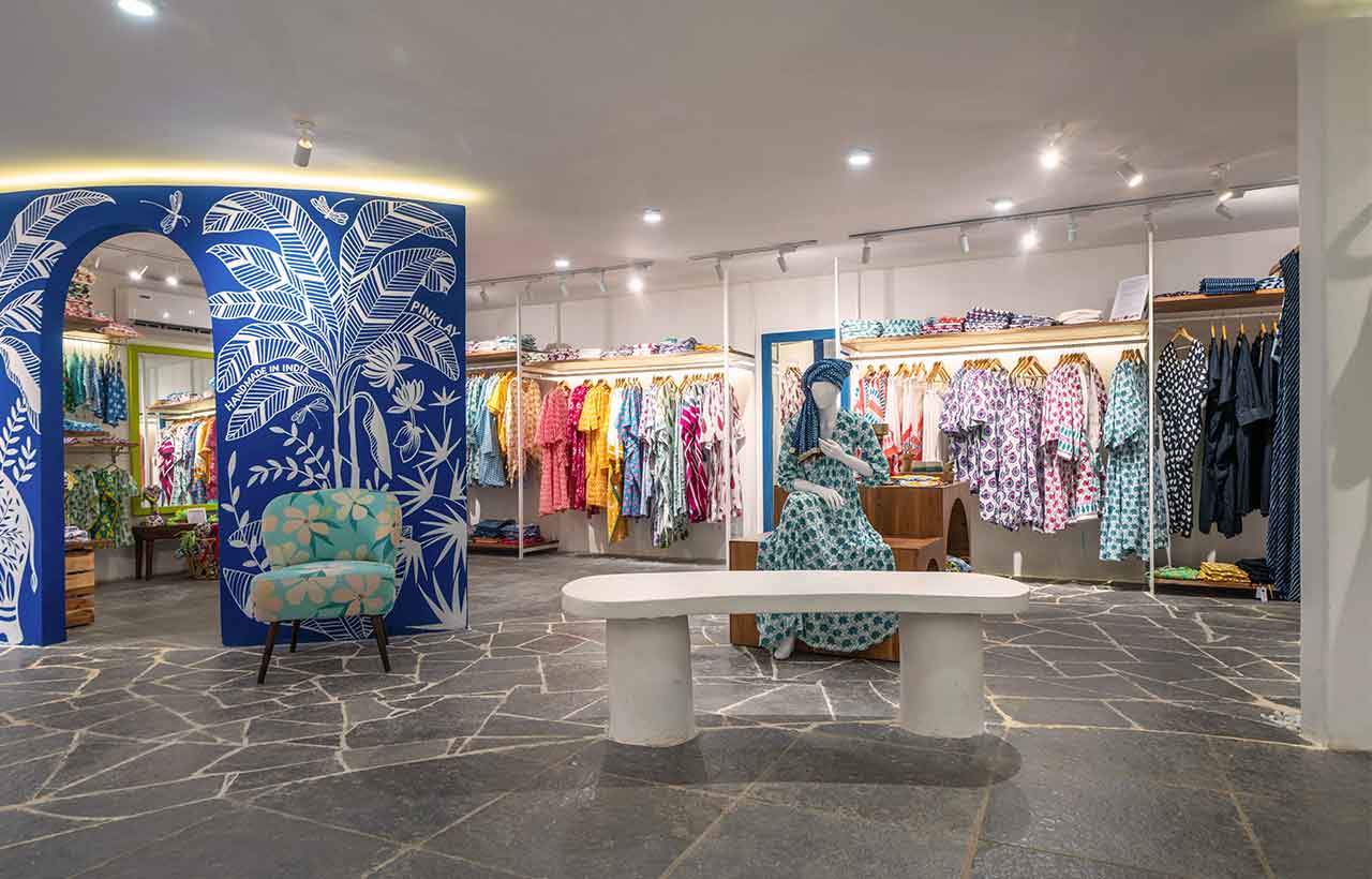 To infuse a snse of drama into the transitional space, a bold curved floor was implemented, featuring organic broken pieces of grey Tandur stone. This distinctive flooring, situated between the gracefully curved walls, not only served as a visual focal point but also contributed to breaking the monotony of the room's rectangular layout. The combination of curved walls and dynamic flooring not only mitigated the challenge posed by the low ceiling but also elevated the aesthetic appeal, creating an engaging and visually intriguing environment for customers to explore. areas devoid of clothing. Curves were added to soften the space due to the lack of height along with arches and curved display rods, curved walls and a curved central bench.
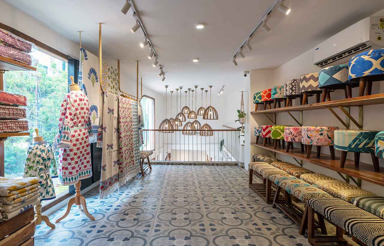
A new staircase and a yellow feature wall were added as you transition to the first floor which houses their furniture and rug display. This store is a playful mix of prints and patterns.
Stay updated with the latest trends and developments in architecture, design, home decor, construction technology, and building materials through Building Material Reporter.
Specifications
Firm Name: Crafted Spaces
Project Name: Pinklay
Project Location: Hyderabad, India
Built up - Area: 2500Sqft
Principal Designer: Mitali Aharam
Photo Credits: Ricken Desai


