Shibumi: Reviving Timeless Charm
- April 18, 2024
- By: Editorial Team
- INFLUENCERS
Storey Tellers Design Studio reanimates this 40-year-old home to infuse laidback luxury reminiscent of a traditional Indian summer. Their latest venture into residential design is Shibumi, an urban retreat in a quiet part of industrial Faridabad. Giving a new lease of life to a 40-year-old residence, the studio has extended some of its parts to suit the needs of the homeowners, while retaining its timeless spirit and emotions.
.jpg) The existing exterior of the structure is characterised by two original arches in exposed, white-painted brick that evoke a laidback, old-world luxury. These arches are replicated on the facades of the newly constructed extensions of the house. To complement these features, earthy materials like stone pavers and understated landscaping form the exterior palette.
The existing exterior of the structure is characterised by two original arches in exposed, white-painted brick that evoke a laidback, old-world luxury. These arches are replicated on the facades of the newly constructed extensions of the house. To complement these features, earthy materials like stone pavers and understated landscaping form the exterior palette.
A covered porch is introduced over the driveway, connecting with the home’s foyer through the arched doorway. “We designed the 9-foot-high arched entrance to provide a sneak peek into the design vocabulary of the rest of the home, with its restrained colours and modest curves,” says Tanbeer Kazi, Partner at the studio.
.jpg) The rest of the home is true to this schema, establishing a sense of calm with interiors that evoke a traditional Indian summer blended with subtle modern farmhouse aesthetics. Leafy, floral patterns in the upholstery and wallpapers give an additional nod to a tropical sensibility. Within this scheme, the furniture takes centre stage.
The rest of the home is true to this schema, establishing a sense of calm with interiors that evoke a traditional Indian summer blended with subtle modern farmhouse aesthetics. Leafy, floral patterns in the upholstery and wallpapers give an additional nod to a tropical sensibility. Within this scheme, the furniture takes centre stage.
.jpg) Komal Rustagi, Partner at the Storey Tellers Design Studio, explains, “We focused our efforts on celebrating the client’s collection of decades-old furniture, only refreshing them slightly and making sure the pieces were the protagonists of the space.”
Komal Rustagi, Partner at the Storey Tellers Design Studio, explains, “We focused our efforts on celebrating the client’s collection of decades-old furniture, only refreshing them slightly and making sure the pieces were the protagonists of the space.”
The foyer leads to a mandir on one side and the private areas of the home, including the first floor, on the other. While the foyer is designed minimally with a focus on the mandir and handcrafted cement floor by Bharat Flooring, a moulding-framed section of wallpaper from the Sabyasachi x Asian Paints Nilaya Collection grabs the viewer’s attention.
The kitchen and a powder room are a little ways ahead. The kitchen is similarly muted with two kinds of windows — a slit and an arched one — looking out onto the front garden and the driveway.
The living and dining spaces are accessed straight ahead from the foyer, which is again furnished with the existing pieces. The bar in the living room is the exception here, which is built from scratch by the design studio.
A wall of arched mirrors accentuates the room while lending it a sense of increased depth of space. Soft colours, intriguing patterns on fabrics and unobtrusive arches feature in the elements here. A British chandelier was upcycled and installed in the living room.
.jpg) The powder room features a much more vintage look, with a restored, four-decade-old vanity and wooden wainscoting. The intricately carved vanity is complemented by a floral wallpaper that ties the room in with the established design scheme of the house.
The powder room features a much more vintage look, with a restored, four-decade-old vanity and wooden wainscoting. The intricately carved vanity is complemented by a floral wallpaper that ties the room in with the established design scheme of the house.
The erstwhile kitchen now repurposed into the master lounge, is led into the living room, which is a warm space intended for quality family time. A TV unit in line with the family’s antique furniture — but with a contemporary edge — was custom-designed by the studio for this room. The wooden chandelier rounds up the room’s vintage aesthetics.
The master bedroom embodies the farmhouse-chic sentimentality with a blue-white-brown palette and airy interiors. An arched niche supports wooden shelving, while a rattan luminaire hangs over a deep blue work desk.
The bed, with a similar blue-shaded headboard, stands against a grey accent wall detailed with diagonal trims.
The son’s bedroom on the ground floor is accessed from a brick-finished hallway with jaali details.
.jpg)
The room is furnished minimally, with a study corner built-in metal and wood. The overall aesthetic of the room is kept contemporary with a masculine edge to reflect the user’s personality.
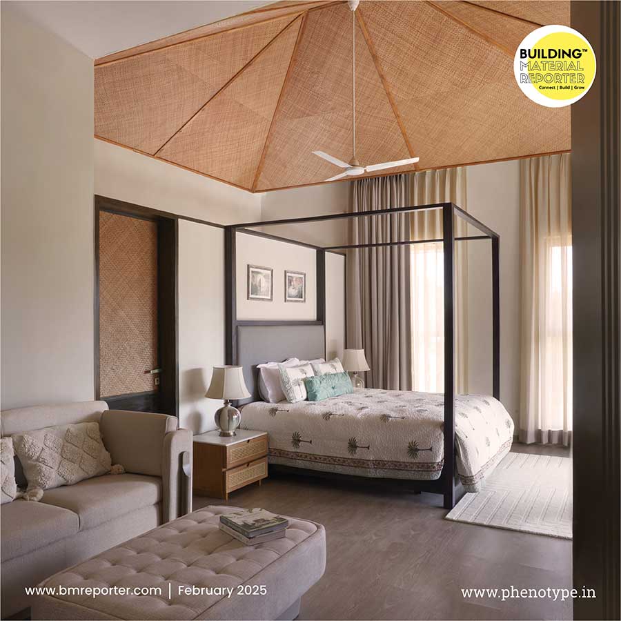
A winding staircase leads up from the hallway to the daughter’s bedroom, which is a light-filled volume accented with earthy colours and natural textures in wood and rattan. The design intent for this bedroom was similar to the son’s — to reflect the personality of the daughter.
.jpg) “The celebration of the past and the present together is what we wanted to achieve with this design, preserving the home’s heart while injecting new life into it,” elaborates Prakash Srivastava, Partner at Storey Tellers Design Studio.
“The celebration of the past and the present together is what we wanted to achieve with this design, preserving the home’s heart while injecting new life into it,” elaborates Prakash Srivastava, Partner at Storey Tellers Design Studio.
The design for Shibumi does a lot more — attention to detail and a respect for the family legacy make up the intangible ways it makes for the ideal urban escape into a bygone India. Despite the radical changes in its shell, the home has been conceived to retain the soul of the homeowner’s childhood.
 Stay updated on the latest news and insights in home decor, design, architecture, and construction materials with Building Material Reporter.
Specification
Firm Name: Storey Tellers Design Studio
Project Name: Shibumi
Project Location: Haryana, India
Built Up - Area: 12,000 Sqft
Lead Designer: Komal Rustagi, Tanbeer Kazi, Prakash Srivastava
Photo Credits: Tarang Goyal


