The Store Between the Lines: A Store with a Story!
- November 4, 2023
- By: Editorial Team
- INFLUENCERS
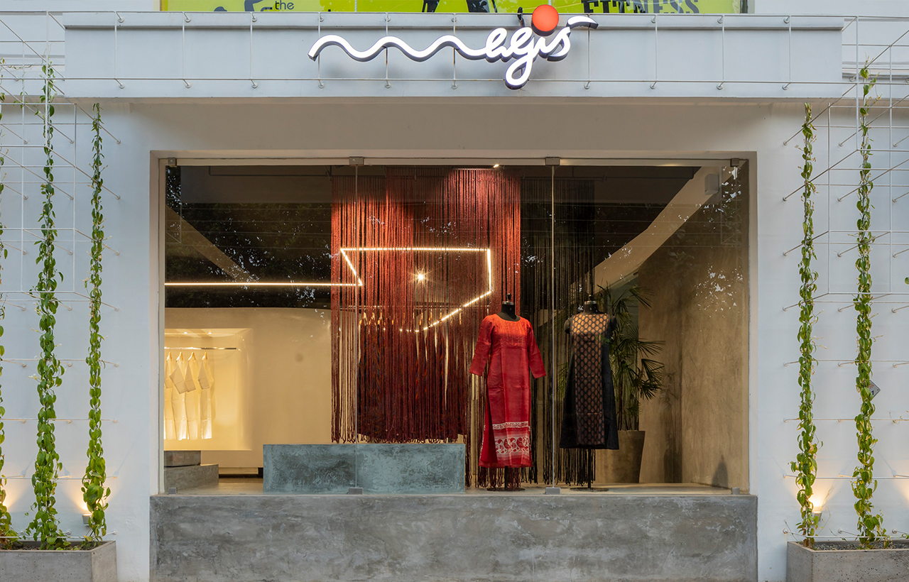
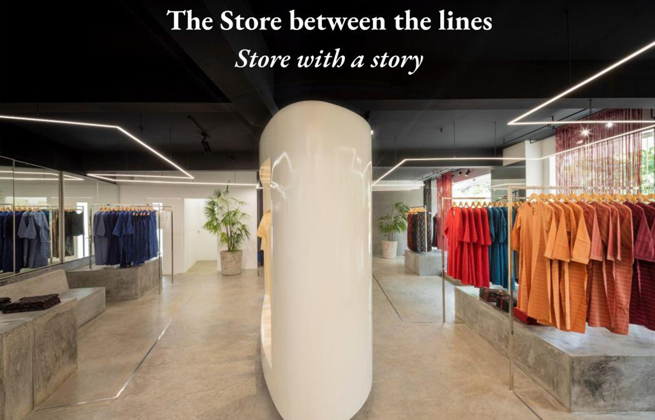 Designed exquisitely by LIJO.RENY. architects The Store Between the Lines, in Thrissur, Kerala reveals drama. Over the last 13 years, 'Magis' has paved its way to everyone's heart and has become a well-known women's wear brand in South India. The owners of this flagship store desired a space to properly showcase the qualities and true essence of their products. This dream led to the creation of "The Store Between the Lines," as it is fondly known. Covering an area of 92.90 sq. mts, the store allows the customers to get an intimate experience of the merchandise on display.
 At the centre of the space, is a large white display unit with a glossy automotive paint finish that contrasts with the rest of the interior design and establishes a display zone for high-end products. While concealing a central column, this unit creates a loop, encouraging customers to explore the store and find new items as they go.
The several cement-finished platforms that are placed throughout the internal perimeter of the store, rise as an extension of the cement-finished flooring construction at different heights. They serve as a pedestal for product stacking, a place for seasonal décor props, and a place for customers to gather for conversations. A sensible and unique approach, this enables occasional modifications to the general display configuration, piquing the interest of their regular clients.
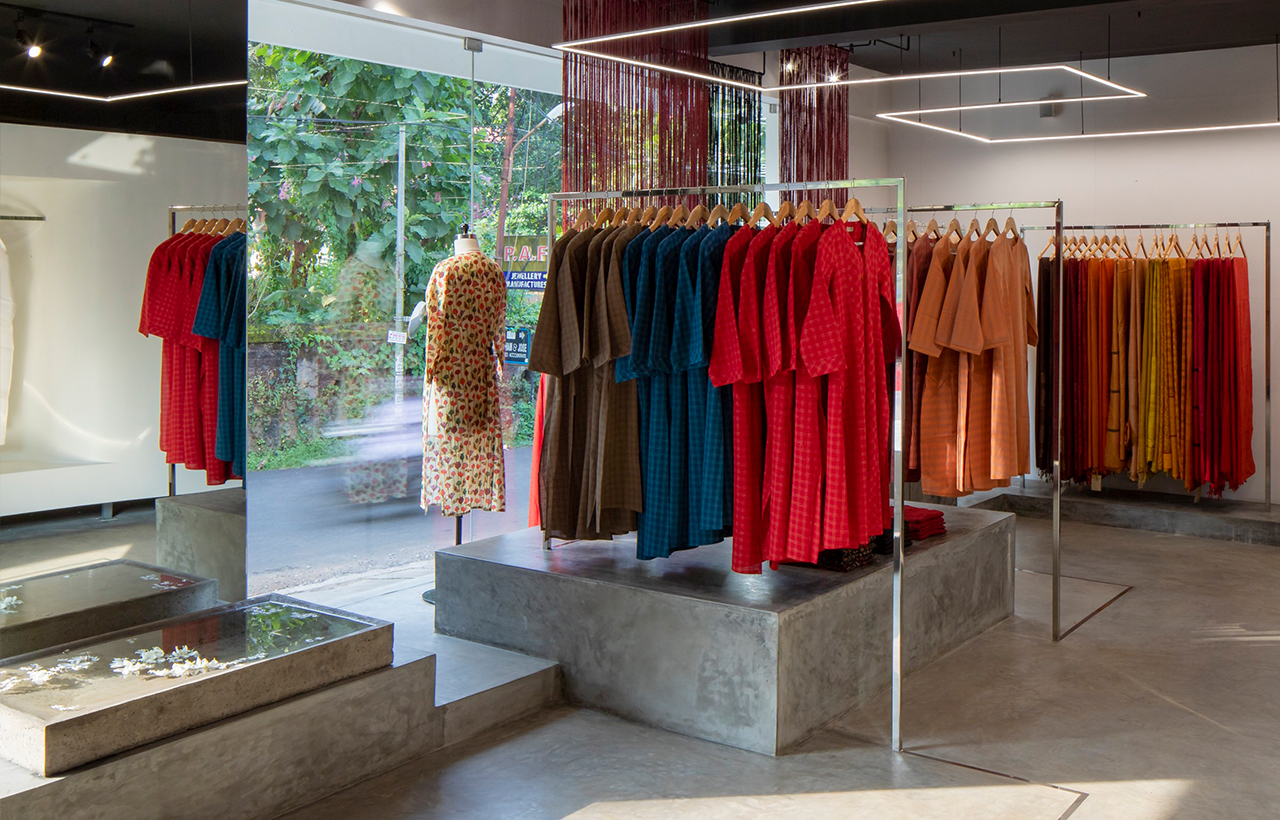 The hanging clothes are put together on stainless steel box sections that rise and fall from the platform and the floor. The general lighting of the store done through LED strip light, looks like a suspension in mid-air and reflects the S.S. box section layout in the plan.
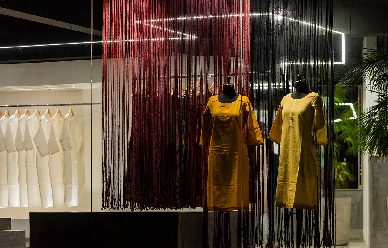
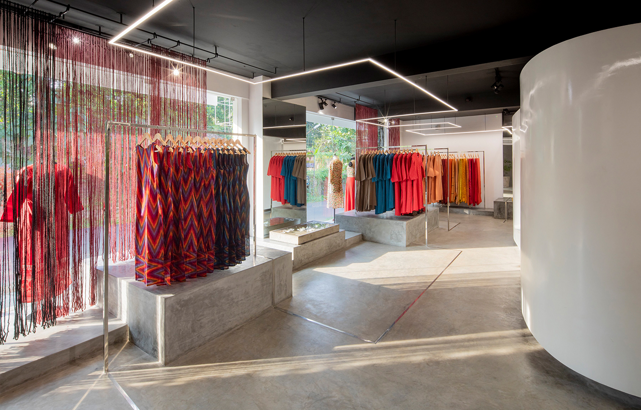 An entire rear wall has storage cabinets covered by sliding mirror shutters that help double the space visually. When a customer demands access, these cabinets are used to store extra inventory. The overall colour scheme is dominated by muted grey tones, which serve as a backdrop for the various hues, tones, and textures that the Magis designers incorporate into each season's collection. The window display idea too can be changed with ease by employing a simple yet versatile system, developed by the architects, fixed onto the ceiling inside the store, above the display windows. This system's ease of use makes it simple and quick to adjust the display to suit their needs or seasonal demands.
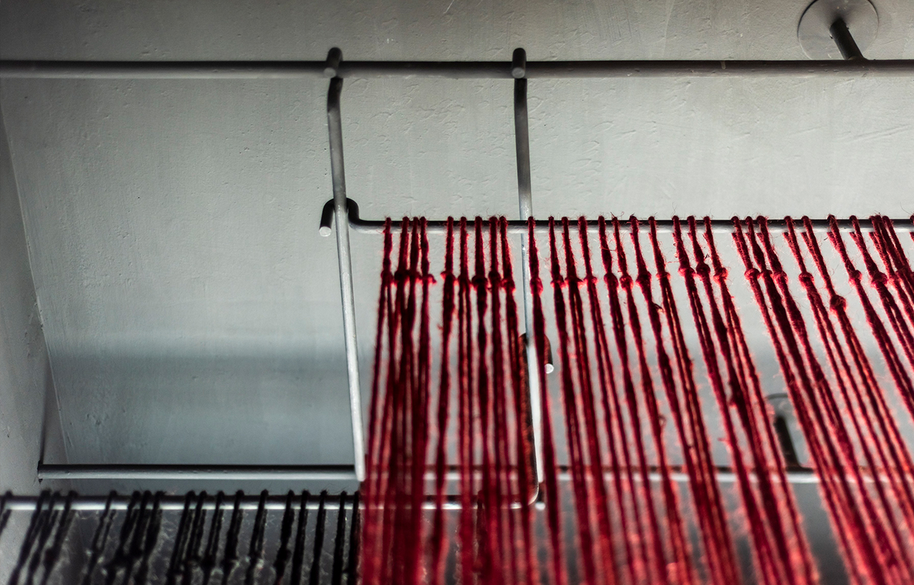 The store's integrity, efficiency, and simplicity mirror the qualities of the products that Magis is admired for. Despite its significant spatial design, the store makes the most of its convenient location. With utmost priority given to visual merchandising in interior design, a certain degree of aesthetic translucency is achieved with its large existing windows facing the street that aim to give onlookers a peek inside the store, encouraging them to stop by and explore further. The facade of the building looks beautiful and is devoid of any major changes from the existing building. Thus, the entire structure gives a visual retreat and embarks a niche to be remembered.
 Stay updated with the latest trends and developments in architecture, design, home decor, construction technology, and building materials through Building Material Reporter.
Specifications
Firm Name: LIJO.RENY. Architects
Project Name: The Store between the Lines
Project Location: Mission Quarters, Thrissur, Kerala, India
Design Team: Ar. Reny Lijo and Ar. Lijo Jos
Built-up Area: 92.90 sq mt
Photo Credit: Praveen Mohandas


