Vanderlande: A Workplace Designed To Encourage Employee Wellness
- June 11, 2022
- By: Editorial Team
- INFLUENCERS
An office space that provides a non-monotonous, visually demarcated workplace setting that accommodates 219 people.
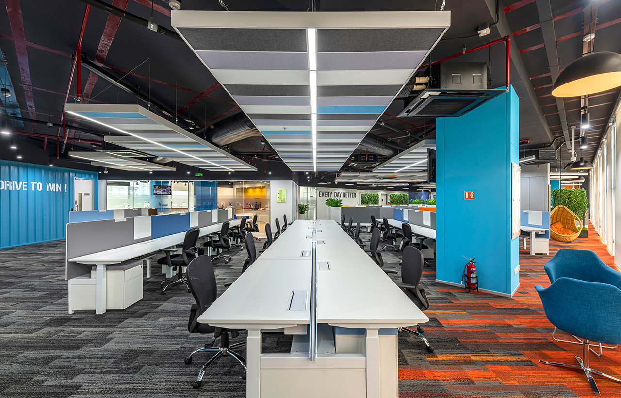
The interiors of Vanderlande exhibit a Rugged Industry Look that narrates the brand's image. The design reimagines the company's factories and manufacturing houses. There are exposed ceilings, factory-like rugged floors with concrete finishes that directly imitate the materials and logistic market. Besides the unique look, the industrial interiors also promote a sense of liberty and creativity among the employees. One of the main design highlights of the workplace is the lab cum display area that depicts a conveyor belt testing machine.
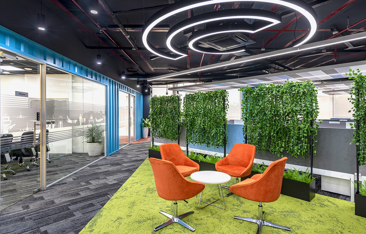
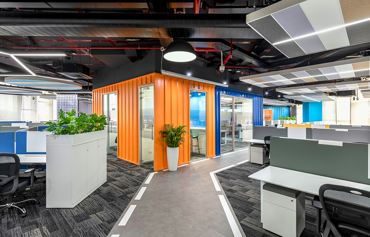
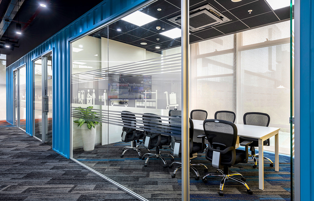
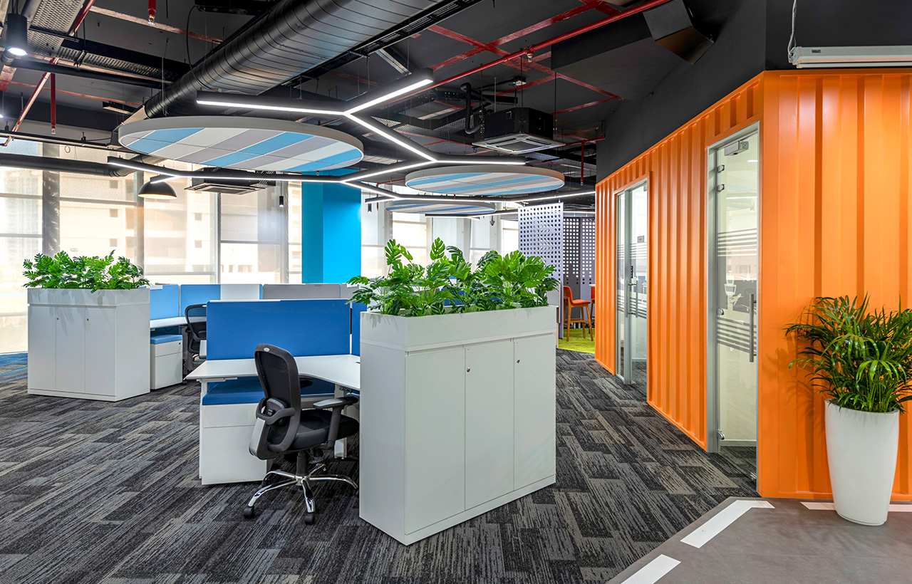
Although the workplace aligns with the brand's design guidelines, it stands apart with multiple innovative elements that connect the design theme to the brand story. For instance, the workplace has cabins that are walled with container like corrugated sheets, mimicking the container surfaces associated with Vanderlande's logistics business. Or the glass frosting and graphics across the workspace depicts Vanderlande's work processes as a story.
The workplace uplifts employee wellness both in terms of spatial planning and design. There are guided accesses to different work zones to avoid employee gathering, a prerequisite element for the post-pandemic life. It is further accentuated by the provision of two separate Town Hall areas in the workspace to avoid cramming during office events.
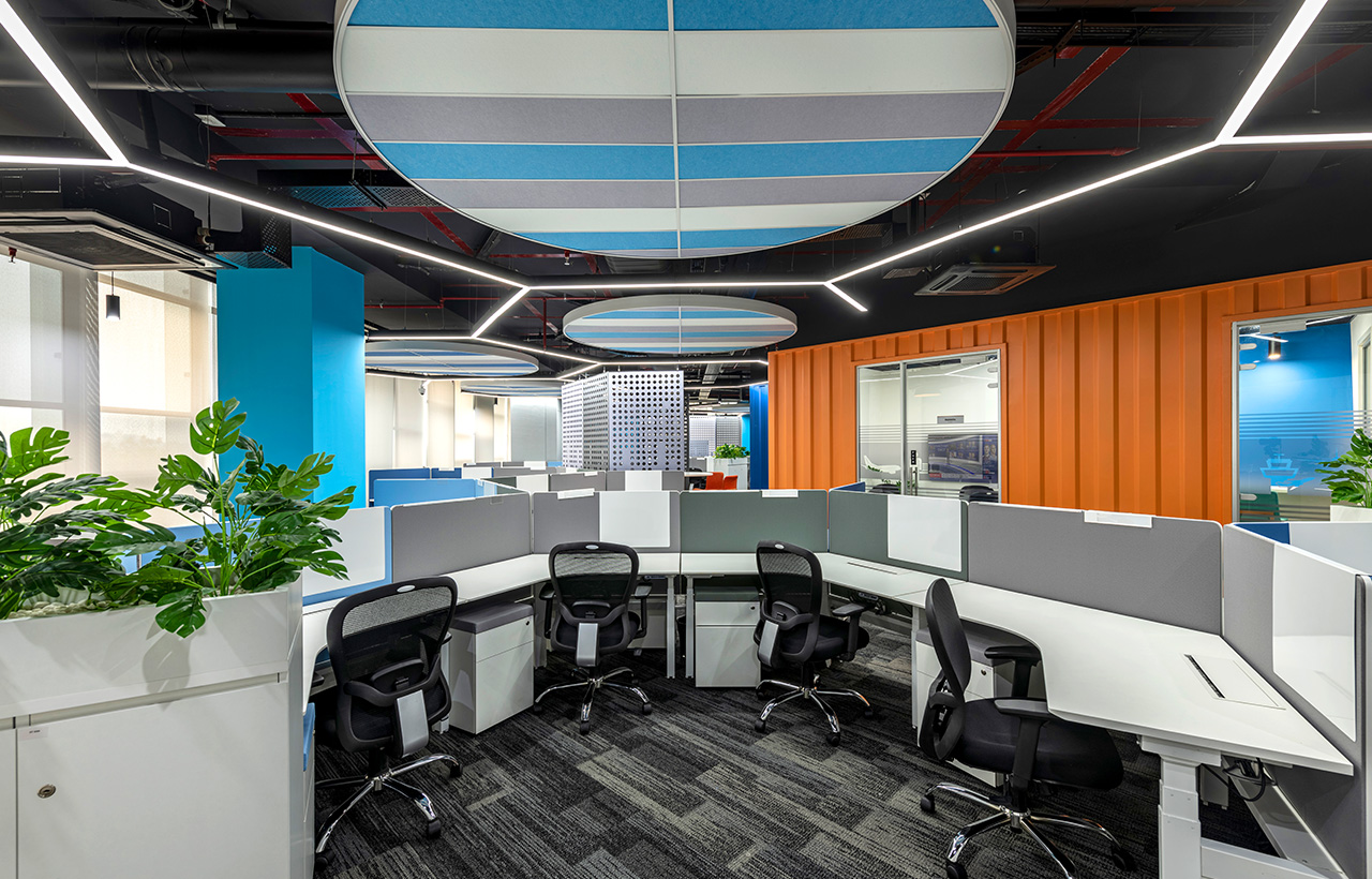
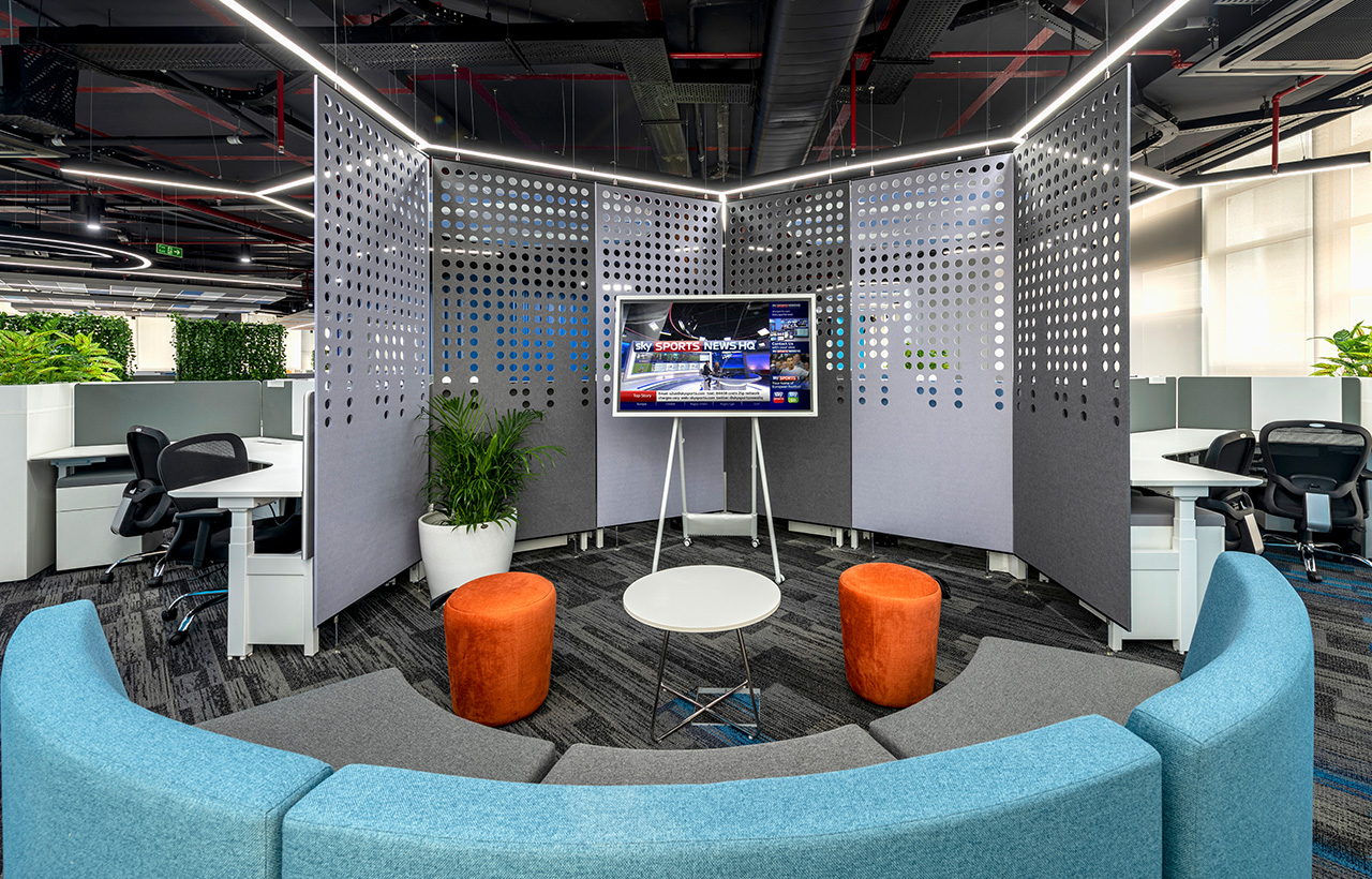
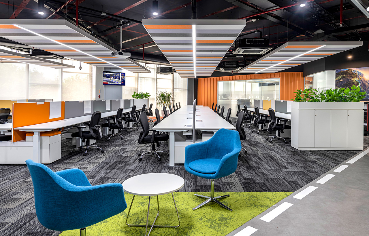
Employee wellness is also promoted by the use of ergonomically inclined work settings. The design includes new age furniture like height-adjustable desks, comfortable lounges, and individual seating arrangements; maintained uniformly across the office floor. Although the layout includes clear demarcations that separate one area from another, there is ample room for safe collaboration in the tech-based scrum and huddle spaces with interactive displays and activity seats for easy access.
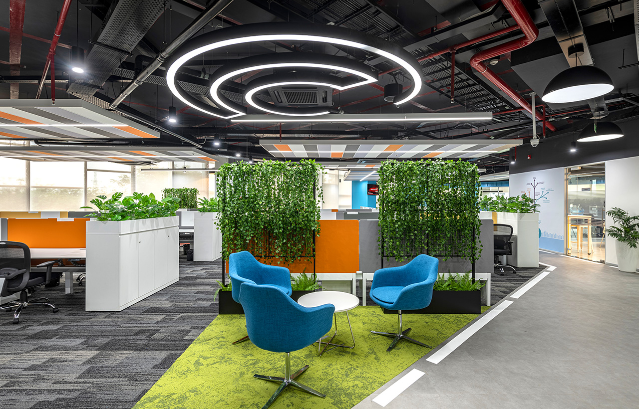
The entire place is also supplemented with biophilic design elements that act as visual barriers among different segments in the office. There are live planters spread uniformly across different zones to separate one area from the other. The office interiors also include well-thought acoustics with design elements like floating ceiling, wall panels, jaali partitions, and carpet floors.
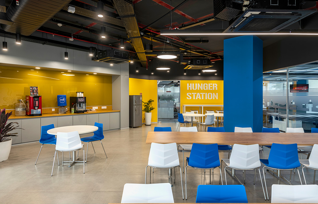
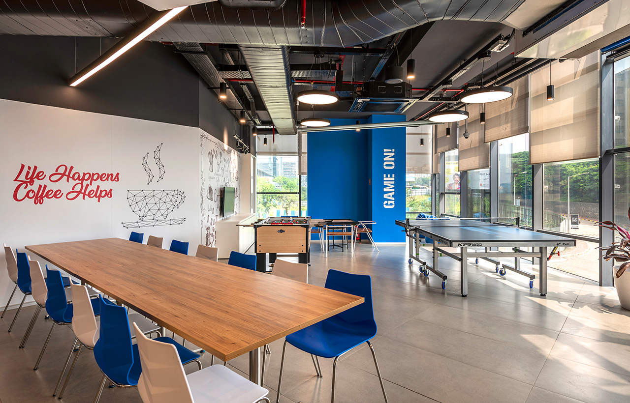
In terms of color palette, ascent colors dominate the floors, walls, and other design areas to create a visual rhythm that adds harmony to the entire space. There is also a wellness room for the employees that serve as the 'relaxing zone' in the office. For the employees who want to take a break from the screens and engage with their colleagues, there are fun corners aka recreation zones with Foosball, Carom tables etc. The location of the workplace also plays a great role in facilitating the wellbeing factor through design. The work desks are positioned by the glazing-exterior-view to let every employee enjoy their inch of office view and relax now and then.
Overall, Vanderlande's office interiors deliver a wellness centric work environment that motivates employees to come to work and give their best every day.
DESIGN INSPIRATION
Vanderlande is a global market leader for value added logistic process automation, especially in the airports and the parcel industry. The company specifically deals in the manufacturing of baggage handling systems for airports. The design was overall inspired by their base the factory based industrial themed office space with different types of work settings based on need.
SITE TOPOGRAPHY AND MATERIAL SELECTION
- Centrally placed lab
- Corrugated Sheets- to replicate the container surfaces cladded on solid masses.
- Concrete finish floors and the white lines on floor to replicate the rugged look factory floors with markings on top of it.
- Open ceiling - To retain the honesty of the space.
- Ecopanels - to achieve the necessary acoustic level with the touch of aesthetics.
- Industrial finished lights - to lit up the space with appropriate illuminance level with trace of rugged feel.
- The motivational core values of Vanderlande have been presented all around the office in a bare industrial format.
- The ideally situated Biophilic partitions create privacy between work area and collaborative zones.
- Colors represented from branding pallet place a major role in symbolizing key assets of Vandelande's personality.
CHALLENGES: Since there were restrictions regarding the weight limits that are allowed per square meter in the premises floor, we faced issues in corrugated container sheet cladding. To resolve this, a lot of research was taken on the detailing especially in terms of the weight per unit area in limit.
SPECIFICATIONS
Clients: Vanderlande
Architects/Designers: Kishore Manohara, Janani Chitra Kulothangan, Sangeetha P Haresh, Kritika Naidu, Smitha Naik Desphande, Vasanti Bahadarpurkar
Photographer/Photographs courtesy: Prashant Bhat
Area: 22,000 sft (approx)
Year: 2020 (completed)
Tech used (VR/AR/BIM/3d Printing, others): BIM - Revit software
Manufacturers: Not up for disclosure
Landscape consultants: Krishnendra Nursery
MEP Consultants: Chethan, Jagdeesh, Naveen
Location: Pune
