Vivacious Healthcare – Surpassing the Conventional Healthcare Spaces
- August 5, 2022
- By: Editorial Team
- INFLUENCERS
Astute Utilization of Abandoned Space
Modish and lively healthcare Project designed by Ojas Trivedi Design Studio is purely a magnum opus transitional and interior design work. Abandoned car showroom cum garage is transformed into Preventive Healthcare setup which was located in a 4-storey commercial building. The Healthcare centre is located at a prime location amid Ahmedabad city, the space required additions of some eye-catching interior elements which could create a sense of curiosity amongst the adjoining road vehicles, visitors, or passers-by.
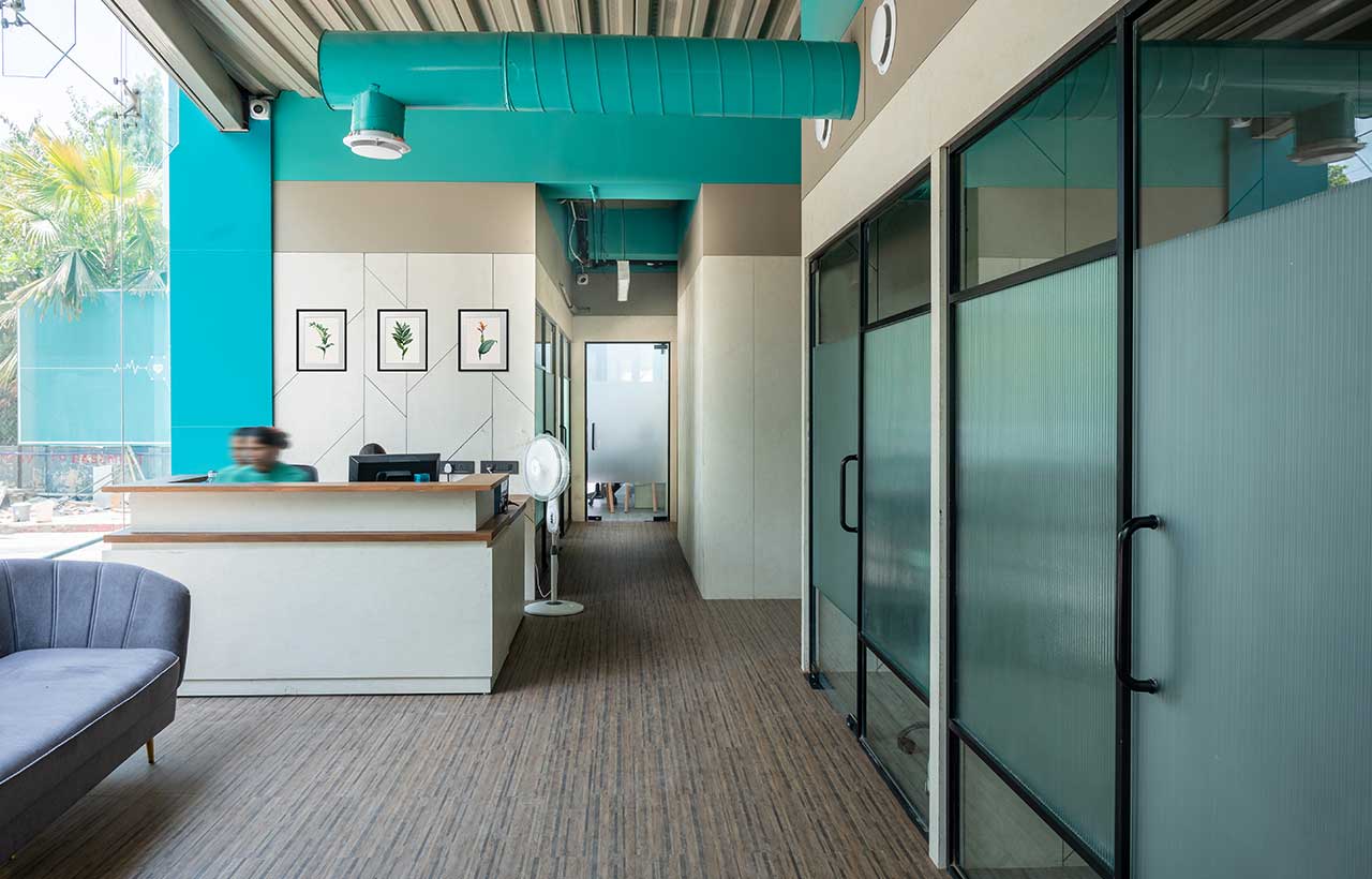
The healthcare structure is a 3-floor structure with a massive double height space in the center of the floor print and a partial basement with a total area of 11000 sq. ft. The beautiful North Façade’s fully structured glazing offers an abundance of daylight to all the adjoining areas. The building requires a good amount of services management and some face-lifting of the front façade in addition to a fresh approach given to the design and interiors.
Foyer, Focal Point of Design
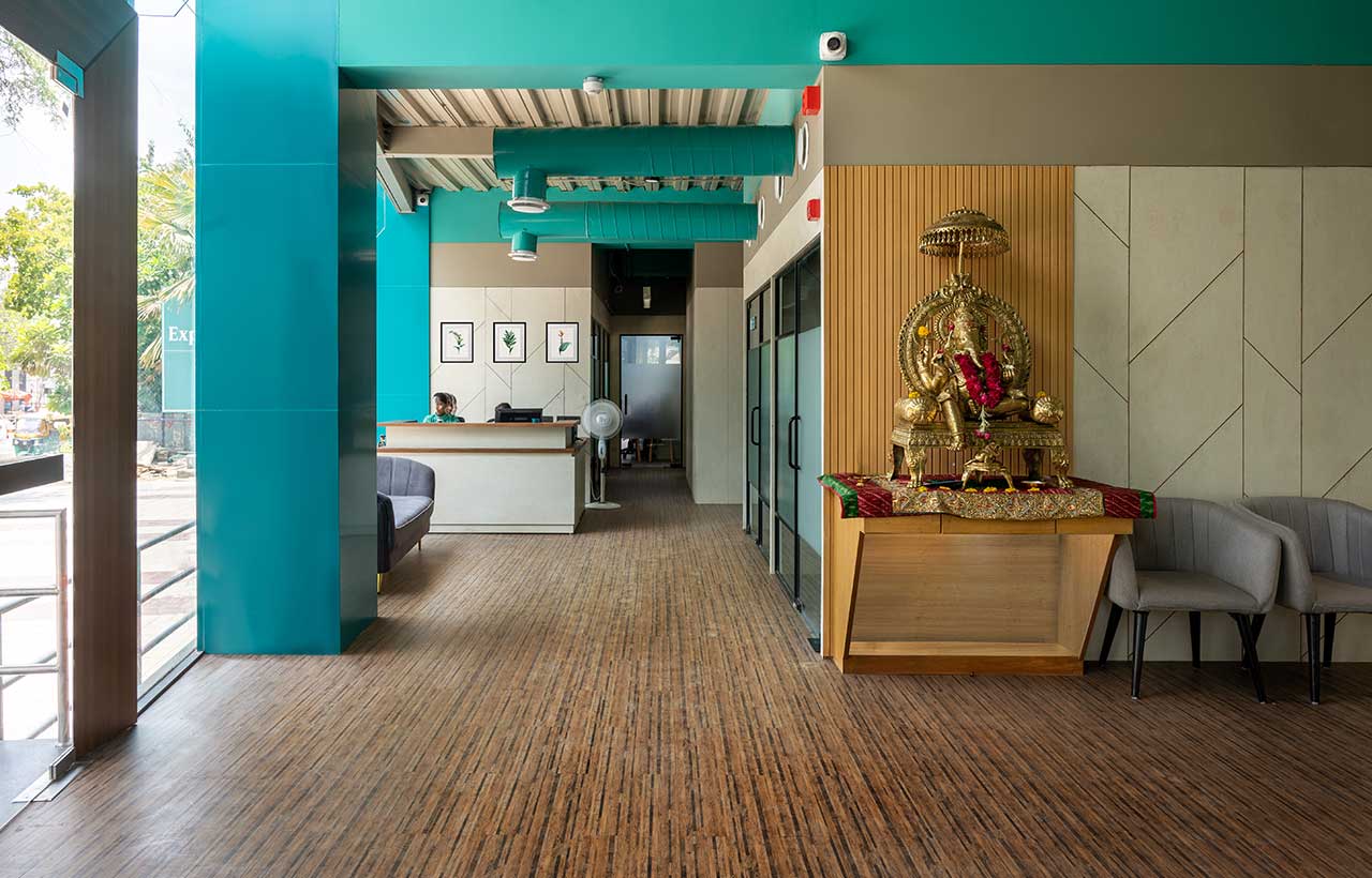
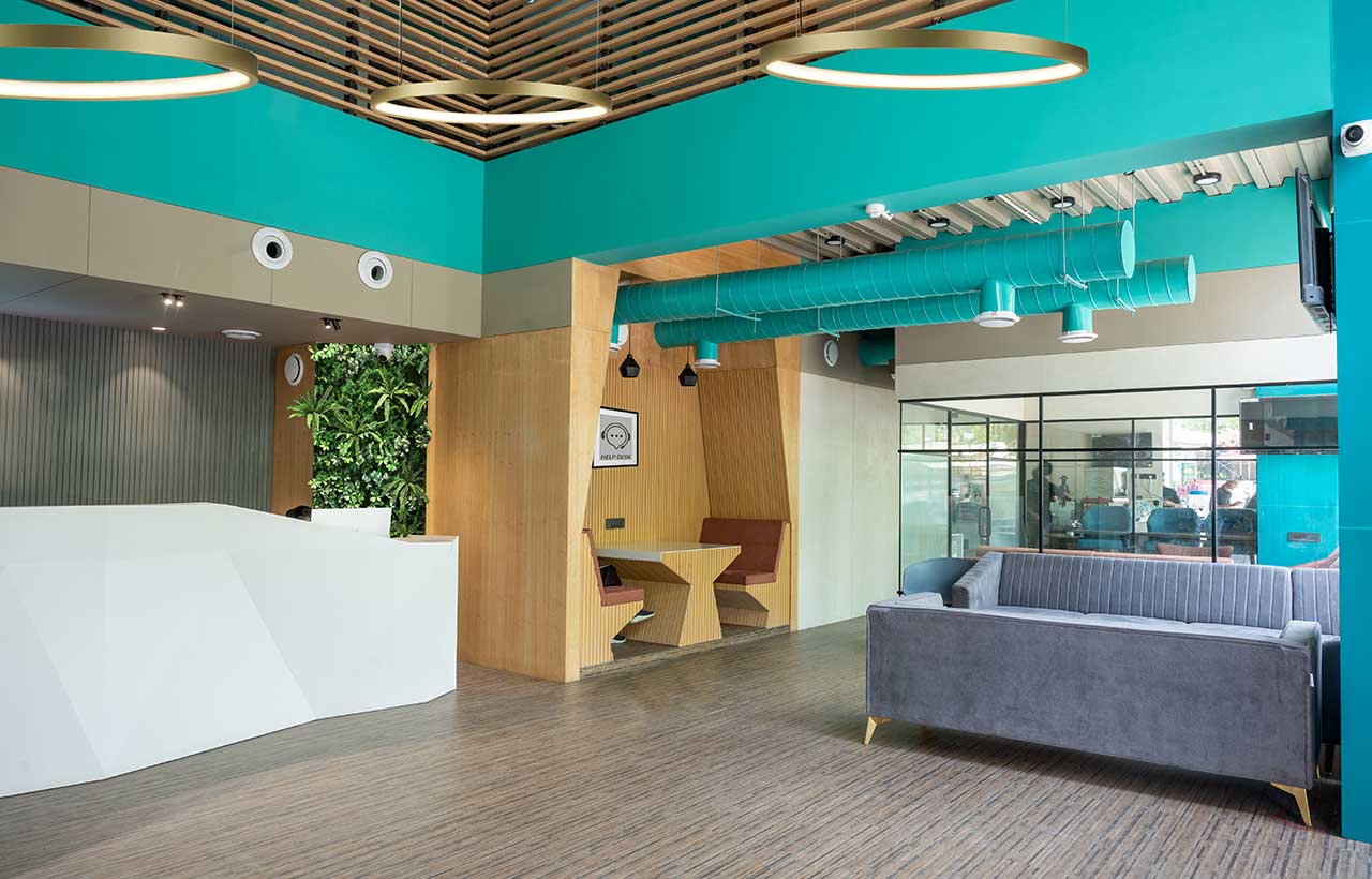
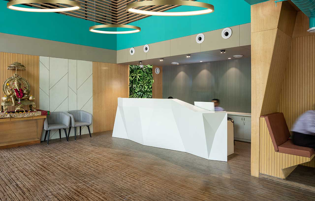
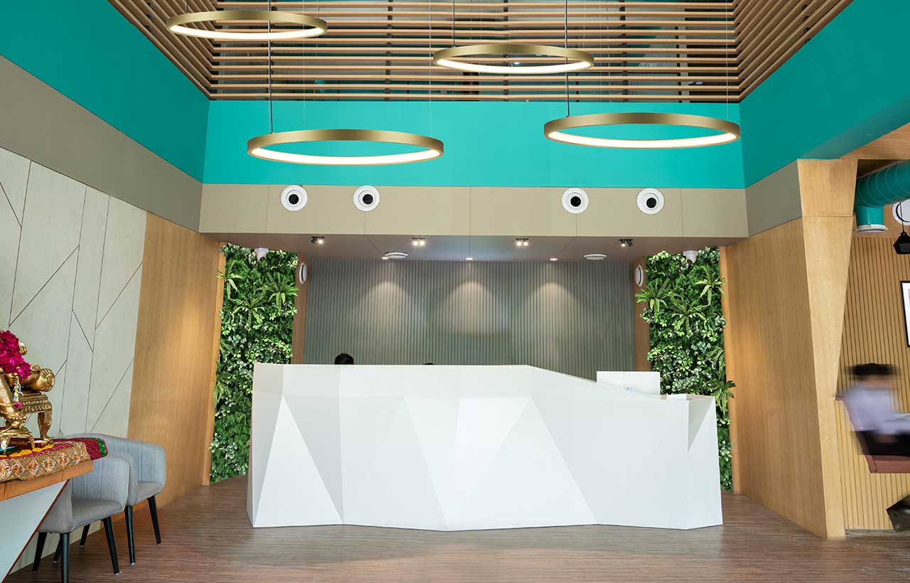
From various proposed layout options, the layout that had a central void as a focal point and functional requirements were shortlisted. The requirements from the client’s side kept on coming in such as to reduce the size of this central void by creating additional floor space on the first floor which accommodated more functions. Whilst preparing the layouts, execution plans for the interiors were prepared. This particular space offers a “pause point” before the Diagnostics and preventive health services. The unconventional design and stunning interiors make it an unusual healthcare centre where you get a positive and calming ambiance.
The idea was to break the old notion of building a typical Healthcare centre with tedious aesthetics and proposing a flamboyant and vibrant approach to design that evokes vibrancy, freshness, hospitable, and looks classy.

Sustainable Adaptive Re-Utilization of Materials by Recycling Most of the Materials
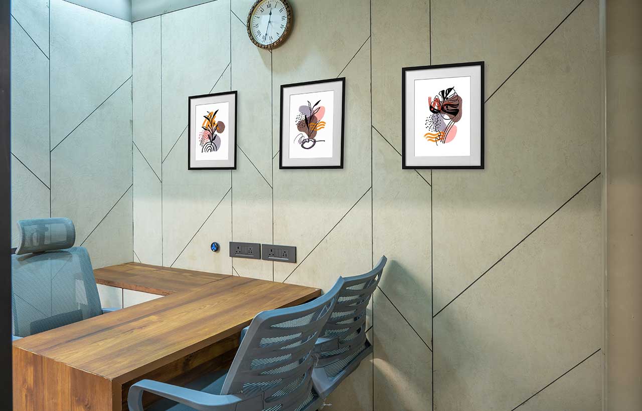
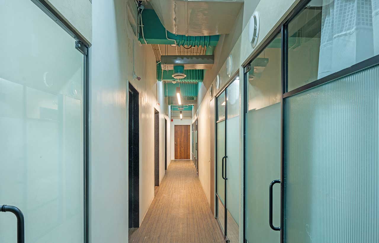
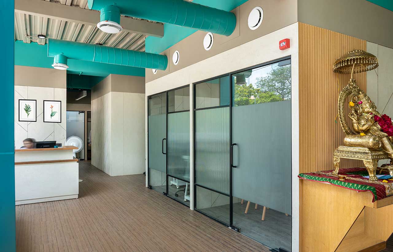
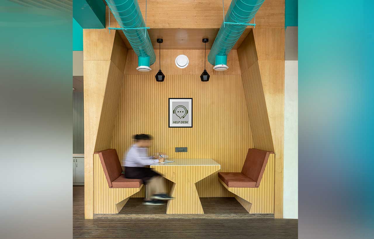
A sustainable approach is a key feature as the re-utilization of the existing services and fit-out furniture was the idea. The transformation of the existing interior elements into a new avatar gave goosebumps to the client and everyone working on the project. For example, Air conditioning ducts were highlighted and kept exposed as the main design element by extending branches as per the new layout. Some of the tables were also transformed to modify the look and give a new form. Many existing plies were reused and refurbished with the use of lime-plastered texture laminates and grooves by using MDF ply with groove thickness. Double height void also was covered on the first floor with wooden members preserved from the car showroom’s original double height space.
Materials used for Interiors
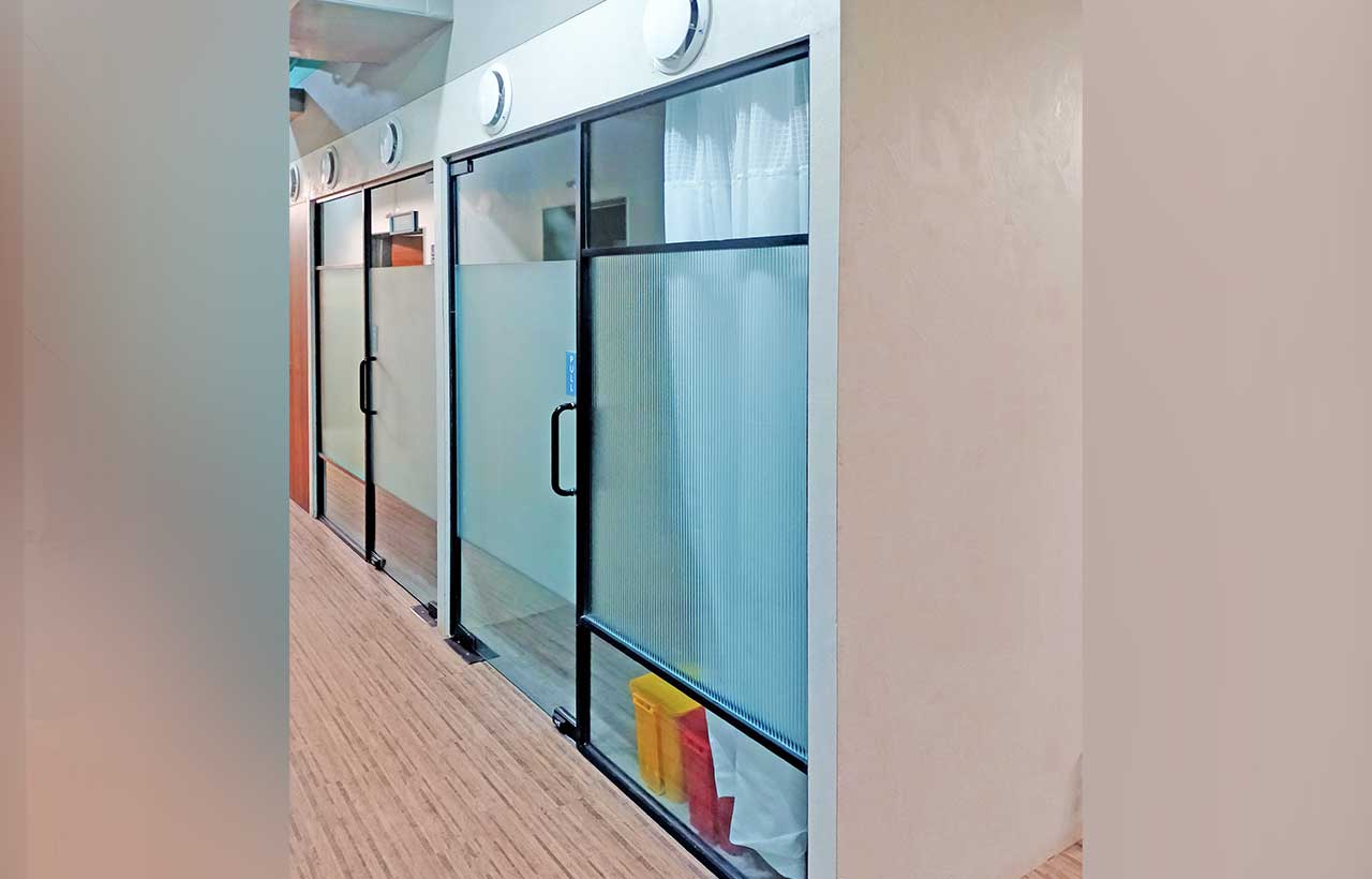
Oak veneers, Solid acrylic material commonly known as Corian, Metal Ducting and deck sheets exposed, Wooden Louver Panels, Textured laminates, Vinyl flooring, Flute Glass, and black anodized brush finish hardware were the highlights of this project. Other materials like Granite, Nano white stone, GVT Tiles with spacers, and toughened glass were also used generously. All materials were cleverly amalgamated as per the material finish interior visualization.

Art Works
All artworks were sourced through an NGO supporting artist well-being and rural talents that required well-being and help. All artwork was originally painted in close coordination with the Interior designer and art curator running an NGO.
Lighting is the main Element of Design
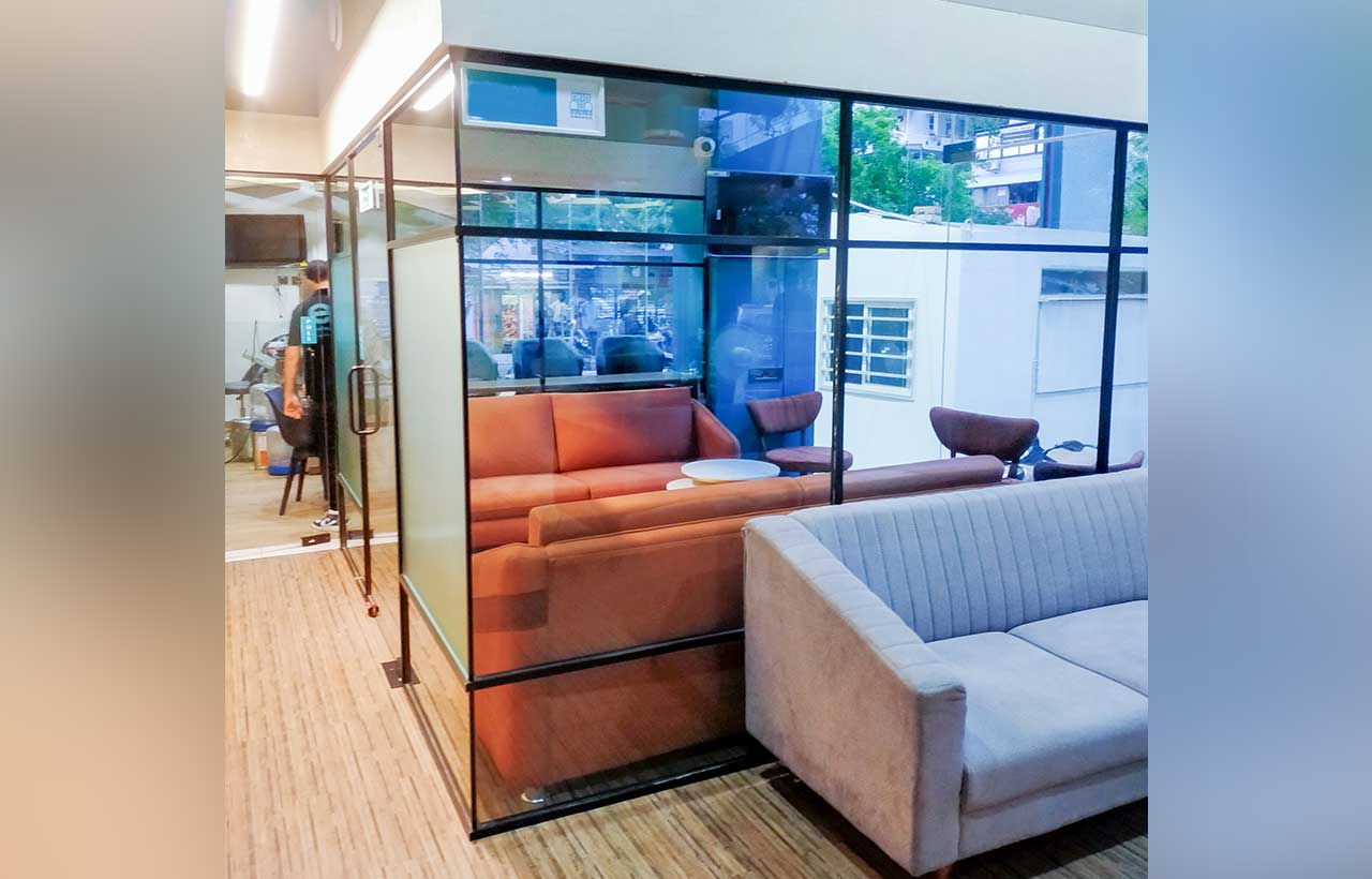
The interior design layout for all functional requirements was worked out, making the project energy efficient by giving them an option of natural light in the whole healthcare centre. The glass window panes and doors provide natural lighting into the premises cutting down the energy consumption cost. The double-height void provides a visual connection with the first floor as well as the natural light source at the first-floor spine corridor. The unusual exposed look of metal deck sheets and surface lighting as a design concept without any false ceiling was given to create the feeling of curiosity and wow factor amongst the people coming in. All the glazed partitions used borrow lights to the deep adjoining areas and kept as buffers with just flute glass textures enabling the privacy of the occupants. Ring LED lights were used to break the volume of double height and to provide some aesthetic value with different mounting heights and radii.
Turning the Healthcare Ambiance from a Gloomy to a Vogueish Style
The interior design of the healthcare centre was accomplished sustainably by working with the best fit layout for the re-utilization of the same space with a vibrant color palette offering stunning, and eye catchy modern interiors. The unusual healthcare centre is setting a style statement for being unique and breaking away from the typical tedious healthcare setup, and giving the flamboyant Healthcare Centre.
