Architect’s Home: Story Through Minimalistic Approach
- October 12, 2022
- By: Editorial Team
- INFLUENCERS
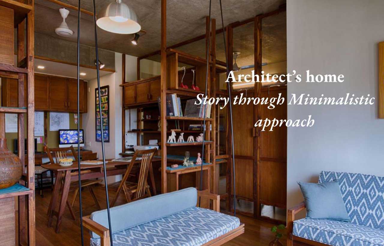 With a minimalist approach, Studio UA lab (Urban Architectural Collaborative) designed an apartment space with a sense of warmth and spaciousness created by playing with material and textures.
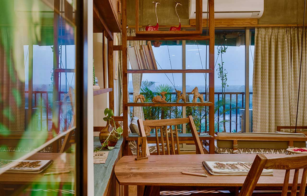
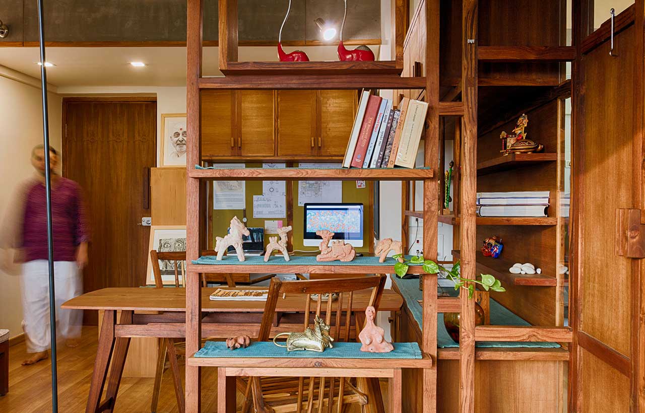
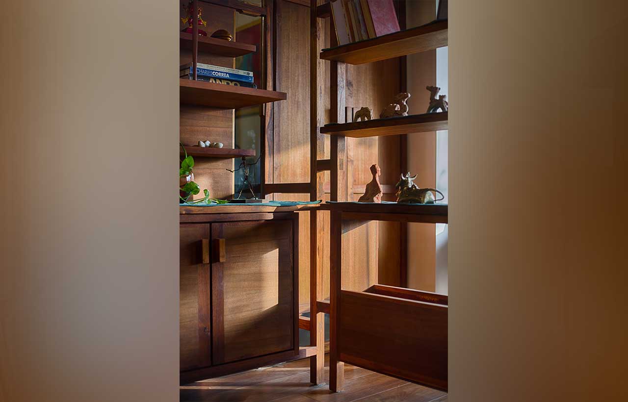
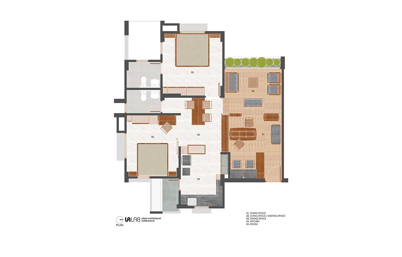
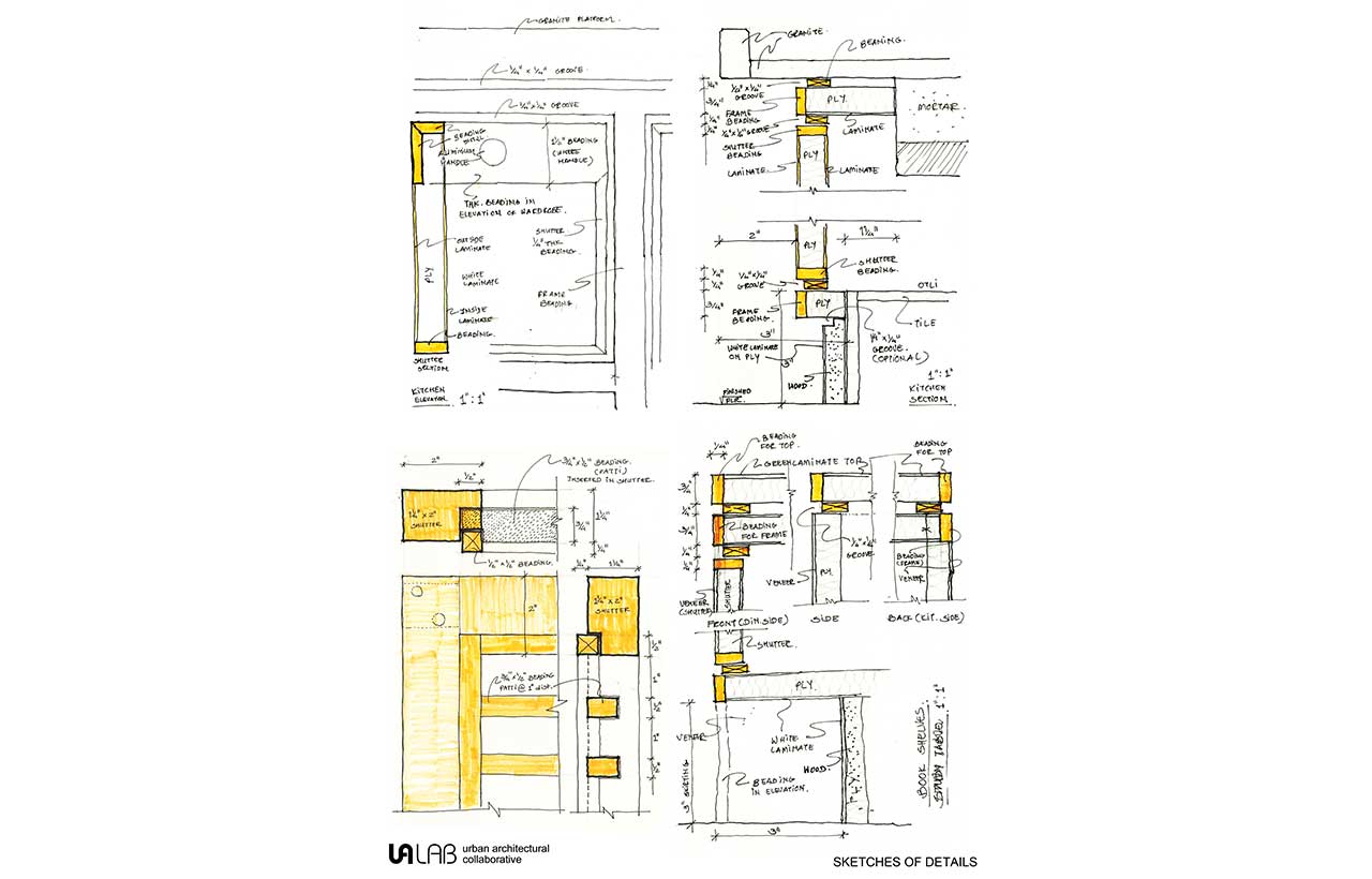
The Apartment of 62 sq mt space required a layout spacious enough to combine work and living together. Spaces are separated through vertical frames that could be combined when required according to the space function. The vertical frames are designed as a combination of transparent, porous, and solid planes. Transparent and porous planes allow for maximum light and air ventilation within internal spaces. While the solid planes within the vertical frames functionally take care of the storage units. The frames are kept open where it meets the ceiling and floor surface to maintain the continuity of space within the apartment. The vertical frames and the furniture are designed using reclaimed wood that is Valsadi sag. The size of the wooden member is kept the same for all the vertical frames as well as the furniture. The furniture is designed using the same concept of frames and planes.
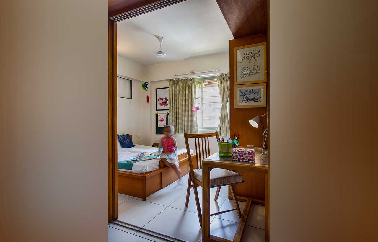
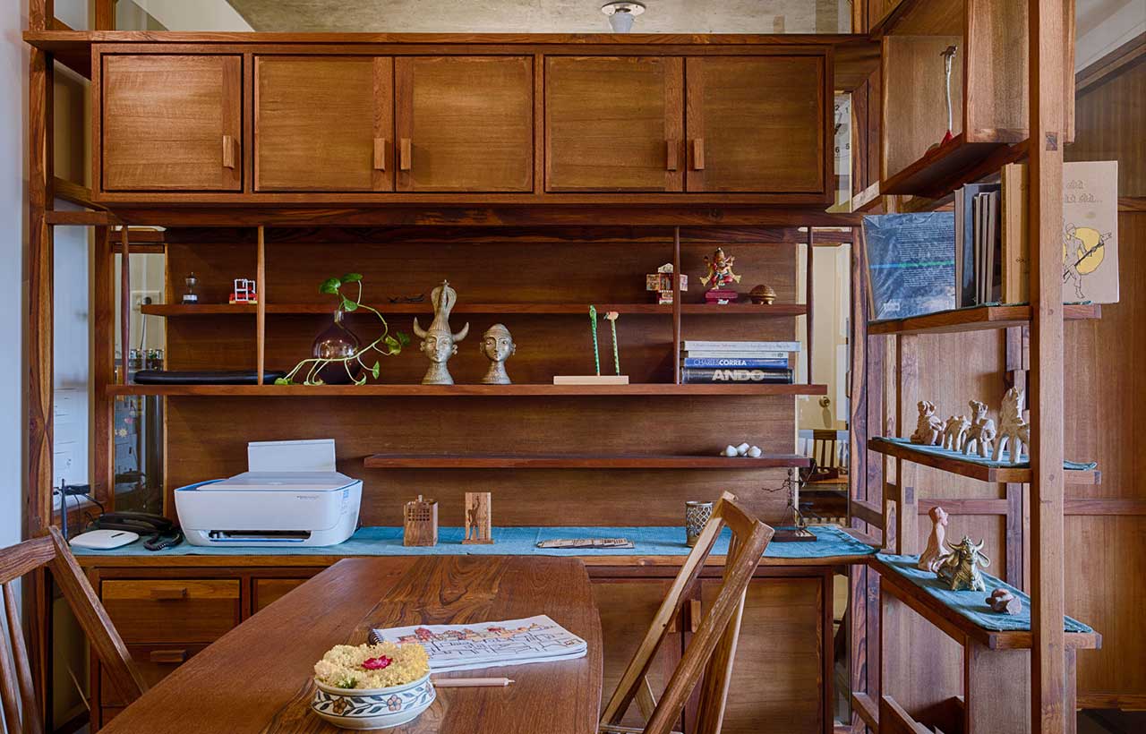 It is designed to create an open-plan interior by minimizing the number of brick walls. There are open frames on both sides of the studio, dividing it from the living area on one side and the dining area on the other. It opens into the living area, which can also be used for studio meetings. Through a slider door, the daughter's room opens into the family dining area. An apartment's layout, materials, and design details provide a sense of spaciousness and warmth that integrates work and living seamlessly.
 The Apartment is owned by the architects. An architect's studio space has been designed for the workspace. Thus work and Living happen together in the apartment space.
Journey Through the Play of Frames and Planes
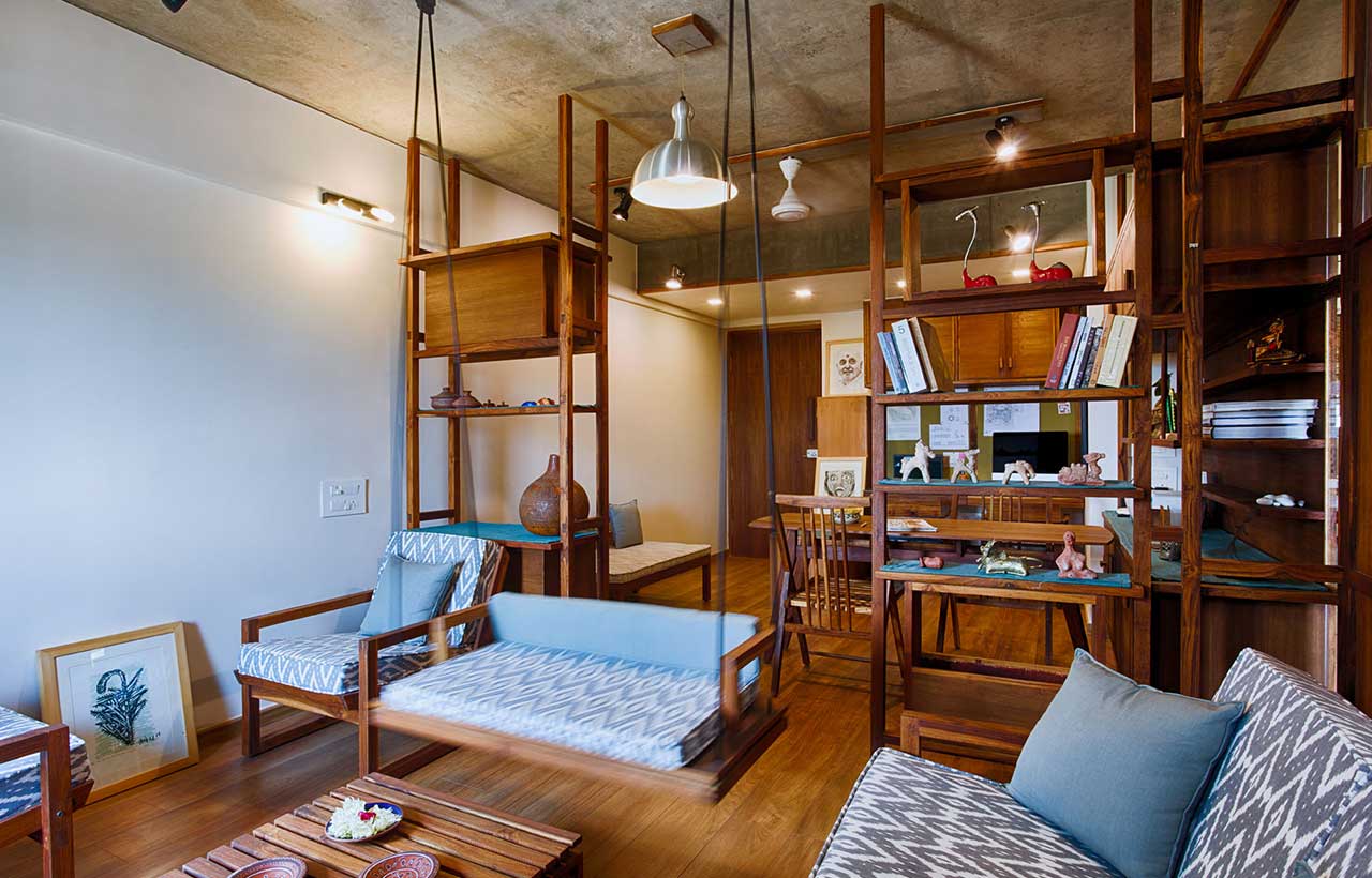 It was important to us to design a space where living and working could coexist. Both of us belong to the design field, so our work is not limited to working hours. The most comfortable way for us to set up our workspace was to combine our studio with our living space. Despite all the informality, we wanted our studio space to be flexible enough to separate our living activities from professional activities. The design intent was to create an open plan with minimum necessary brick walls. The internal layout is to be designed to create Transparent -Porous spaces which could be combined and separated when required. Transparent and porous spaces allow for maximum light and air ventilation within internal spaces. By choosing one material of the same size and having a similar design vocabulary, the space takes on a monolithic character. The reclaimed wood is polished with the Tel-paani technique (the Indian way to polish wood) to allow for an apparent finish. The clear finish allows the wooden joinery to be perceptible.
Performance of the Notion
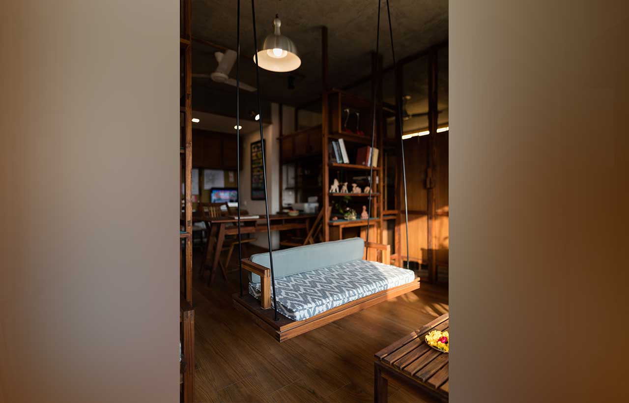 It was our intention to create an open plan without brick walls. All the internal brick walls have been removed except necessary. Envelopes of open frames are designed as a combination of transparent, porous, and solid planes to create separate spaces. Transparent and porous planes allow for maximum light and air ventilation within internal spaces. While the solid planes within the vertical frames functionally take care of the storage units. The frames are kept open where it meets the ceiling and floor surface to maintain the continuity of space within the apartment. The vertical frames and the furniture are designed using reclaimed wood that is Valsadi sag. The size of the wooden member is kept the same for all the vertical frames as well as in the furniture. The furniture is designed using the same concept of frames and planes.
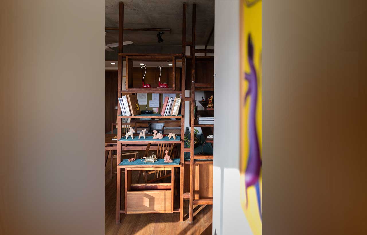
 The requirement to accommodate work and living together in an area of 670 sq ft apartment space was a challenge in itself. Secondly, the design intent to create an open plan which could take care of dualities of space called for a conscientious internal layout. A layout flexible enough to create separate functional spaces without compromising on light and ventilation within each of these spaces. The vocabulary of vertical frames with meticulous details is designed to complement the spacious internal layout.
Material: Details and Textures
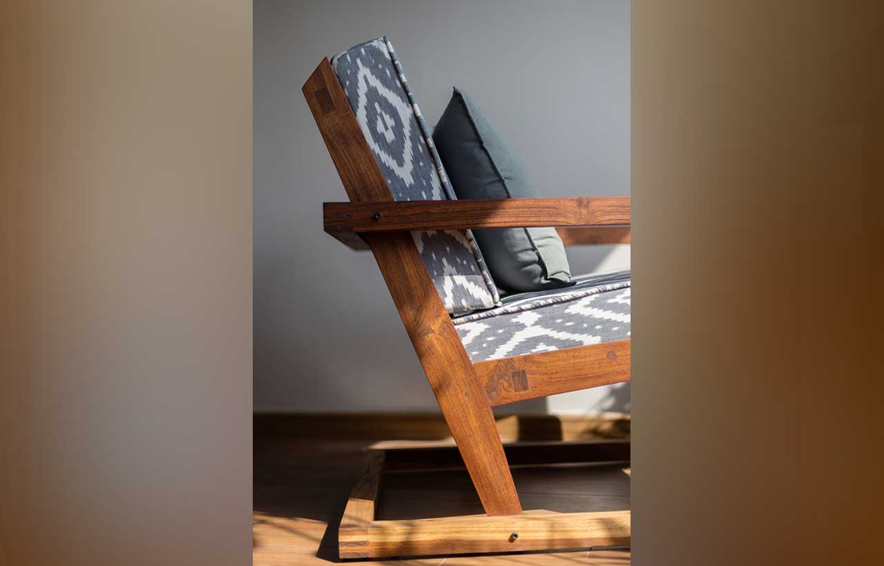
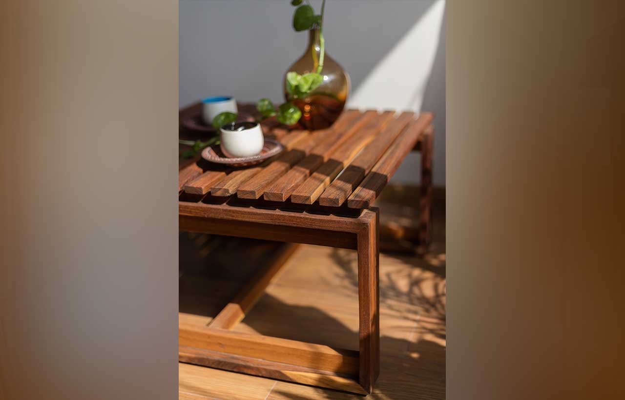
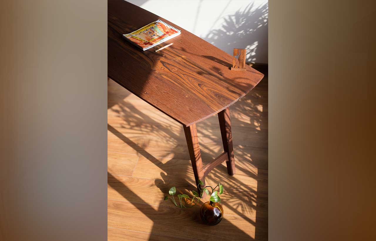
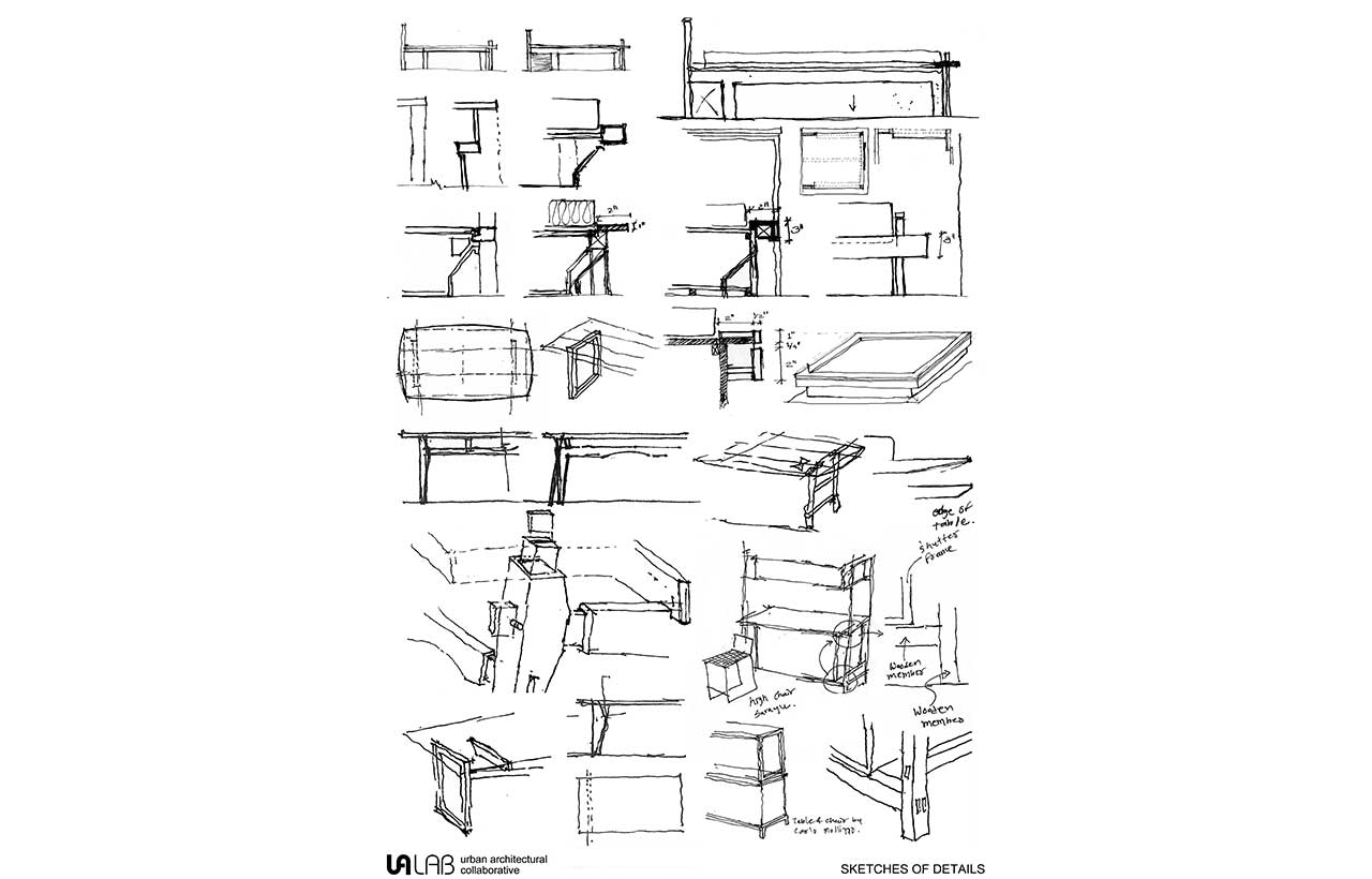
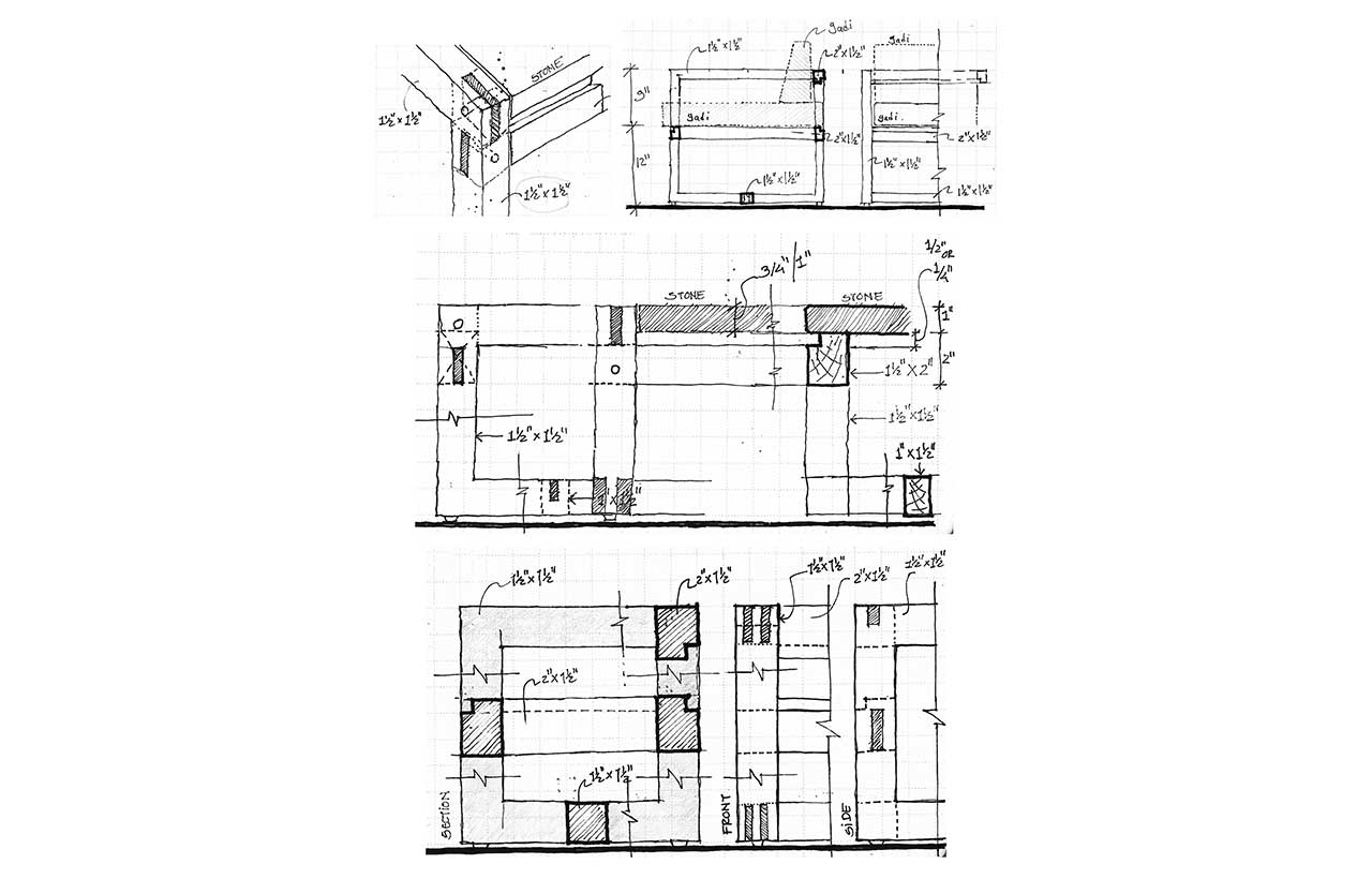
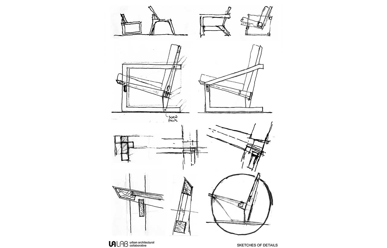
 We have designed all of the furniture. The furniture designed using reclaimed wood that is Valsadi sag. The size of the wooden member is kept the same for all the vertical frames as well as the furniture. The furniture is designed using the same concept of frames and planes. Wood with a combination of glass, stone, and metal is used for vertical frames and furniture. The size of the wooden member is kept the same for all the vertical frames as well as the furniture. The furniture is designed using the same concept of frames and planes. Bison panels which are generally used for exteriors, we have used in interior works to give a rustic effect. The finish of the Bison panel works well with the exposed RCC ceiling finish. All the Wooden Partition and Wooden Furniture are designed with intricate wooden joinery details. No nails have been used in any of the wooden joineries. The wood used in the design is reclaimed. The reclaimed wood is polished with Tel-paani technique (Indian way to polish wood) to allow for a clear finish and to breathe the wood.
 Stay updated on the latest news and insights in home decor, design, architecture, and construction materials with Building Material Reporter.
Specifications
Project Name: Studio UA Lab
Architecture Firm: UA Lab (Urban Architectural Collaborative)
Completion Year: 2017
Gross Built Area: 62 sq mt
Project Location: Ahmedabad, India
Lead Architects: Vipuja, Krushnakant
Photo credits: Dhrupad Shukla
Design Team: Vipuja, Krushnakant
Consultants: Kantilal Mistry
