Cube House: Composition of Playful Spaces
- December 27, 2022
- By: Editorial Team
- INFLUENCERS
 A comparison when drawn along the plot size and the requirements which housed a formal living area, kitchen, dining, store, and utility along with four separate bedrooms; proved to be our own design challenge. Designing a contemporary home of an appropriate size and accommodating all the requirements within the parameters of the government by-laws was the guideline.
Client's Brief
The clients were a mid-age gynecologist couple who had been very adamantly clear about the location of their house. They wanted a home that was near the vicinity of their hospital and their parent’s home. They had always been confined to small spaces and the main focus of the project from the beginning was to design spaces that gave the feel of open spaces, but also connected them with nature.
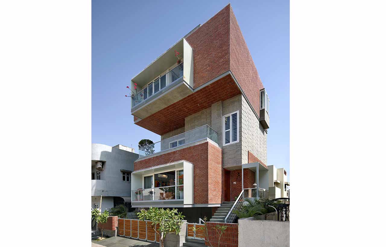
 The plot size was a mere 1600 SQ.FT. of the area and the foremost apprehension was to design a beautiful home for the family in such a compact plot size. Their set of requirements had been firm; to design for a family of four with parents who would occasionally live at their home. The daughter was 14 years of age, and the son was 16 hence they needed their own separate expanse of rooms. Though contextually the site overlooked the luscious common plot of the society and overlooked a striking open view from the roadside; it fell in the airport zone of the city and hence we faced limitations regarding the height of the building. Hence the overall concept derived for the project was that of vertical development.
Spatial Planning
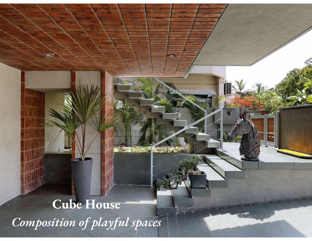
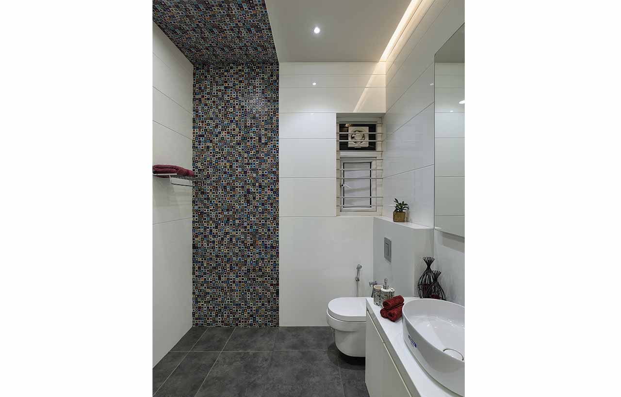
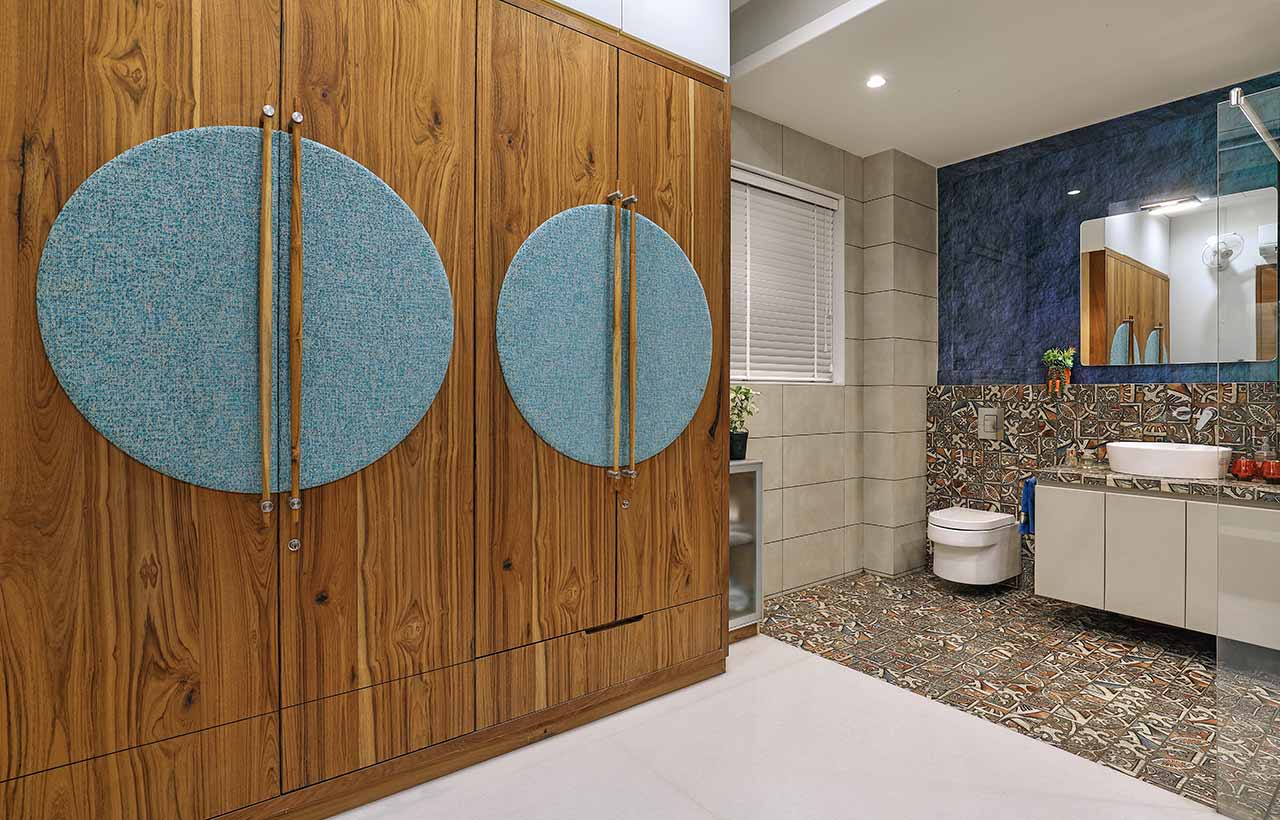
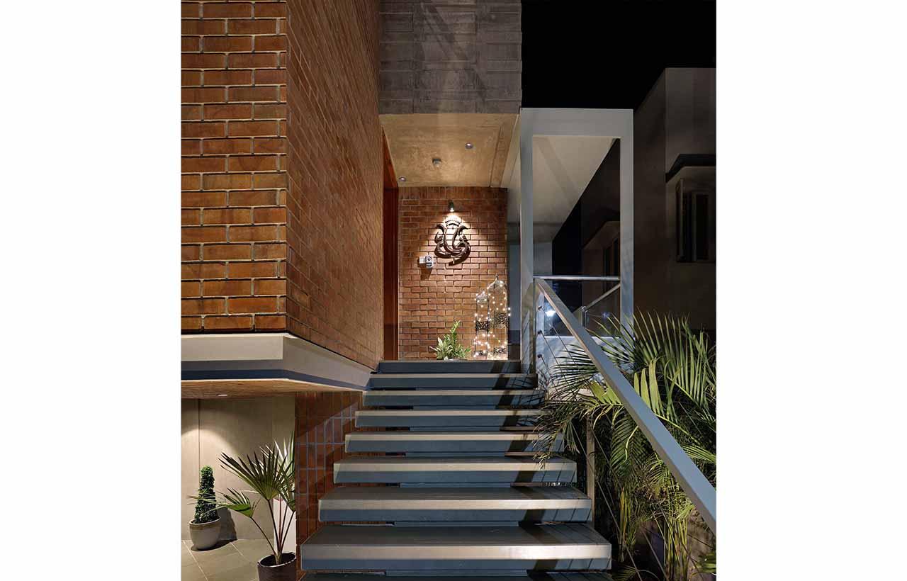
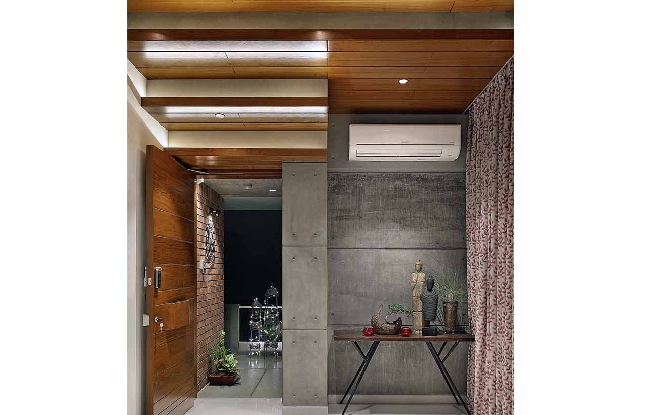
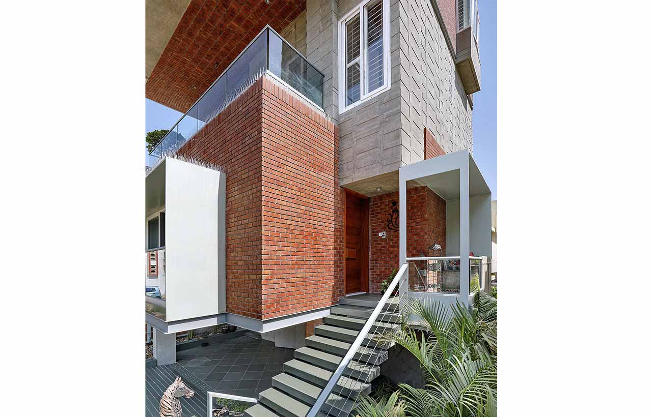
 The semi-basement floor was developed as a car parking garage along with a small utility hall, a servant’s toilet, and an elevator from the parking that lead to all the floors making easy accessibility for users. The upper ground floor faces the main road with the common plot across it and is designed as an open floor plan with no partition walls, due to which the whole space feels like one. The main approach of the house is from the main road which is a series of staircases leading up to the porch which is at a height of 8 feet. This accounts for a wholesome experiential journey from the road up to the porch with bamboo planters and flora guiding one all the way. This floor is designed as a living area, dining, and kitchen with a small floating utility, and a guest bedroom/parents’ bedroom. The kitchen backyard was designed as a floating utility. The parents’ washroom being a confined space was entirely cladded in glass, having a white slab complimented by aqua-blue tiles. The balcony attached to the bedroom on the rear side brings out the same language of connectivity with nature.
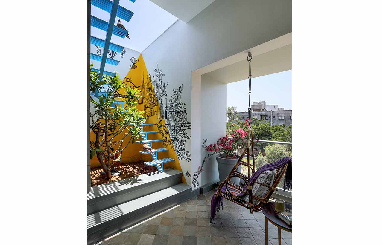
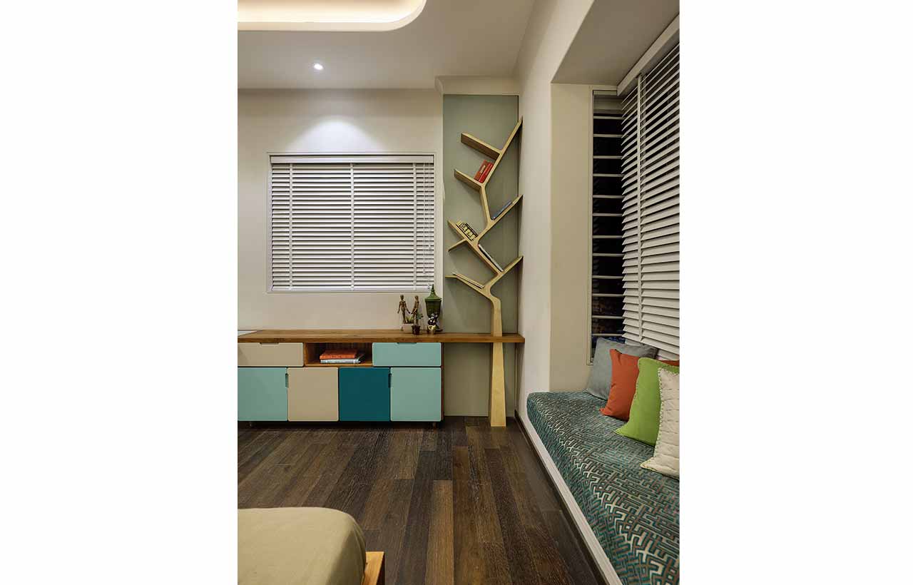
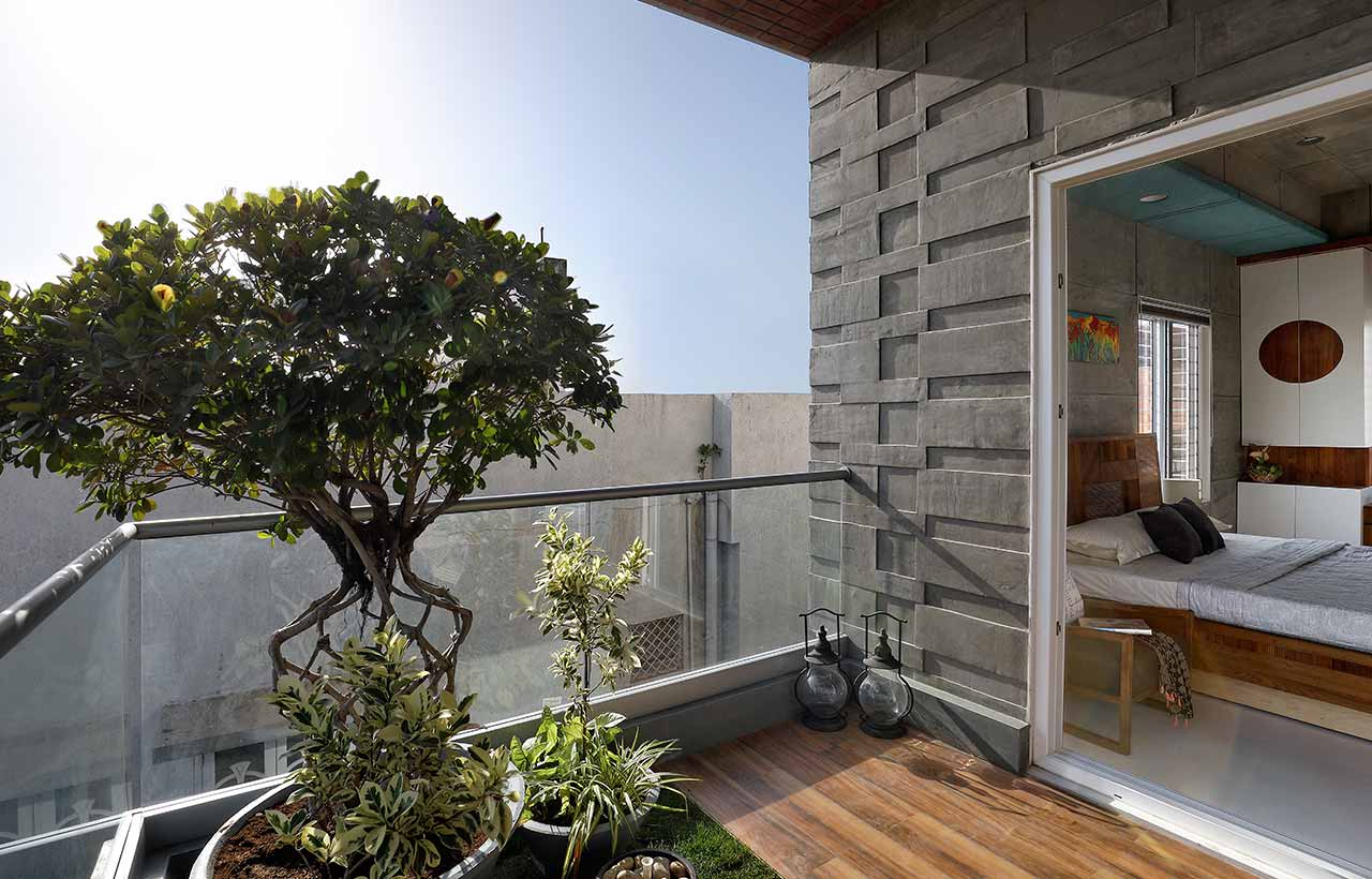
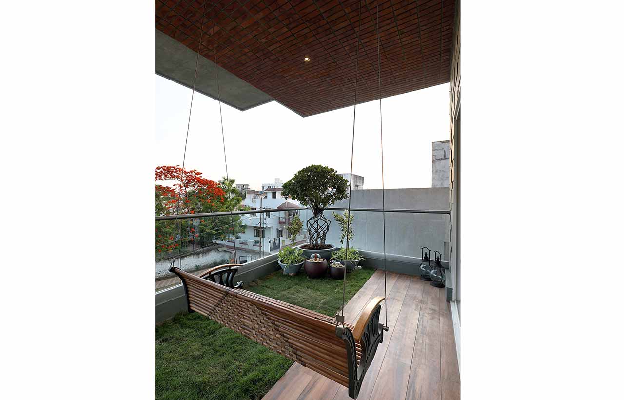
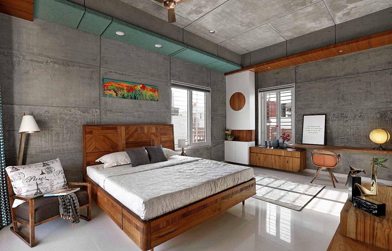
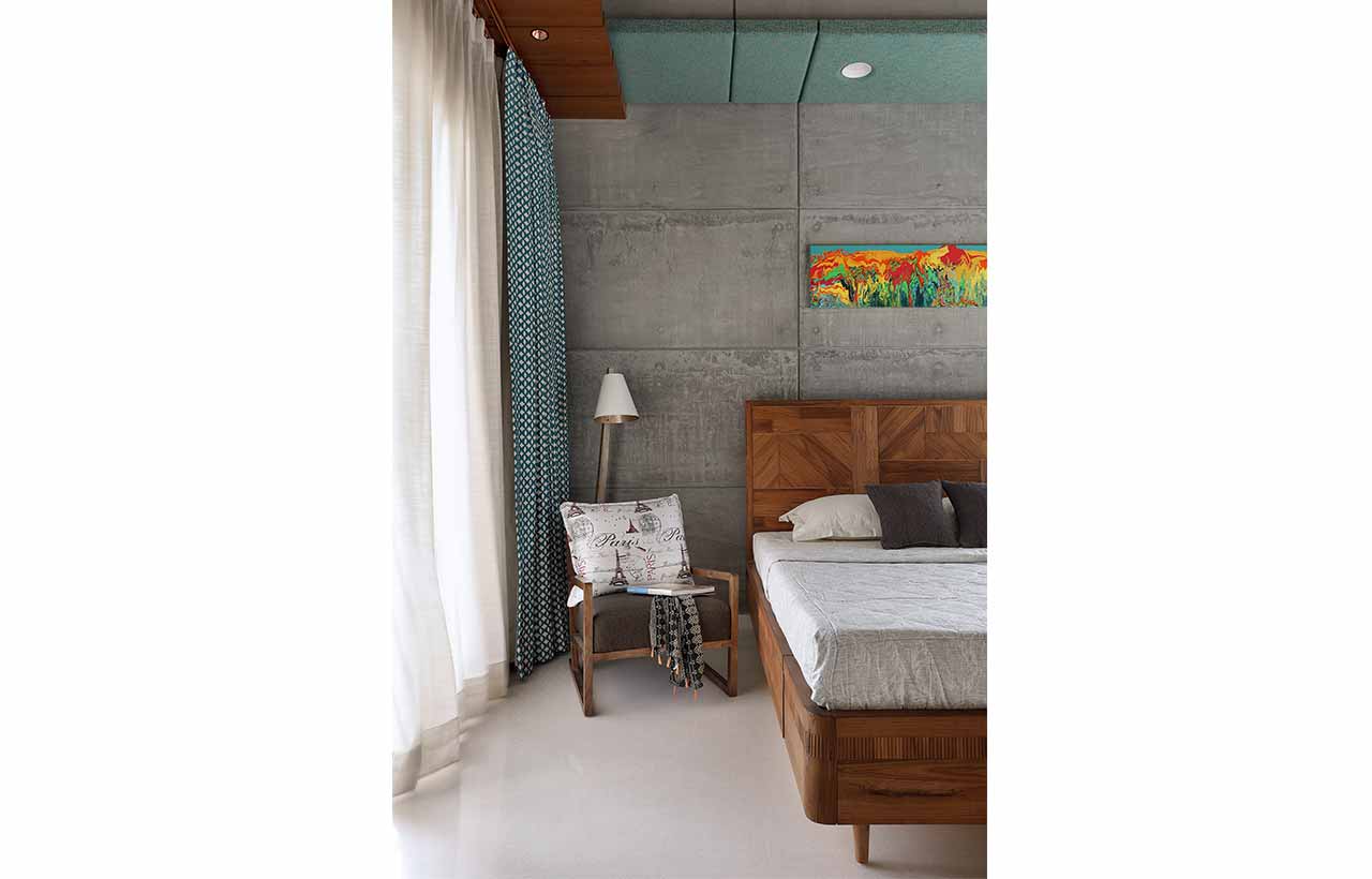
The second floor was allocated entirely as the master bedroom for the doctor couple. The space was meant to evoke a feeling of openness and was to be curated in such a manner that it would allow maximum natural light and ventilation. The client's fondness of having their morning tea sitting on balconies and gazing at the life outside gave us an inclination of making a space that connects the outside environment with the indoors. The master bedroom is spread across the entire floor with a mid-level terrace and is more than 100 sq. ft. The common plot was a main driving character of the locality which gave the impression of a farmhouse; almost a treat to someone who loved even the smallest balconies of their previous home. The master bedroom was designed with materials that made the space feel more raw and rustic. A jhula as a supplementary element was hung in the terrace area which provided a serene view of the outside and would make one feel relaxed after a hectic day. The third floor was delineated as two separate bedrooms, one for the son, and the other for their daughter; each revitalizing the same concept of overlooking the common plot and connecting with nature. The son’s bedroom was visually directly connected to the plot whereas a small terrace area was built for the daughter’s bedroom.
Material Exploration
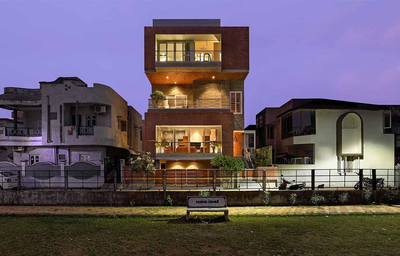
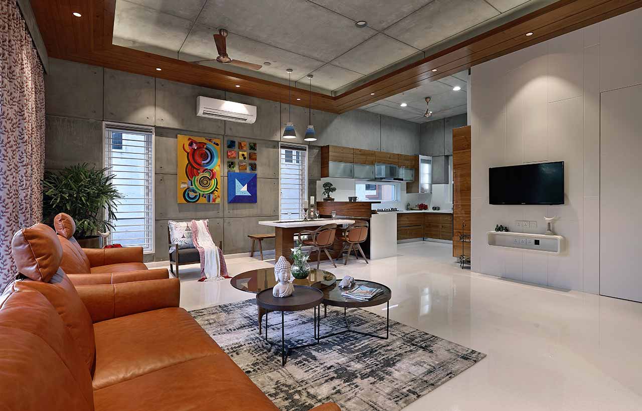
 Different floor cubes were composed of different materials. The upper ground floor was fabricated as a brick cube; the first floor was fabricated as a concrete cube and the floor above it again a brick cube. This led to a well-composed and completely resolved architectural mass deriving the overall residence of the family. The balconies have been framed with metal sheets appealing to the solemn part of the cube stack overlooking the common plot. The material palette comprises white marble for flooring in the interior spaces and natural Kota stone in the parking, utility, and staircase areas. Wooden flooring was chosen for the bedrooms. The exterior is composed of a selection of natural materials such as exposed bricks and exposed concrete.
Furnishings Furniture Art
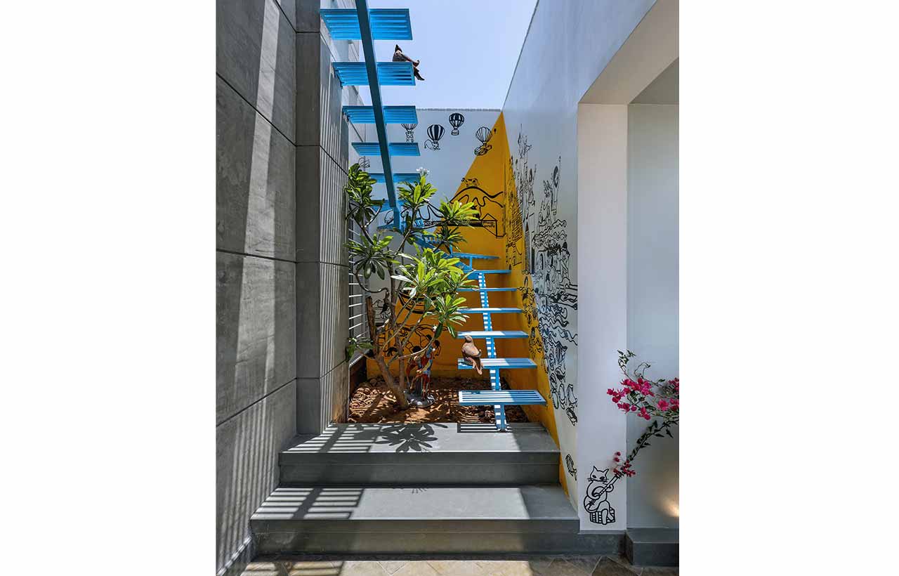
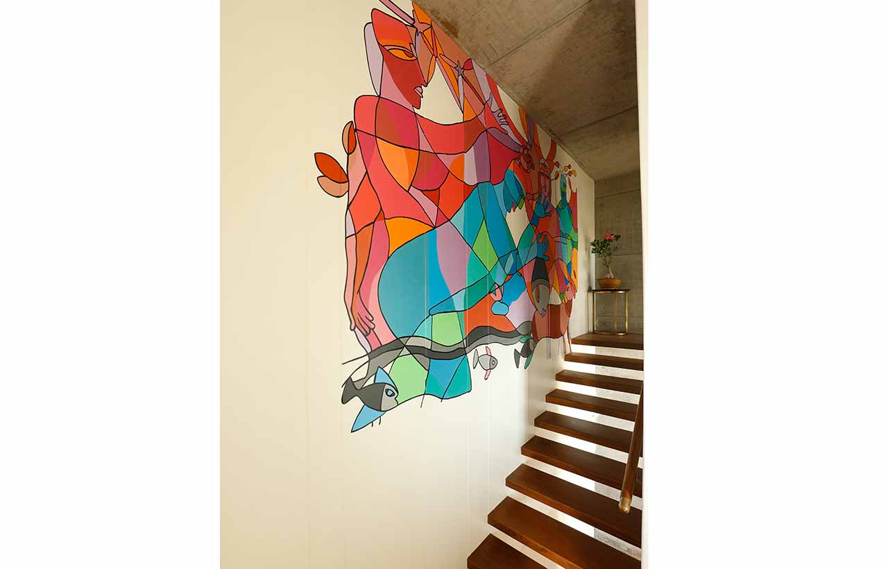
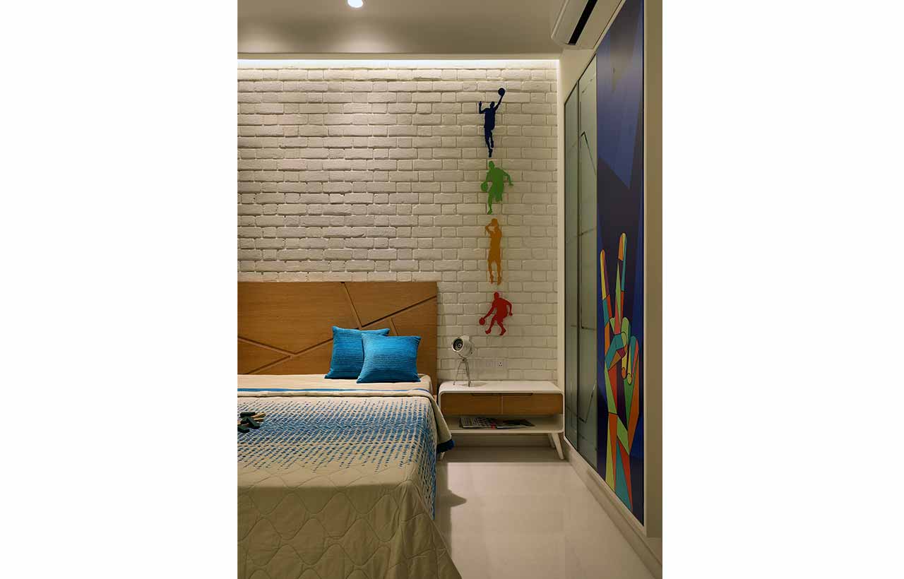
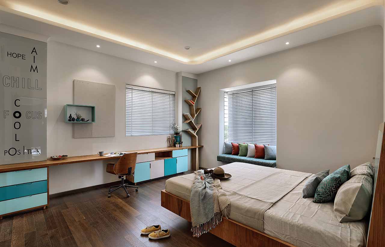
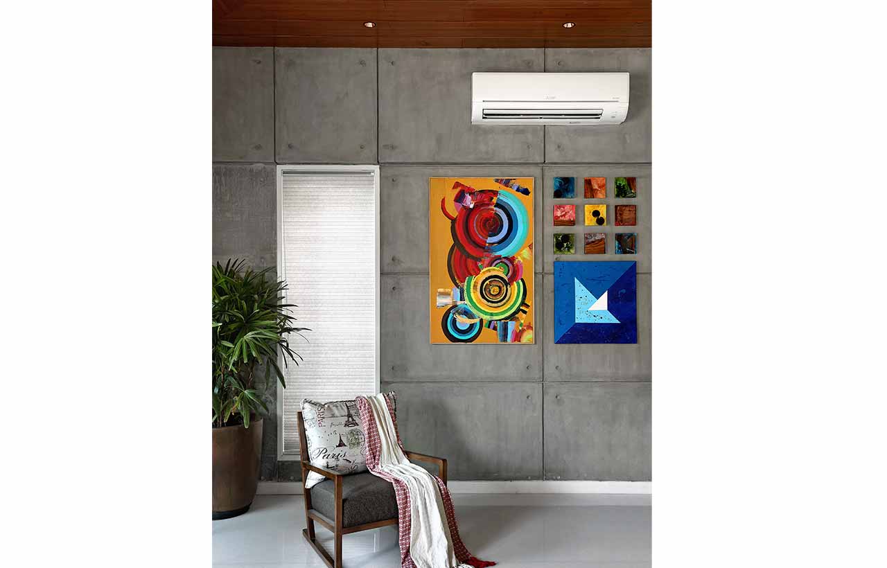
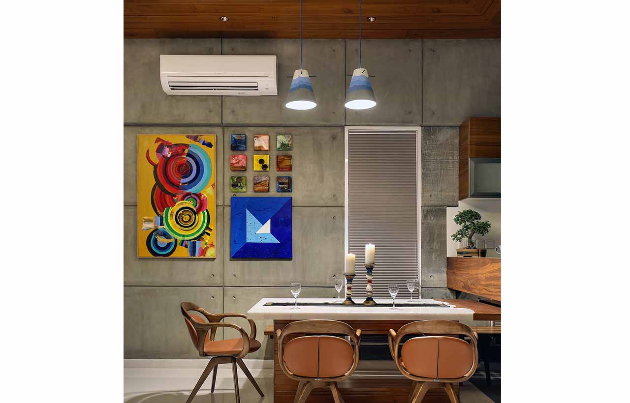
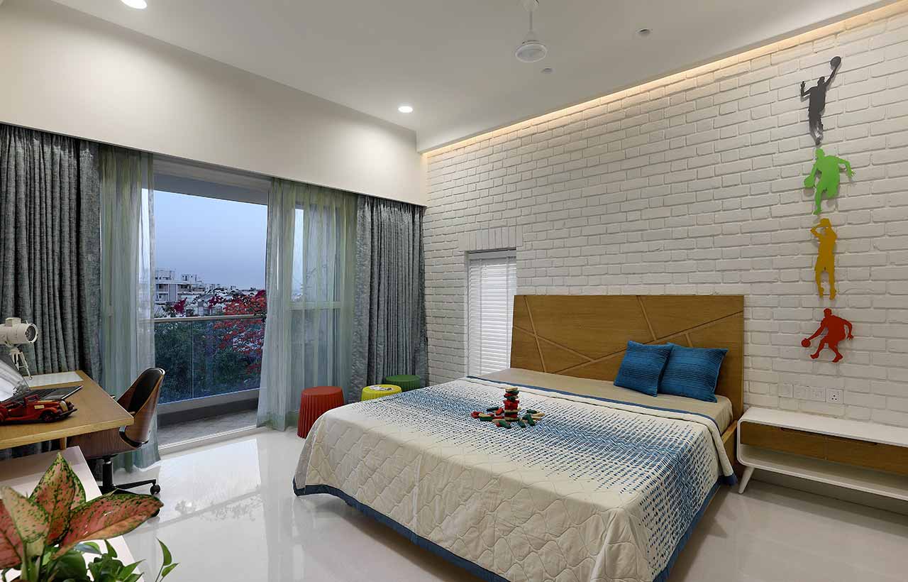
 The furniture was made of natural hardwood, bringing the same architectural character to the interiors. The concrete shells were chosen not to be superficially treated, and rather be displayed in their raw, beautiful form. The marble and wooden flooring used in the internal private areas of the residence complemented the basic material palette. Instead of having a typical spiral staircase leading up to the terrace, a fabricated staircase painted bright blue was furnished with the wall behind it being painted in a bright shade of yellow which was inspired by the natural sun rays observed on site that extended to the wall painting. The entire internal staircase was blended with exquisite abstract paintings, adding an interesting character to the space and volume. Since it was a narrow strip of space, the painting brought in more depth and vibrancy. The son’s bedroom was themed on sports and outdoors which were his areas of interest. The brick wall was accentuated with sports decals and artwork. On the other hand, the daughter’s bedroom was designed as more of a free-spirited area with inspirational words and quotes reflecting her liking and taste.

Responsibility
Though it was an uncommonly small size of land, the end outcome was a piece of architecture that had a statement of its own. It has been a process of thoughtful planning, meticulous design decisions, and careful designing which eventually lead to a house that evokes different experiences in each corner of the house. Just sitting in the bedroom would let one connect with nature from multiple spaces, not just from the balcony.
Innovation
Considering the proximity to the airports and the height limitations imposed due to it, it was necessary for the house to have a structural system with minimal beam depths. Instead of proposing the conventional frame structural grid, we were inspired to diverge from the convention. A structural consultant was brought on board while conceptualizing the basic form instead of sharing finalized design for structure and we sought to derive a structural scheme similar to that of shipping containers. When 10 shipping units are stacked on top of each other they do not require any additional structural support and the open shelf unit is capable of transferring the load itself. We designed the structure as a shell structure, giving us the possibility to work with a maximum open span of volume and avoid unnecessary beam and beam depths. The entirety of the project was envisioned as a shell structure of cubes stacked on top of each other along the vertical line of stacked containers; giving rise to a playful volume of spaces and a stunning building elevation. This concept when discussed with the structural engineer, the outcome was to design a house by stacking different volumetric RCC shells on each other and generating a column-free volumetric space with multiple connection points to nature and outdoors. Going vertical not only allowed us to play with the volume of spaces but also saved space and allowed for the accommodation of more requirements.
Sustainability
During the design of the building, the balance of open, semi-open, and closed spaces was maintained which helped in the regulation of temperature as it was a very confined space. Adequate openings were provided in a manner that confirmed proper cross-ventilation of wind in all the spaces. The semi-open spaces such as balconies are placed towards the south which acts as a buffer and does not let the interior spaces heat up directly.
Exploration
Cut and shift form exploration was used particularly for this building. The design process had a lot of back-and-forth shifting of masses according to the spatial requirements of the client while keeping the functionality intact. The overall concept was to design small home with a bold structure and interiors that justified the individual personalities of all its residents and lead us to explore abundant themes and structures.
Specifications
Project Name: The Cube House
Architecture Firm: Modi Srivastava & Associates
Area: 3273 Sqft
Project Location: Vadodara, Gujarat
Lead Architects: Ar. Hitesh Modi & Ar. Amit Srivastava
