Experience Center: Fluid Expression, Fusion of Aesthetics
- January 12, 2023
- By: Editorial Team
- INFLUENCERS
 The past couple of years have been deprived of any kind of in-person experiences, especially those that are guided through travel and exhibitions. To bring together an expansive range of international products for the building industry in India, Excella Experts curated an opulent experience center that caters to end-to-end design requirements for homes and offices.
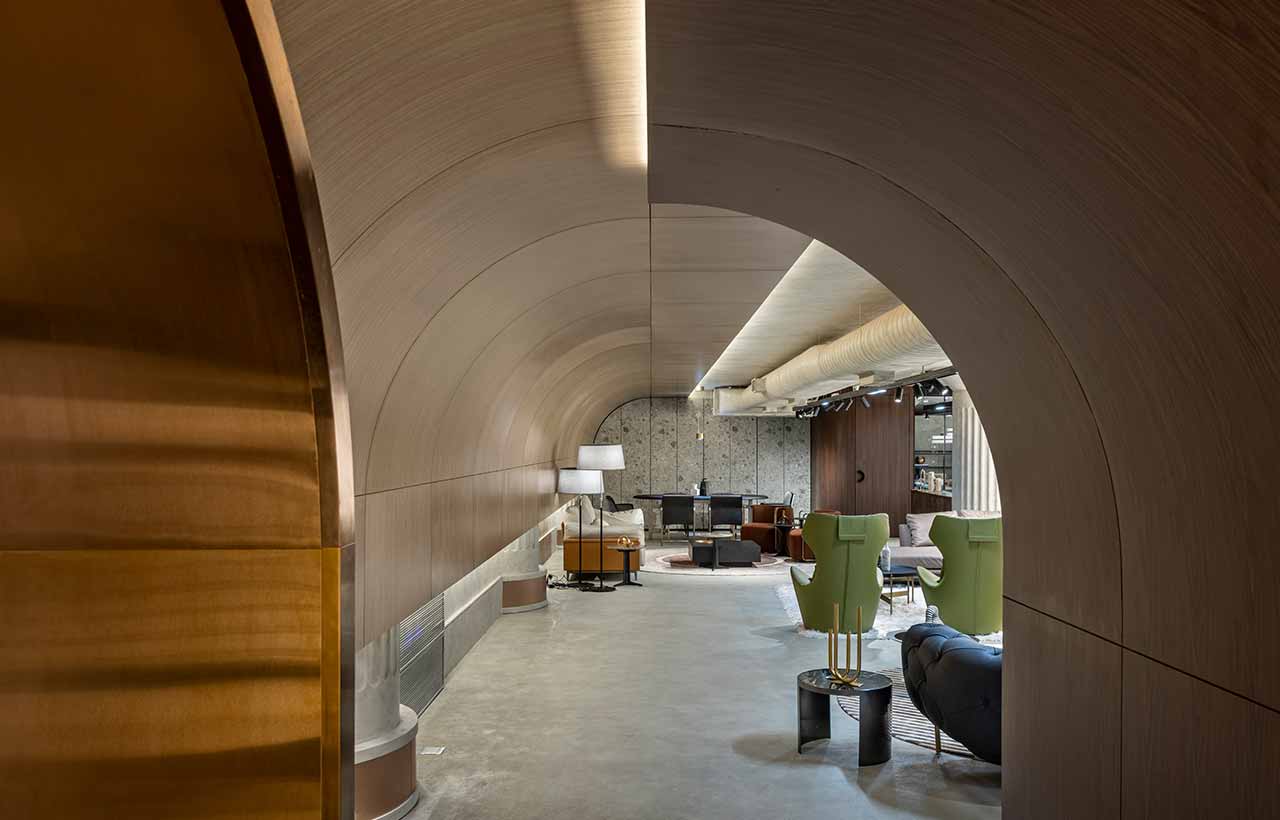 Located in an upcoming furniture hub in Worli, Mumbai that caters to all needs of the building industry, the exquisite premises occupies 3500-sq ft of space. Drawing inspiration from international exhibitions that showcase luxe products in eclectic settings and are user-centric, the Excella Experience Center is a one-stop shop for all kinds of interior essentials from materials, furniture, decor, lighting, and much more.
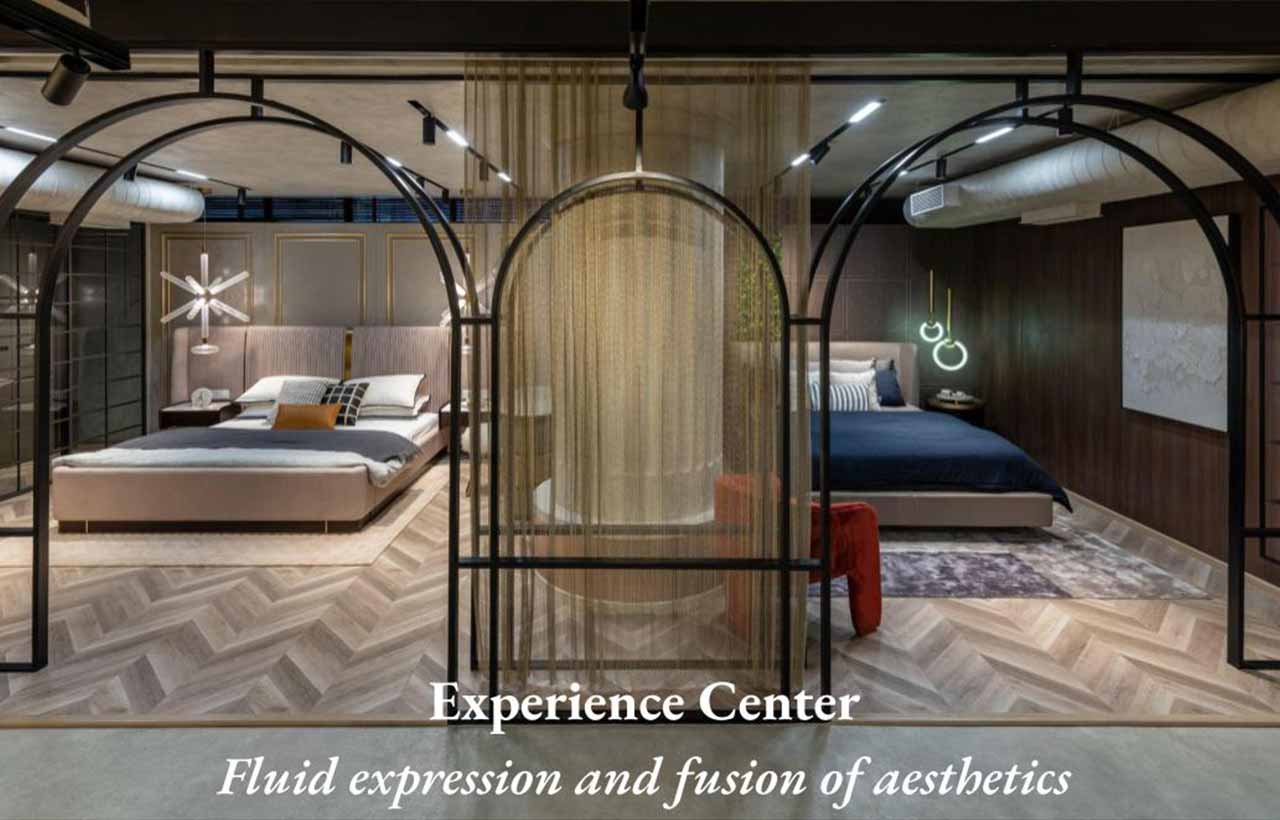
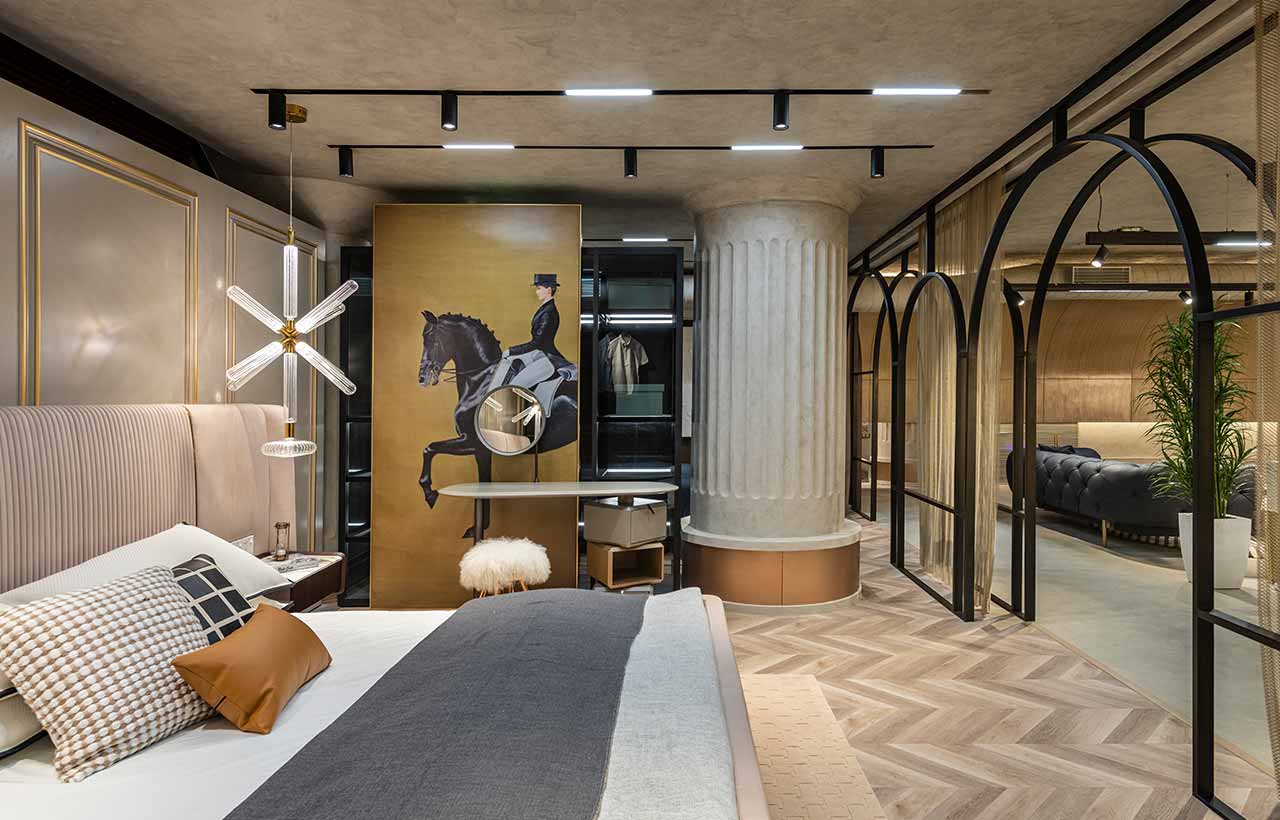
 Conscious of the dynamic nature of the exhibitions, the design intent was to craft a space that adapts to the changing apparel, yet accommodates the showcase of each object on display. Hence, the interior designed and detailed to act like a ‘shell’, taking a subdued aesthetic that elevates the exhibited item and adds to its experiential character. Albeit subdued in materials, this box displays an intriguing visual and sensorial exploration with an aesthetic driven by concrete, intersecting arches, and a mock tunnel-like setup, all of which manifest the ambiance of entering an exhibit, rather than just a store. Further, the vocabulary has a playful and fluid expression, a fusion of art deco with an edgy industrial aesthetic, holistically harmonizing with displayed items.
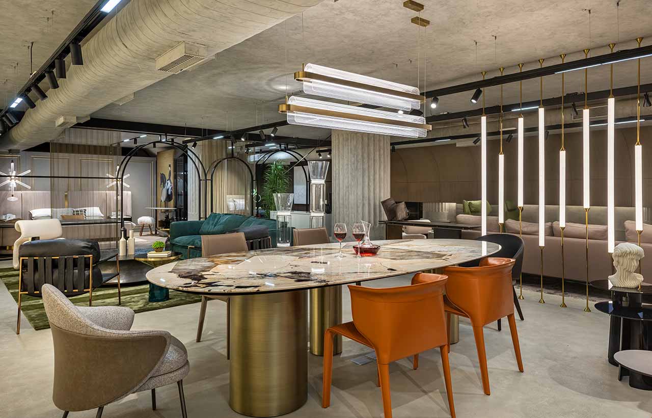
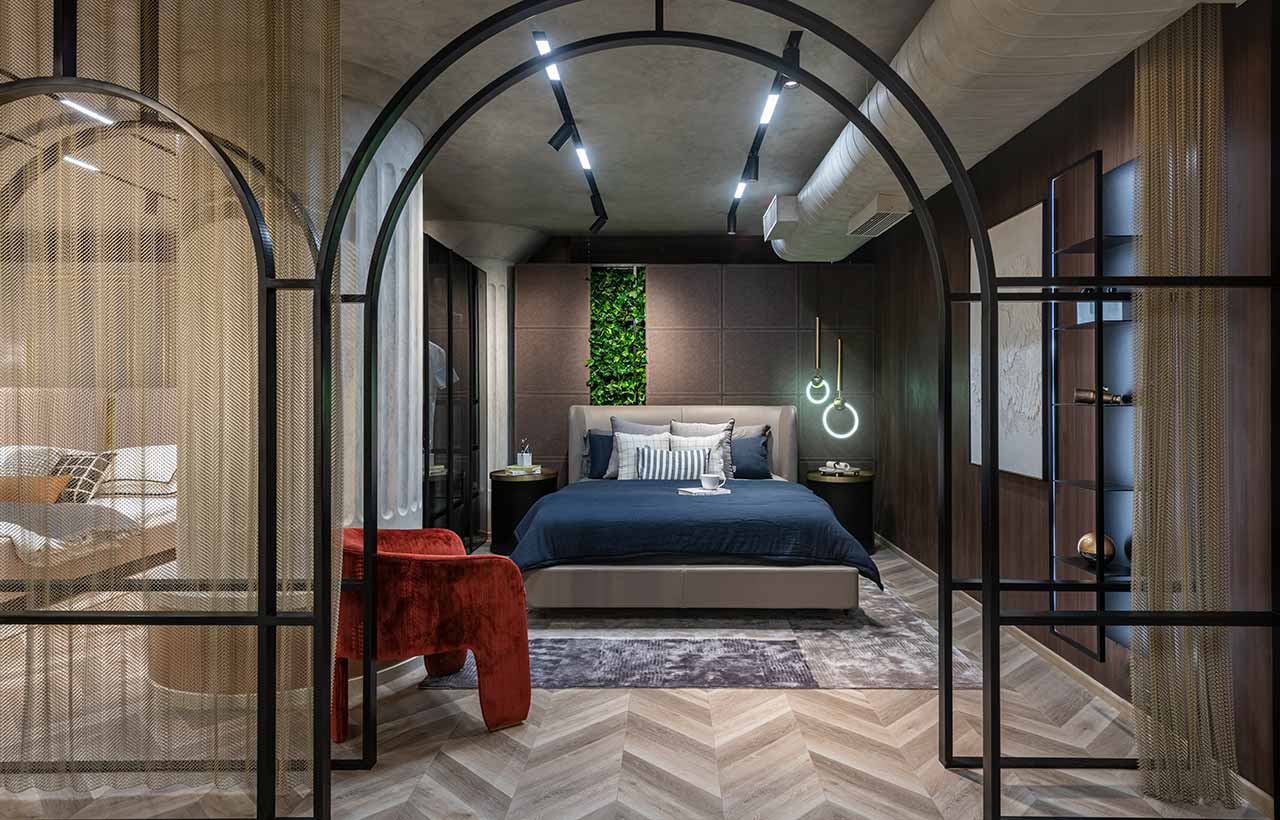
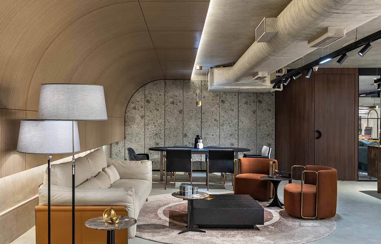 Reinvigorating the identity of a showroom and fusing it with that of an exhibition, the grand room is spatially zoned to accommodate clusters and pockets of real setups of living spaces, dining areas, bedrooms, and office settings, like conference rooms. Each organised interior space gives the patron a qualitative experience of the material, the finish, and the object; to establish an understanding of an actual setup and help them curate a visual catalogue of spaces to handpick pieces from. In response to the shortage of time (the space is put together in 80 days) and the need for sturdy flooring, a 3mm layer of Italian material top-flex is cast on the existing flooring, giving a seamless appearance in a subtle grey. Its non-absorbent and non-porous properties oblige the easy mobility of heavy furniture pieces. Taking off from a monochromatic approach to the visual aesthetic, the scoop-treated columns and the concrete finish ceiling, both in a cloudy grey finish, establish a neutralised background that allows the building materials and pieces to stand out.
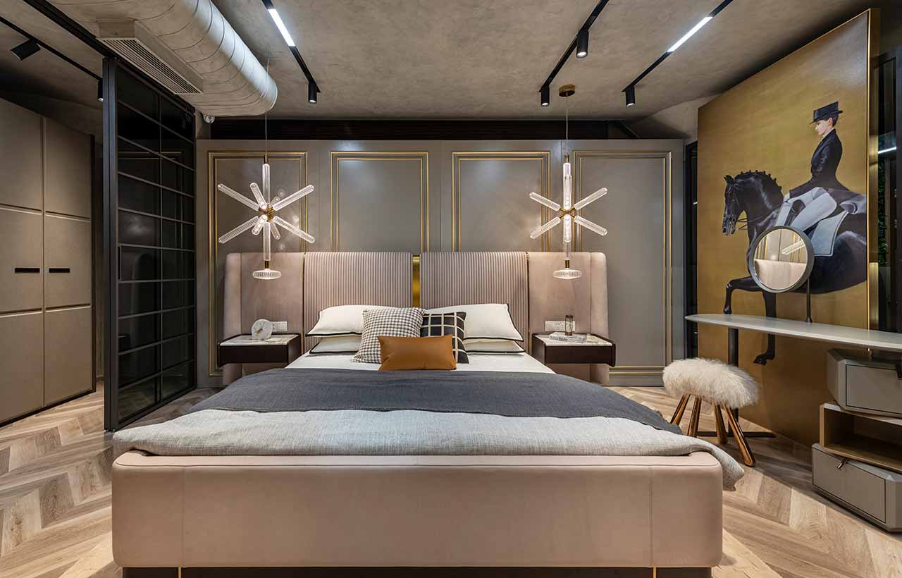
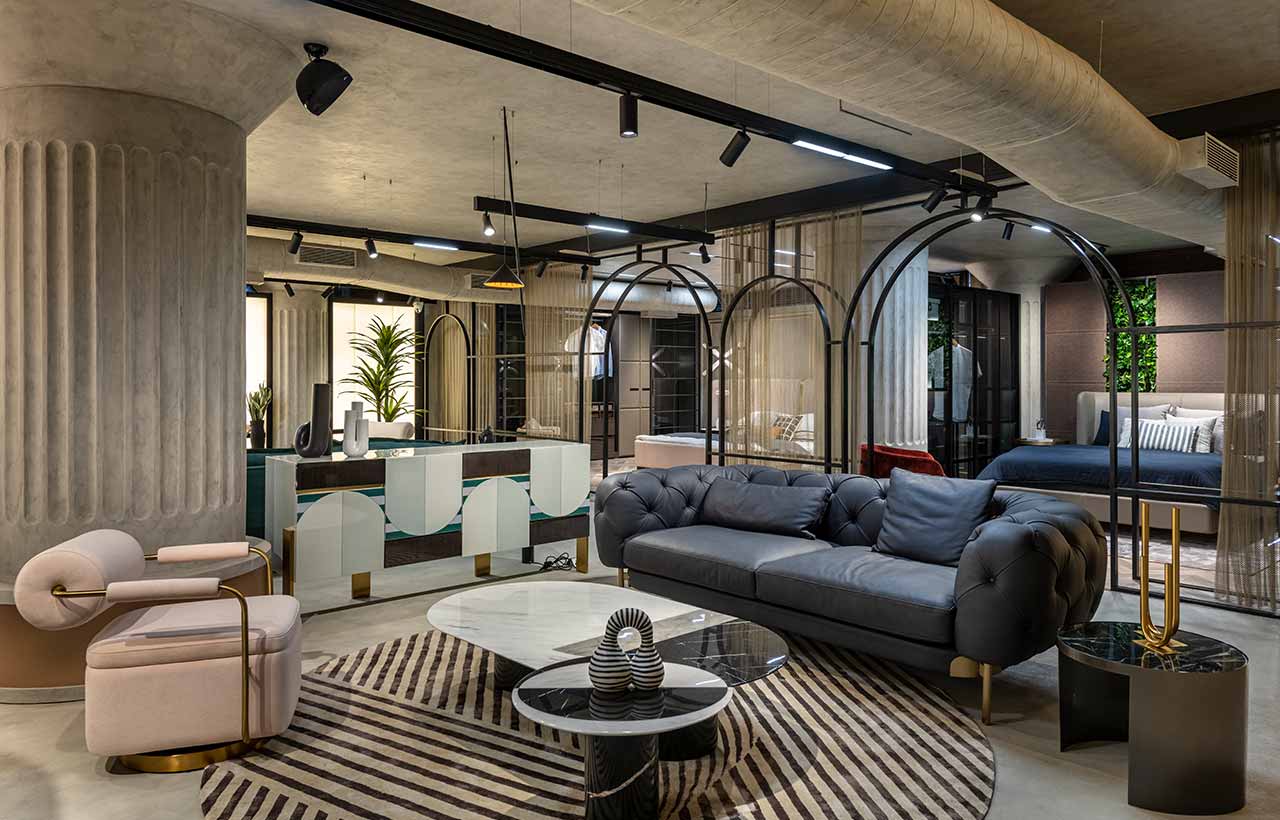 Before starting with the design, each item on display--materials, furniture, decor items, and light fixtures all are sourced and curated to enable a comprehensive solution. However, it’s ensured that the design isn’t limited to certain pieces but is incremental in nature and amalgamates different genres of sliding shutters, wall panelling systems, lighting solutions, accessories, furnishings, furniture, and more into a holistic design scheme. To amplify and ensure maximum integration of services, the design is detailed in grids that form junctions for the services to enable that. In settings like the bedroom, the surfaces have metal frameworks that ease the process of changing the clad finishes with fluency. Similarly, the architectural lighting of the experience center is hung on magnetic tracks, prearranging the flexibility to expand the opulence and illumination whenever and wherever required.
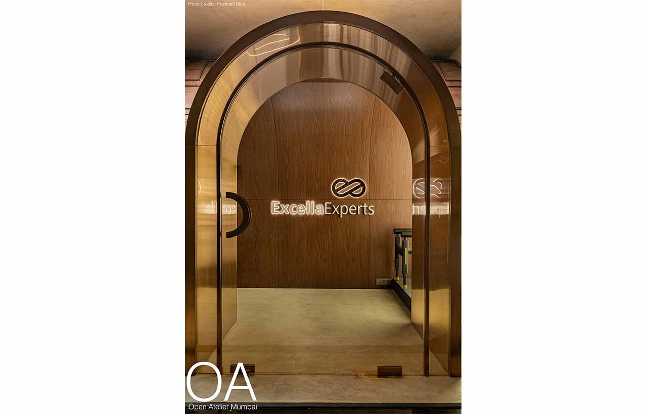
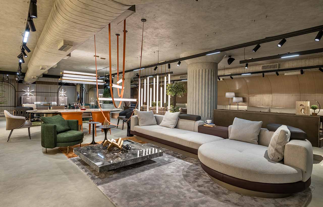 The more permanent elements of the exhibition are designed to foster aesthetics and detail to accommodate functionality to the best of their ability. The entrance to the showroom is marked by an arched door that sits beside a display on its facade. Owing to its ever-changing nature, the glass fixture has a ledge in the bottom half, where more significant pieces and consignments can be pushed through without hassle. Behind the front exhibit, as part of the front facade, sits the most spectacular installation made from a bent Flexi-ply and detailed with CNC cutting that showcases floor plans of spaces, like the dining space, the home theatre, and the balcony; all of which are detailed with furniture and hand-drafted nomenclature and dimensioning. This piece establishes the identity of the interiors as a space for design solutions, right from a glimpse.
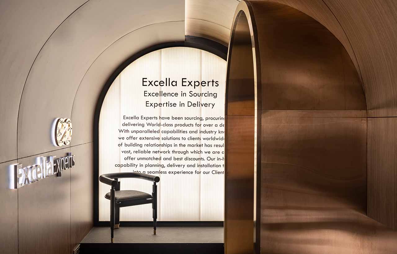
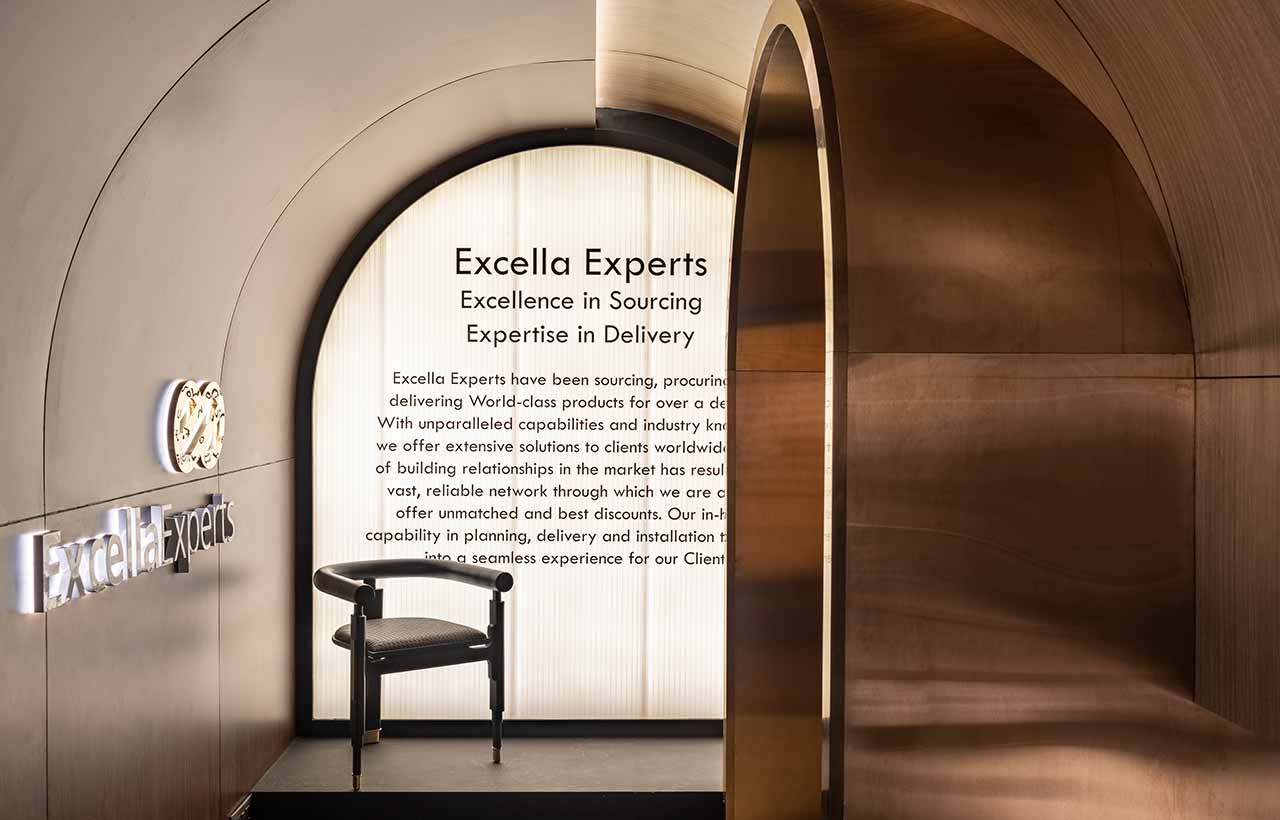
 Upon entering, the patrons are greeted with a beautiful arched surface with light peeping from the slit that’s built from the popular luxe material. Sitting right beside the entrance, on a dais, is a backlit polycarbonate panel that displays the philosophy of the Excella group, familiarising the architects, interior designers, and patrons who visit the space of the core ethos. These backlit panels have been scrumptiously used in the side facades to create a beautiful illusion of a window that beams with diffused natural light through the sheer curtains.
The Excella Experience Centre is a sensory extravaganza with a play in volumes, eclectic and dynamic interiors, playful details, and a vivid range of materials that sit there as if the space is designed for each particular piece. This showcases an inherent understanding of how flexible and adaptable a ‘shell’ needs to be to take a back seat while still powerfully communicating the intent it was built for. Together, the whole emporium is a partial response to the nostalgia of the pre-pandemic encounters of attending exhibitions and experiencing spaces, filling that void and manifesting into an ever-transforming place, rooted in details.
Specifications:
Project Name: Experience Center for Excella Experts
Architecture Firm: Open Atelier Mumbai
Area: 3500-SQFT
Project Location: Mumbai, India
Lead Architects: Rahul Mistry
Photo Credits: Prashant Bhat
