Inside a Family Home Integrating Vastu and Courtyard Design
- November 19, 2024
- By: Ar. Priyanshi Shah
- INFLUENCERS
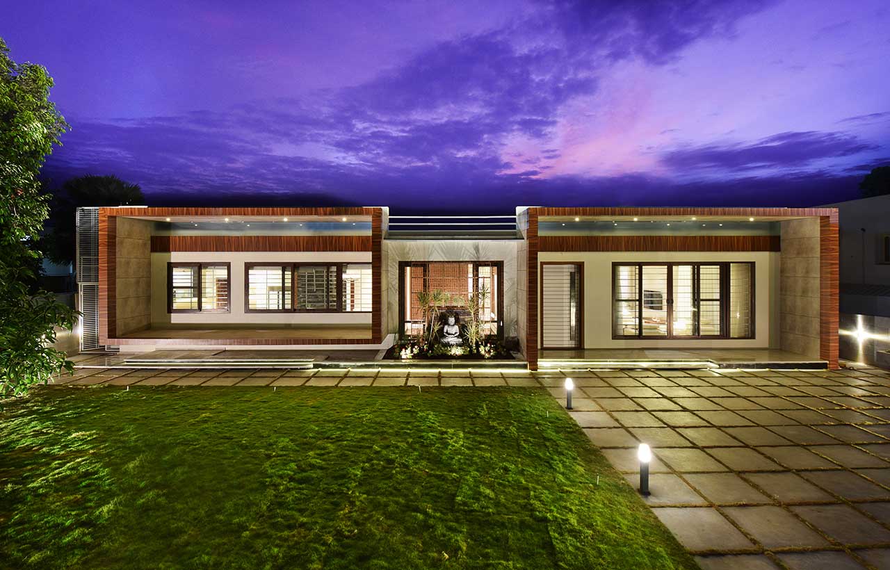 Inside a 3600 sqft home designed by studio TAB incorporated courtyard design and vastu principles adopting a contemporary language for a family home in Bangalore. With the minimal shades of colours, diverse materials and intricate details the spaces feel alive. As one enters the dynamism of design, the openness and thus the expanse of the house is seen at once, creating the play of mass and void. Sketches and discussions were held explaining how to achieve a certain character in space that transforms natural light, ventilation and openness into a lively home.
Understanding the Homeowner’s Vision and Needs
 The client is part of the second generation of a leading industrialist family in South India. After living in a joint family home, the second generation decided to move into their individual homes. This villa is the first of the 3 individual villas for the family. The project is located on the outskirts of Bangalore city. The client desired a luxurious yet manageable home for his small family. A house wherein there is space for everyone and every activity and yet no unnecessary space which would end up gathering clutter. More importantly, the client wanted a home completely compliant with Vastu Shastra norms. The house needed to be restricted to a ground-storey building only due to the region’s bylaws.
Overcoming Design Challenges
The client came from a joint family wherein their family home was a heavily ornamented, jarringly opulent house. The decorative opulence was the basic spatial quality as the ventilation was compromised. Most houses within the surrounding built environment displayed a similar character. The architect and the client had long brainstorming sessions discussing the basic idea of space. Every preconceived notion of space was stripped off to derive the basic fundamental sense of the pure quality of space.
Thoughtful Design Strategy
 To begin with, a detailed climatic analysis was done to understand the sunlight, rain and wind factors prevalent. This helped them to apply the Vastu norms thoughtfully rather than a blind application without reasoning. Based on the hierarchy of spaces and Vastu norms, the zoning was done. Since the plot would eventually be landlocked on 3 sides with only the front being the most open space, the private spaces like bedrooms were zoned towards the back and the more common interactive spaces were zoned towards the front of the plot. A design exercise followed which reduced the number of internal solid walls and retained those walls which we necessary. Since the built-up space’s parameters restricted the sizes of the rooms, they avoided the room-within-walls approach as it would have rendered the house too claustrophobic.
The Spatial Challenge
 The client’s new home was to be of a relatively smaller size as compared to his previous family home. This decision was taken by the client’s family as they needed a home that is manageable and purely functional without the additional frills that would remain non-utilized in the long run. The challenge for the architect was to adhere to the decision of a 3600 sqft built-up house, but ensure that the family wouldn’t feel claustrophobic. The Architect set about by defining spaces that needed to be confined within 4 walls, spaces that could flow into each other within walls and spaces that just required a demarcation without walls on all sides. This study helped achieve spaces that connect visually and yet are strongly defined in their usage.
With this concept of minimal walls, visual contact is achieved right from the kitchen to the family room - a distance of about 70ft.
Courtyard - The Heart of the Home
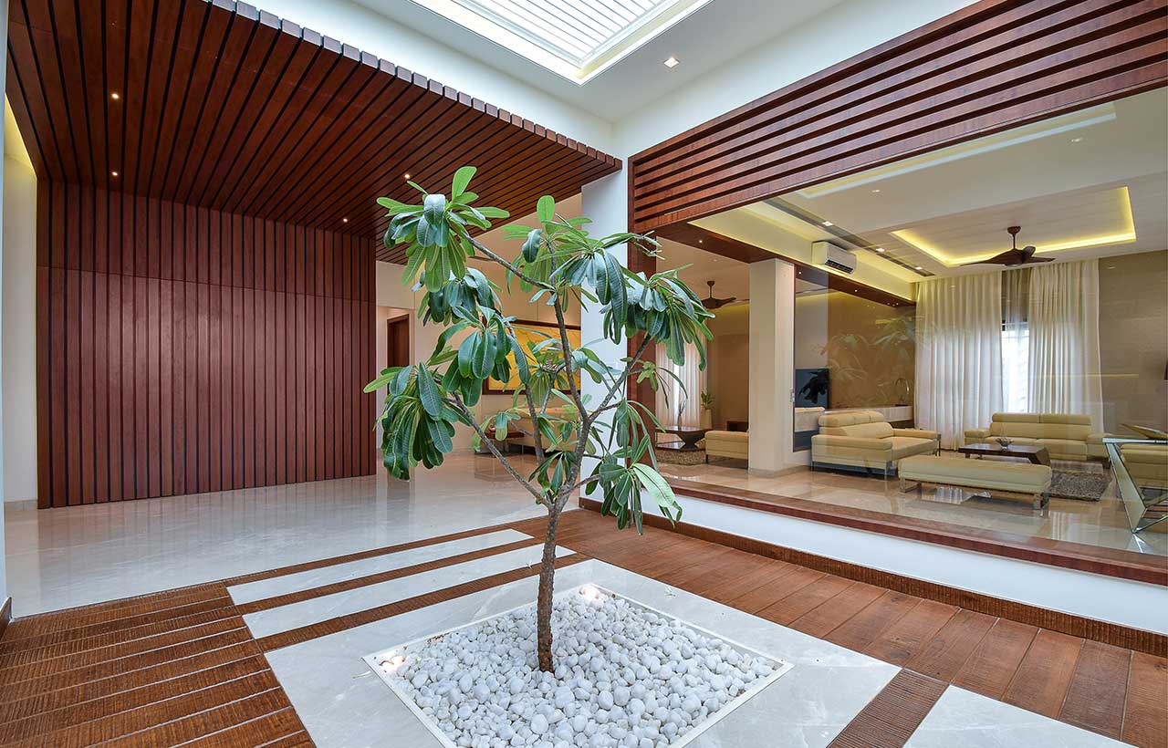 Courtyard became the guided architectural language in achieving the feel of space. Instead of confining the puja space within a box of a room, they opened it into an open-to-sky courtyard juxtaposed with pergola roofing. This space thus became the open barrier space between the congregational spaces and the dining + kitchen space. They wrapped the 2 enclosed spaces with an exaggerated overhang of 6 feet. The concrete wrap rises prominently above the courtyard height on both sides. To balance the ample mass on 2 sides, the central courtyard space is mainly a void. It has a custom-designed mesh pattern made in mild steel with a copper finish in the front and a skylight roofing on top. Together, the exterior elevation is a beautiful play of mass and void.
Entrance to The Home
A large open lawn endows the plot on one side and a chequered flamed Kota stone flooring on the other. Alongside the exaggerated overhangs on 2 sides, what catches the eye instantly as one enters the plot is the courtyard garden. A landscaped garden sits pretty in front of the internal courtyard. The garden wraps around a rock-cut 5-foot-high Buddha statue, creating a pleasant sight.
Family Spaces: Drawing Room & Family Room
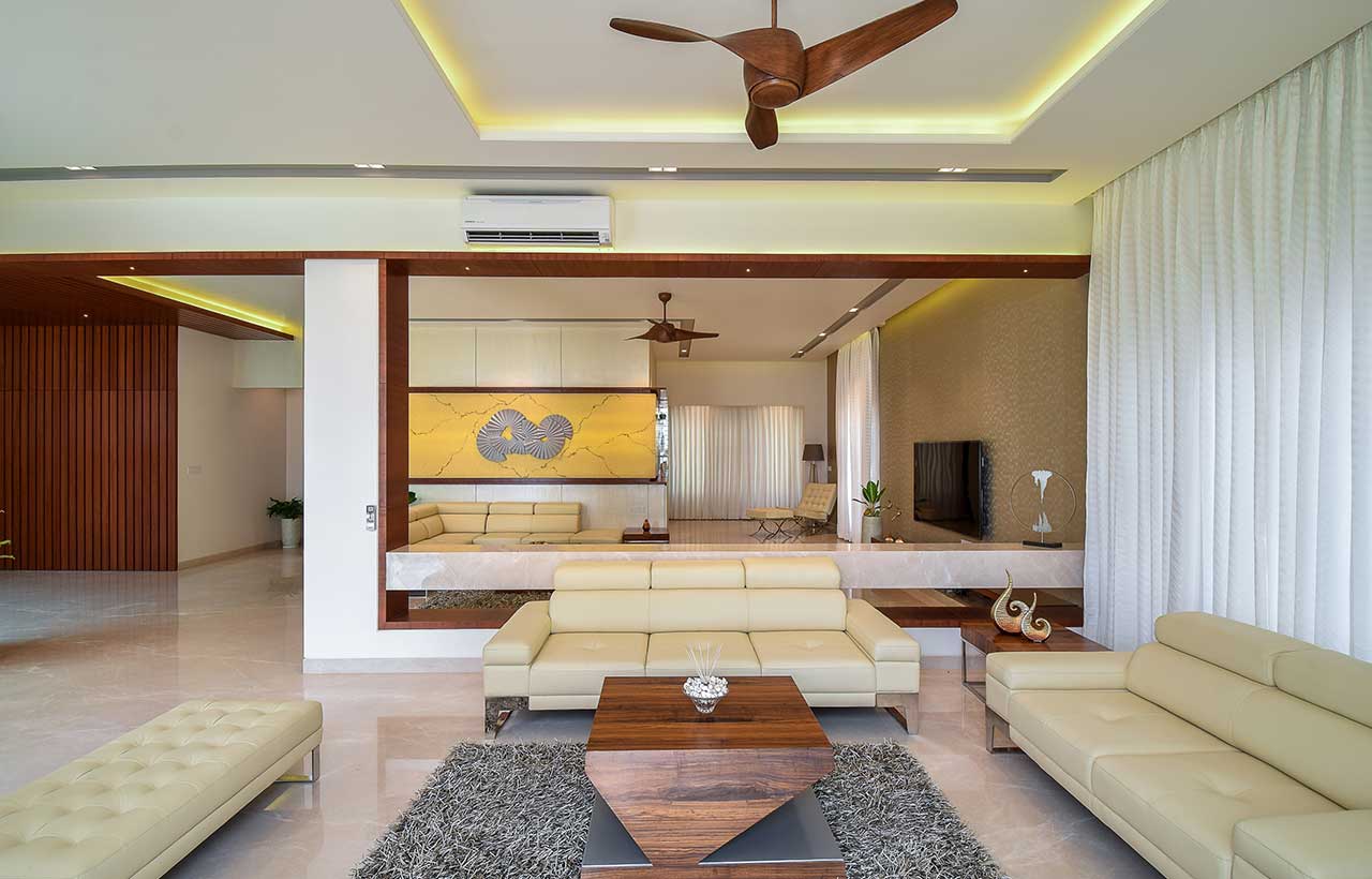
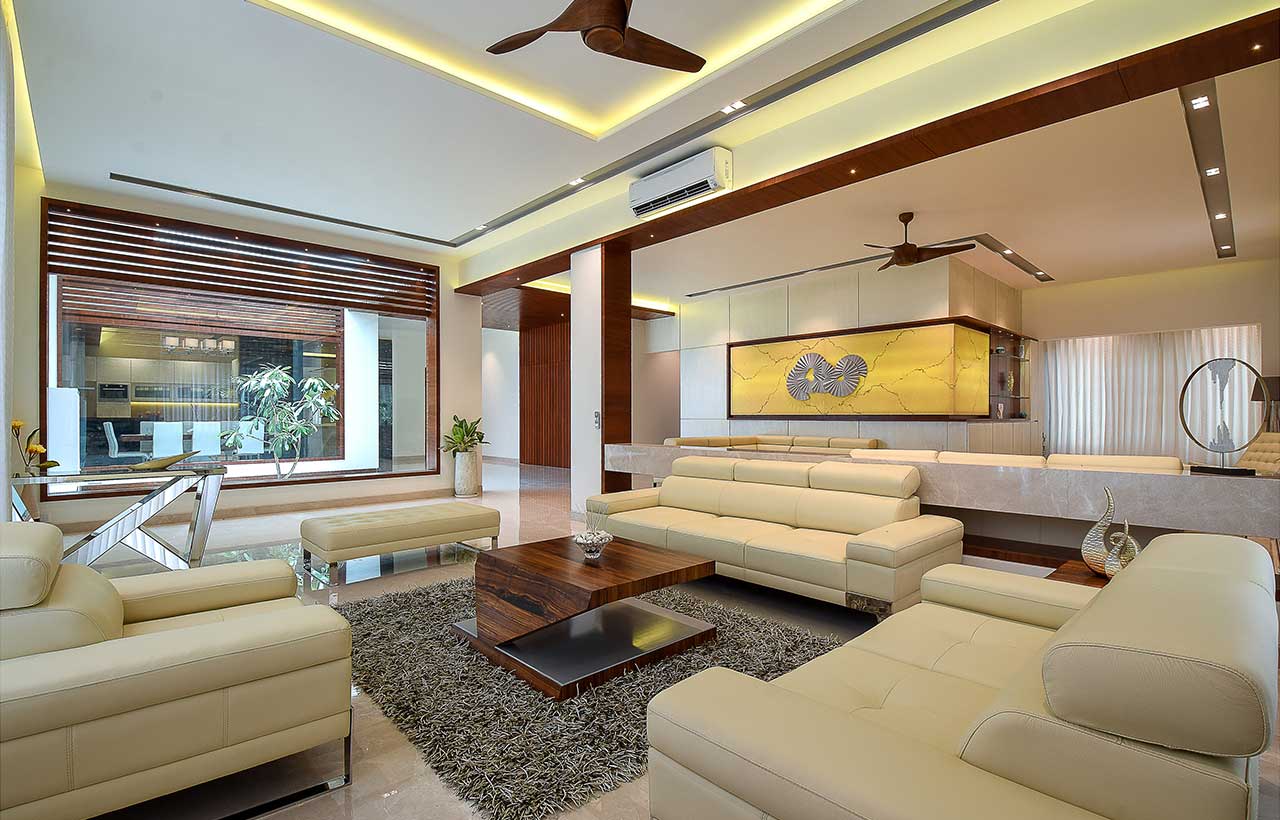
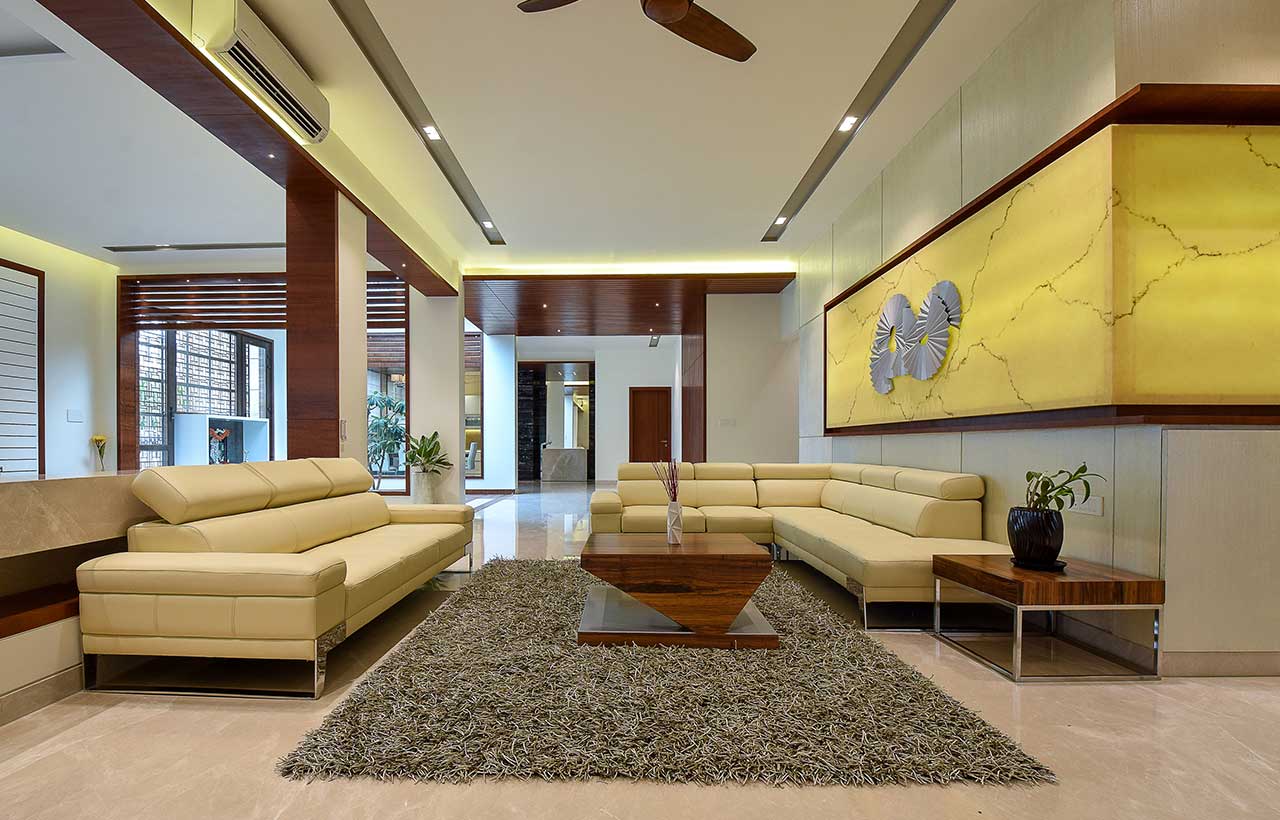 Refraining from confining each room within 4 four walls, the congregational spaces flow into each other visually by avoiding solid walls wherever possible. The drawing and family rooms are segregated with a height 15 feet long floating marble ledge. The ledge acts as a barrier between the 2 spaces without obstructing the visual connection. The drawing room is flanked by 10ft high windows that open into the lawns. The family room is split into a TV zone and a reading/ bar zone. The large wall adjacent to the drawing room is the first wall that is seen as soon as one enters the house. Using this surface as an art palate, they crafted a large chequered metallic textured base that enhances the scale. It also has a beautifully concealed bar unit on one side which can be opened up when the client hosts his guests. In the middle of the wall is a dim lit Onyx stone slab that has been clad. A custom-made folded metal plate mural art sits pretty on the Onyx wall. On the other end of the drawing room, the floor space has been kept empty without clutter. All it has is a Barcelona chair seating with a footrest under a floor lamp, thus giving a perfect setting for reading.
Transitional Spaces: Courtyard & Corridor
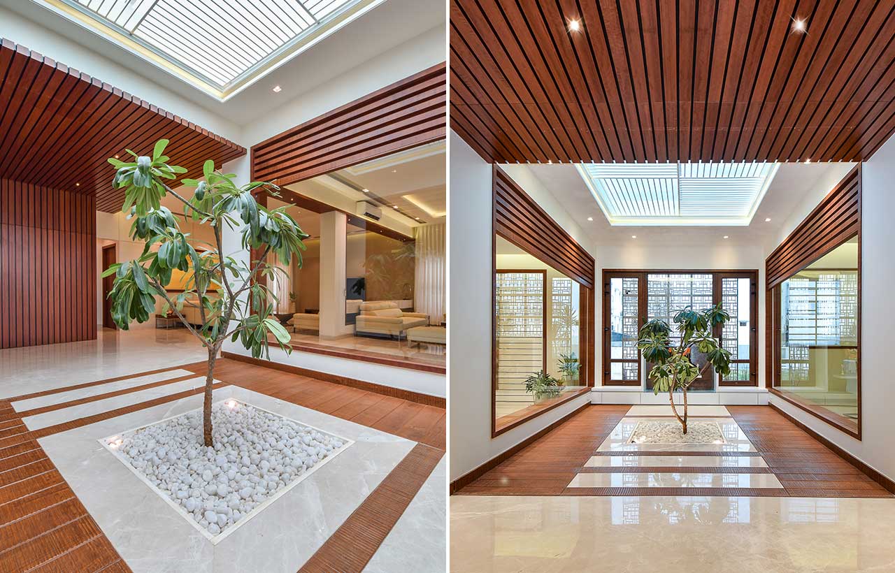 The planning of the house revolved around the courtyard. The courtyard opens into the corridor and has 2 glass walls on either side and a mesh wall on the front side. This space is essentially seen from most spaces of the house, be it interiors or exteriors. A rough, untreated teak wood flooring leads one into the courtyard. The courtyard is basically the Puja space for the client. Instead of confining the Puja room within 4 walls, it is flanked by a flowering tree and designed with natural stone and wood as materials. The whole idea was to create a serene, natural space that fills one with sanctity while praying. A Plumeria Alba tree is the central focal part of this space. As the tree rises to the sky, it remains the most pleasing view from any given space of the house. A wooden batten design encapsulates the corridor on the ceiling and the wall. It creates a stark contrast to the green tree and white floor. Somewhere hidden beautifully amongst the battens is a door that leads into the kid's room
Culinary Spaces and Dining Experiences
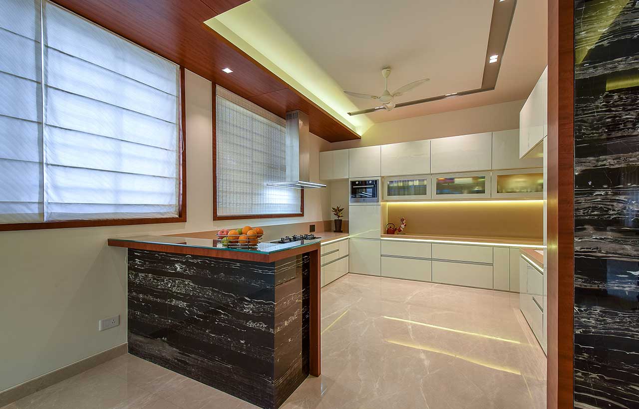 On the other side of the courtyard is the dining & kitchen space. An 8-seater dining table, designed and executed completely on-site adorns the dining space. The kitchen opens into the dining room with a breakfast ledge in between. The ledge also acts as a serving top between the kitchen and the dining space. The kitchen is a neat, white design with all the latest fittings & appliances. The most interesting part of this space is the common handwash area -a space which is generally discreet and hidden away. It is cladded in the walls with White Porto marble and this marble runs on the breakfast ledge too. A floor-to-ceiling height mirror is clad in between. In front of the mirror, is a custom-made basin that is designed using the same flooring marble. The basin has been carved into the marble without adding any other element. A 4-foot tall pillar cork basin adds to the grandeur of this space.
“I look forward to waking up early and walking around the house just to witness the play of sunlight through the courtyard and the way the Plumeria tree responds to the first light. I look forward to returning home from work as the home gives me a sense of calmness and serenity. The play of soft light and shadows is soothing. Not one thing in the home is a highlighting element and the beauty lies in that as I get to unravel new spatial experiences in and around the house each day. This house is not about any inanimate object used for creating focal highlighting spaces. For me, the hero of the house is the space and this can only be experienced.” The client describes the thoughtfully designed experience
Master Bedroom
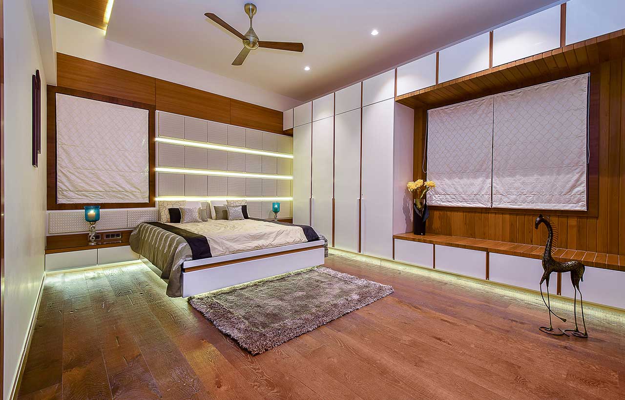 A king-size bed has been designed with a window-level high headboard. The headboard pattern is an interesting play of cushions & lights. Apart from the wardrobes within the walk-in wardrobe room, the client required an additional wardrobe within his room too. To avoid creating a heavy visual mass, it was toned down the shutters with a white deco finish with floor-to-ceiling handle grooves. Each groove is an 18mm groove with veneer on one surface and brushed brass on the edges. The wardrobe envelopes a window that is framed with Burma Teak wood battens on all sides. The battens double up as an Indian seating space adjacent to the window. The tv zone is essentially a Travetino marble cladding on the wall with a long linear cut near the bottom. A minimalist black matt mirrored L-shaped ledge juts out of the marble that serves as the tabletop. The master bathroom has been clad with an interesting pattern created out of Beige Atlantide marble. The patterns of the marble are intricately clad to form a homogenous pattern on walls and flooring.
Kids Room
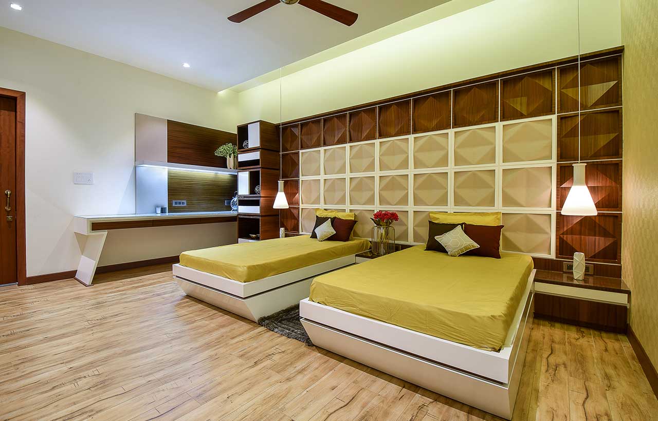 The twin bedroom is for the client’s 2 daughters. A customized mural design, made of a tessellation pattern of foam and veneer covers the wall behind the beds. The pattern emerged after a painstaking on-site experiment with materials and forms. Each square panel further has 8 triangular panels sloping down in different directions. While the foam panels serve as the headboard, the veneer panels form the frame of the whole design. Each of the squares and their respective 8 set panels were individually designed & executed at the site. On the far side is a study table with a bookshelf as a play of mass &void storage spaces.
Son’s Room
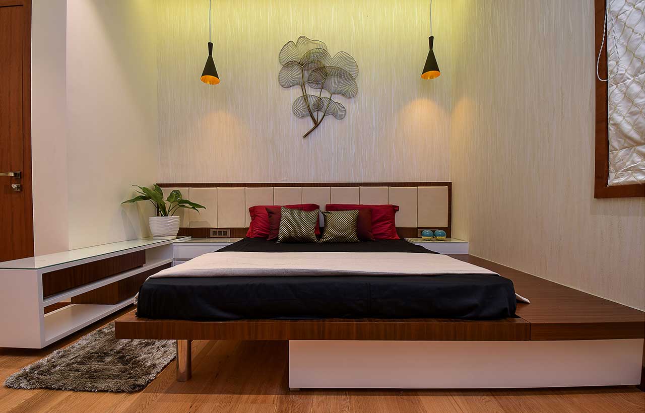 This room had to reflect a certain amount of flair to suit the teenage son’s taste without going overboard. Thoughtfully designed with a staggered bed that rests on a steel leg in one corner and the other end extends into a bedside seating zone. The side tables on one end flow onto the perpendicular wall to form a display ledge. The opposite wall has the wardrobe + TV unit + display racks, all bound together within one design. The Tetris-inspired pattern has the display boxes in walnut veneer and the complete white surface acts as a wardrobe with openable shutters.
Customized Furniture Design - Centre Table
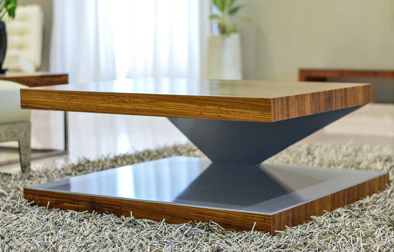 It is a customized design which has been patented by studio TAB. The centre table is a floating top which emerges from one corner of the bottom part. The form wings out from the corner support in a rhythmic angle and goes onto the form of the tabletop. Finished in real ebony on all outer sides and brushed stainless steel on the inner side.
 Stay updated on the latest news and insights in home decor, design, architecture, and construction materials with Building Material Reporter.


